🪪 Verinium Access Terminal
Idemia
The whole product rests on one sequence, done once, by somebody who has never seen it. On the last step of that sequence, one tester out of six got through on their own. The technology worked. The sequence did not.
Two test waves, July and September 2021
UX Designer in R&D, from protocol to handover
16 across the two waves, recruited guerrilla style
Check that the instructions are understood, that the app reassures people about what happens to their data, and that somebody meeting the product for the first time can enrol and authenticate without help.
The product, and the one moment it can fail
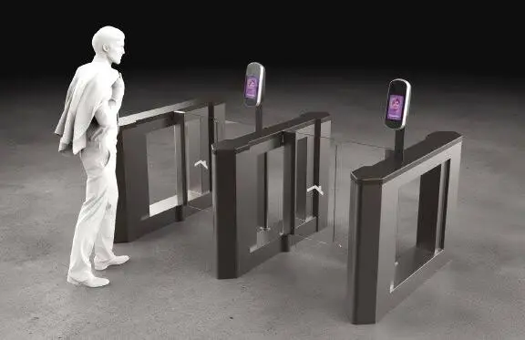
An access terminal is not an app you learn. You meet it in a corridor, with people behind you, on a morning when you are thinking about something else. The enrolment happens once. If it fails, you go and find somebody with a badge, and the product has lost its argument.
The sequence runs: a tutorial, the terms and conditions, permission requests, a selfie capture, a confirmation screen, a screen telling you your identity is valid, switching NFC on, then at the terminal a face capture and the phone presented to a reader.
Nine moments where a person who has never seen any of it can stop.
Testing on the real technology, not on a mock-up
I put the prototypes on the working technology rather than on a screen mock-up, because face capture fails in ways no prototype reproduces. A prototype always recognises you. The real camera does not.
Two guerrilla waves, people recruited where they were rather than through a panel, six testers then ten. I wrote the protocol, ran the sessions, kept an observation grid per tester, and recorded the audio with their consent so the recommendations could quote what was actually said.
One bias I wrote into the report rather than around: the prototype under test was the English version, and the tests ran in France. Two testers did not read English, and that shaped what they could and could not do.
What the testers showed
People understood the promise. Five out of six understood they would have to open the app and show their face. Five out of five said they trusted the technology with their face, and the average score they gave the experience was 4.5 out of 6. The product was not rejected. It was just not usable yet.
Nobody reads what you write. Six out of six accepted the terms and conditions without opening them, while understanding perfectly well that there were terms. One tester's suggestion was better than ours: summarise the few points about data protection on one screen, and let people click through if they want more.
The capture gives no feedback. Two testers out of six restarted the capture because nothing told them the photo had worked. Two complained that the terminal took the picture before they had time to stand properly. One read the word "awesome" on the success screen as a bad sign.
NFC means paying. Three testers out of six did not know what NFC was on a phone, and read it as something to do with contactless payment. Three clicked "turn on" and then stopped on the system screen that followed without pressing the switch.
And the last step. Three out of six hunted for the NFC reader on the terminal and struggled to find it. One got through unaided.
The failure that was not an interface problem
One tester could not enrol at all. The capture failed, again and again, on a black face behind a mask. He gave up, because nothing on the screen told him why it was not working, and he ended up tapping the phone screen to try to take the photo himself.
Four out of six kept their mask on for the capture, so this was not a corner case of somebody doing it wrong. It was the product working for some faces and not others, in a building where everybody was masked.
That one went into the report as a recommendation to the technology, not to the interface: make the capture work on a black face behind a mask, or ask every user to remove the mask on the capture screen so nobody is singled out by a failure they cannot explain.
It is the finding I am most glad we ran these tests on the real camera. On a mock-up, every face works.
The A/B test that did not say what I wanted
The NFC step was the worst one, so we tested two wordings for the prompt, five testers each.
So the wording moved the first attempt and not the outcome. My own line in the file that day: no notable difference in behaviour between the two wordings.
I kept it in the report as it was, because the half of the result that looked good would have sold a fix that does not fix anything. What actually blocked people was underneath the wording: they did not know what NFC was, or why a product that had just recognised their face still needed it. No label solves that. An explanation and an error screen with a way out do.
26 recommendations, and a documented handover
The report came back with twenty-six changes, each tied to the observation that produced it. They are not ranked. They follow the journey, screen by screen, because that is the order in which the failures happened.
Tutorial
Terms
File, photo and camera permissions
Location permission
Selfie capture
Confirm
NFC activation
Face detection
NFC authentication
Outside the flow
The deck ends on a question rather than an answer: whether a specific document has to be signed if the technology is installed at Idemia itself. I left it in rather than resolve it, because it was not mine to resolve.
I closed the project with a documented handover rather than a slide deck, because the team that inherited it had never sat in a session. A deck says what we found. A handover says what to do with it when we are gone.
Key Results
Sixteen testers across two guerrilla waves, an A/B test reported with its negative result intact, and a documented handover to the team that took the product on.
Outcomes
The value of this one is not the interface changes, it is where they came from. Every recommendation is attached to a number of testers and a moment in the session, so the engineers could argue with the finding rather than with me.
And the product was never the problem people assumed. The face recognition worked. What failed was a phone, a reader, and a step that asked people to know a piece of vocabulary nobody outside the building uses.
Constraints
The prototype was in English and the testers were in France, which cost us two of them on wording questions. I reported it as a bias rather than smoothing it over.
In R&D the UX team billed its time to the project teams, so the study ran in weeks. There was no third wave to confirm the fixes, which is why this one hands over its observation grids rather than its conclusions.