🏦 Cardplayer - Website Redesign for a flagship poker media brand
CardPlayer
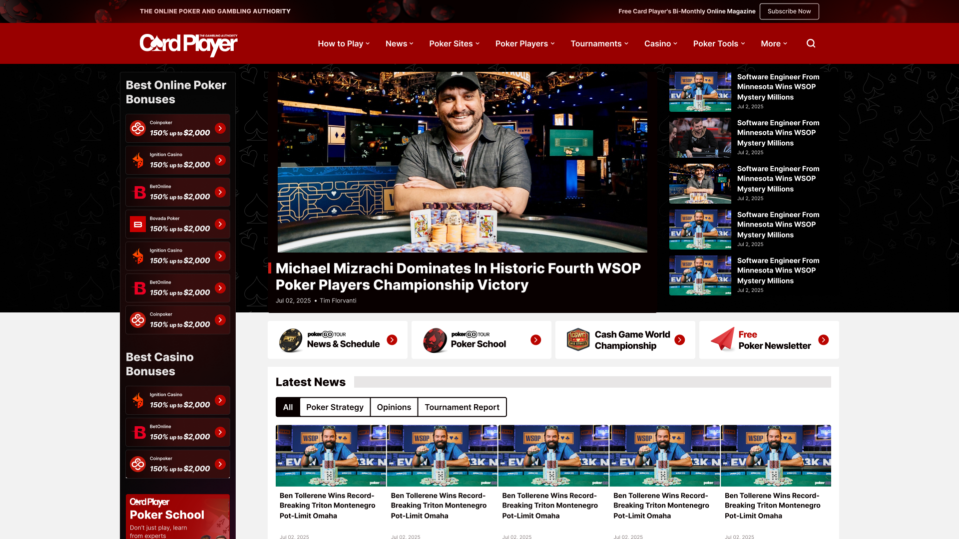

Over years of incremental growth, the product accumulated template sprawl, inconsistent patterns, and weak desktop mobile parity, increasing design debt and making further iteration costly. The redesign goal was to re-architect the template ecosystem, not to ship a visual refresh.
5 months
Solo Designer, Solo designer, 1 Seo Director, 1 PM, Dev Team
Poker Media Website
Modernize CardPlayer’s legacy experience into a scalable, contemporary template system by consolidating repetitive layouts into canonical patterns, improving editorial hierarchy and scanability, restoring desktop mobile parity, strengthening brand authority and trust signals without diluting its DNA, and increasing delivery efficiency through clearer governance and implementation-ready structure.
Remote from Bangkok (GMT+7) with structured async handoff across EU timezone.
Mission 1: System diagnosis and Scope control
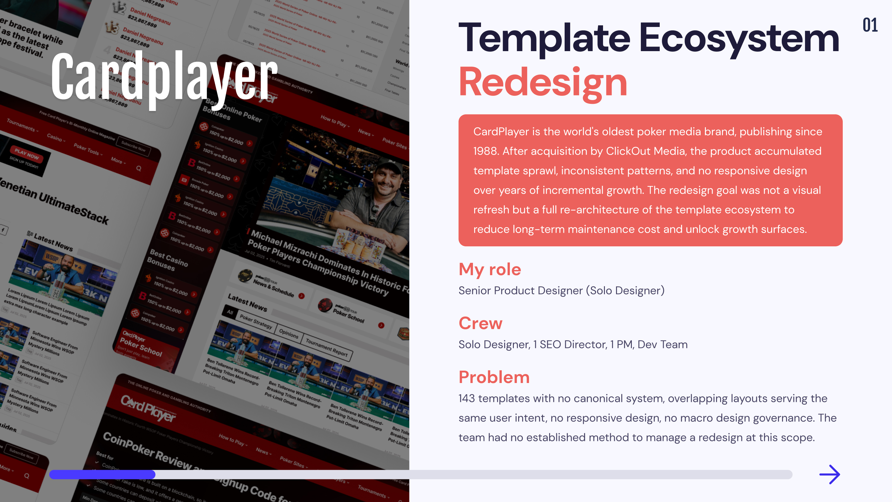
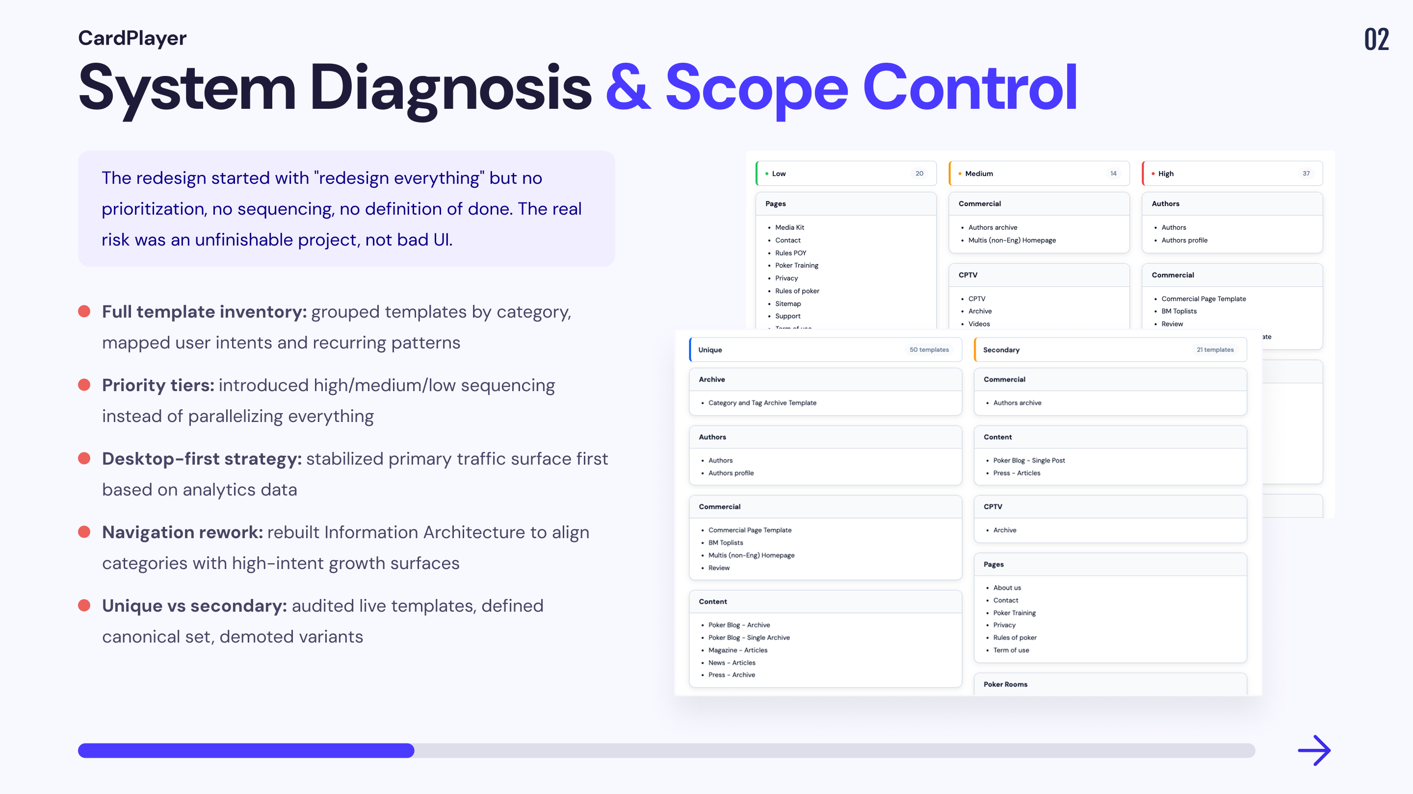
The product had become a patchwork of templates added over years to ship fast. The outcome was predictable: the same user intent served by multiple layouts, unclear rules, inconsistent navigation across sections, and endless debates because no one had a system view. The real risk wasn’t “bad UI”, it was an unfinishable redesign.
CardPlayer’s redesign was a large template migration with multiple stakeholders and hard business constraints. At this scale, the main risk isn’t UI quality, it’s execution failure: unclear scope, inconsistent implementation, and the system decaying back into new one-off variants. Jira covered micro delivery, but it didn’t provide macro visibility on progress, priorities, dependencies, or remaining scope. In parallel, the design system risked becoming too heavy to maintain if component variants exploded in Figma.
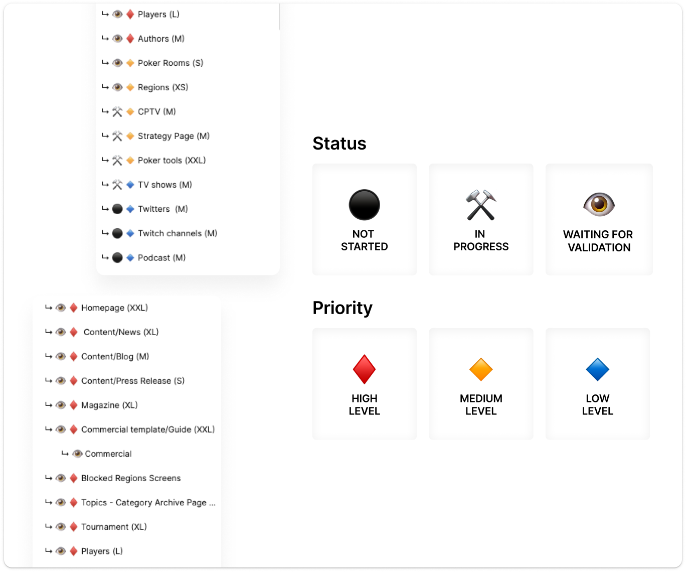
1. Established scope clarity and prioritization
📔 Context
The redesign started with a broad “redesign everything” ambition, but the team had no established method to manage a redesign at this scope (no roadmap, no definition of done, no sequencing).
🚨 Problem
💊 Solution
2. Etablished a desktop first strategy
📔 Context

At project start, the site wasn’t responsive and analytics showed desktop as the primary traffic driver. The business needed the highest-impact surface stabilized first.
🚨 Problem
💊 Solution
Outcome: desktop-first became a data-driven sequencing decision, not a design preference, and reduced parity drift risk later.
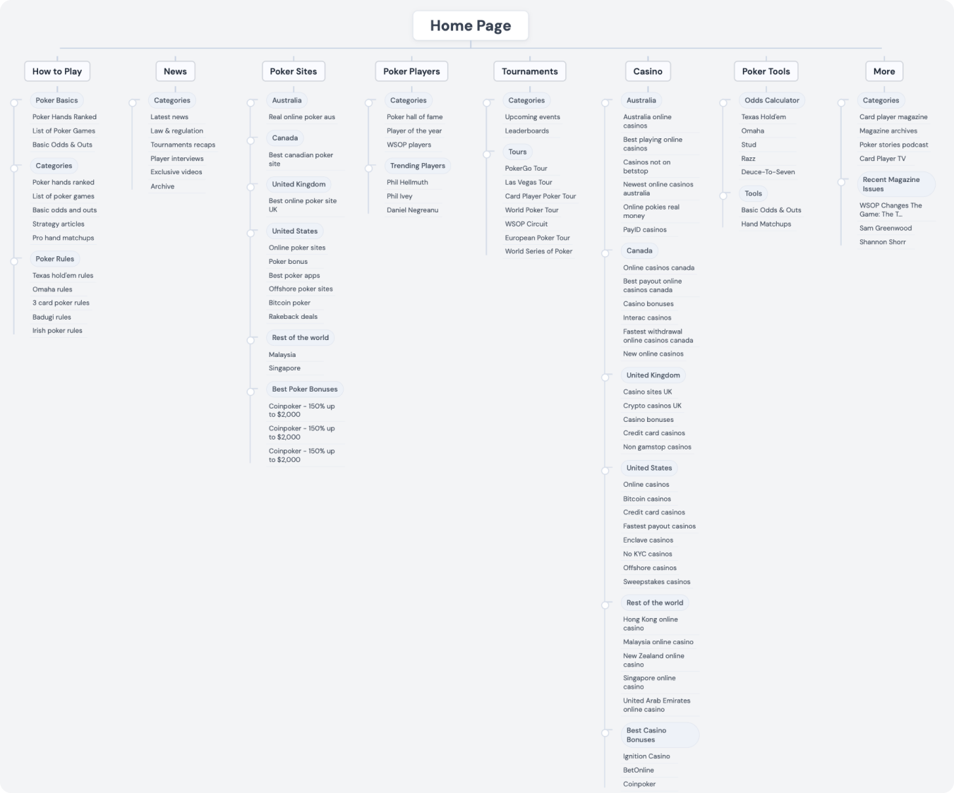
3. Reworked global navigation and content categorization
📔 Context
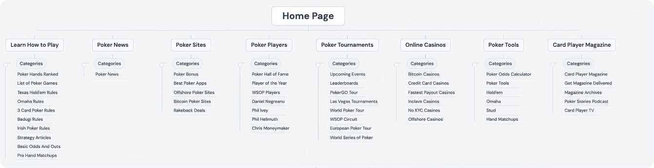
The existing navigation was built from legacy growth, with overlapping categories and unclear content grouping. For an SEO and affiliate media product, navigation is a growth surface: it drives discovery, internal linking, and revenue routing.
🚨 Problem
💊 Solution
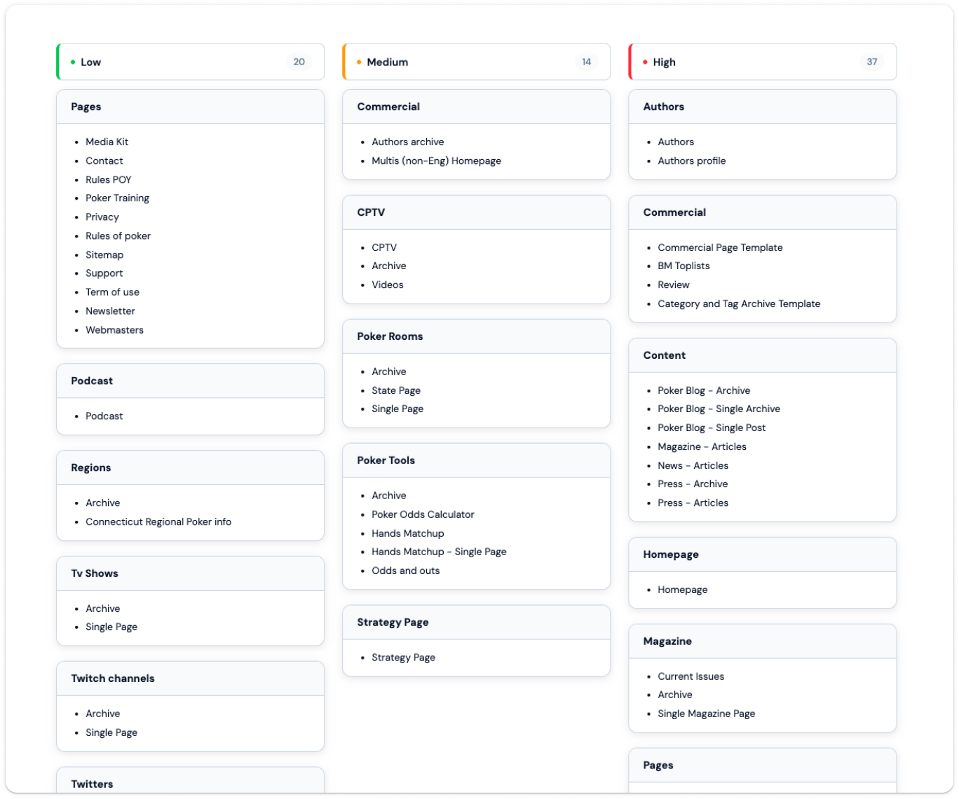
4. Defined unique vs secondary templates
📔 Context
Over time, CardPlayer added new “templates” in a fast-paced environment to ship quickly. Many of these pages were not truly unique products: they were small variations of an existing intent, created without a global view of the ecosystem.
🚨 Problem
💊 Solution
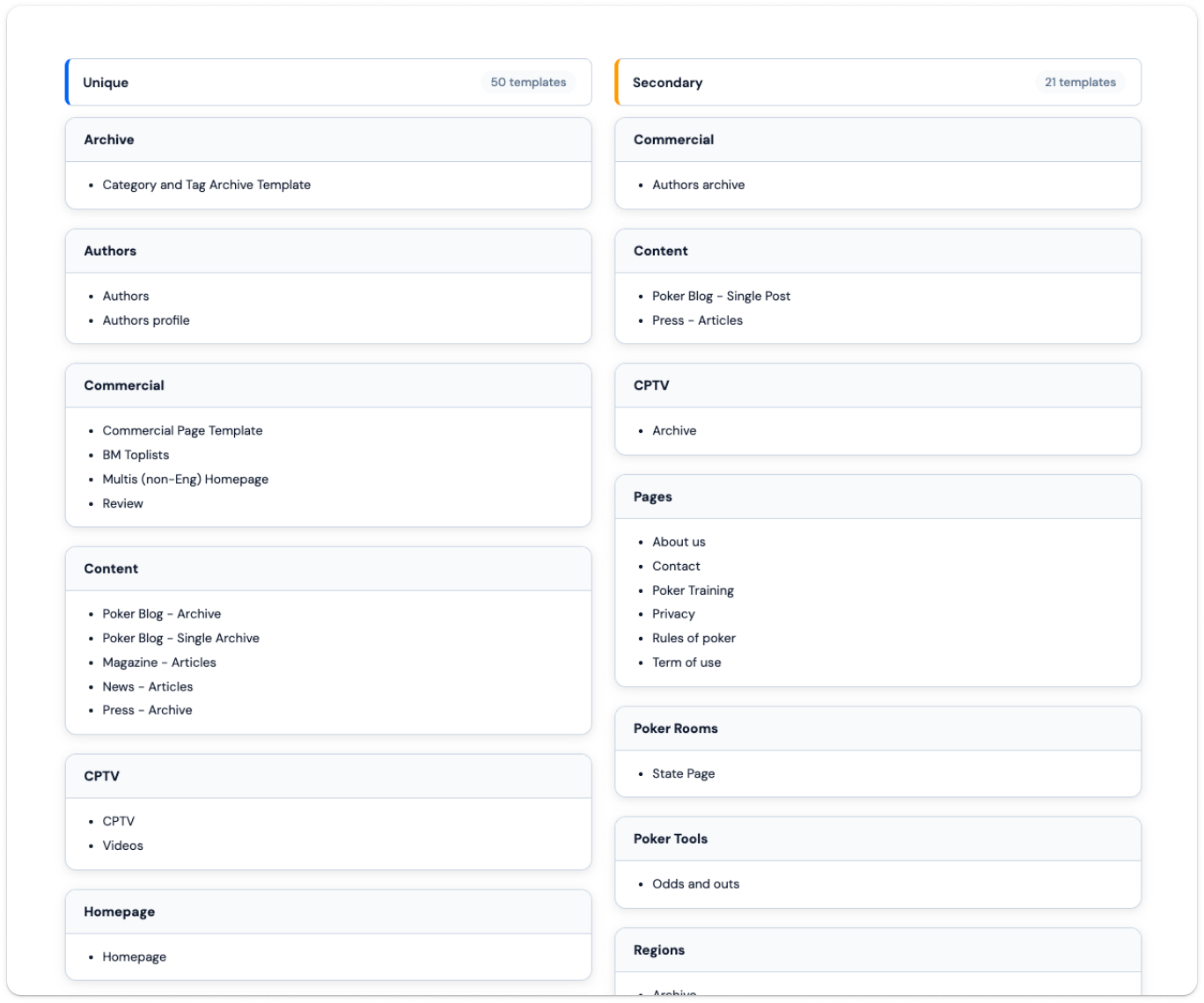
Outcome: the redesign shifted from “support every legacy template” to “support a smaller canonical system with governed variations”.
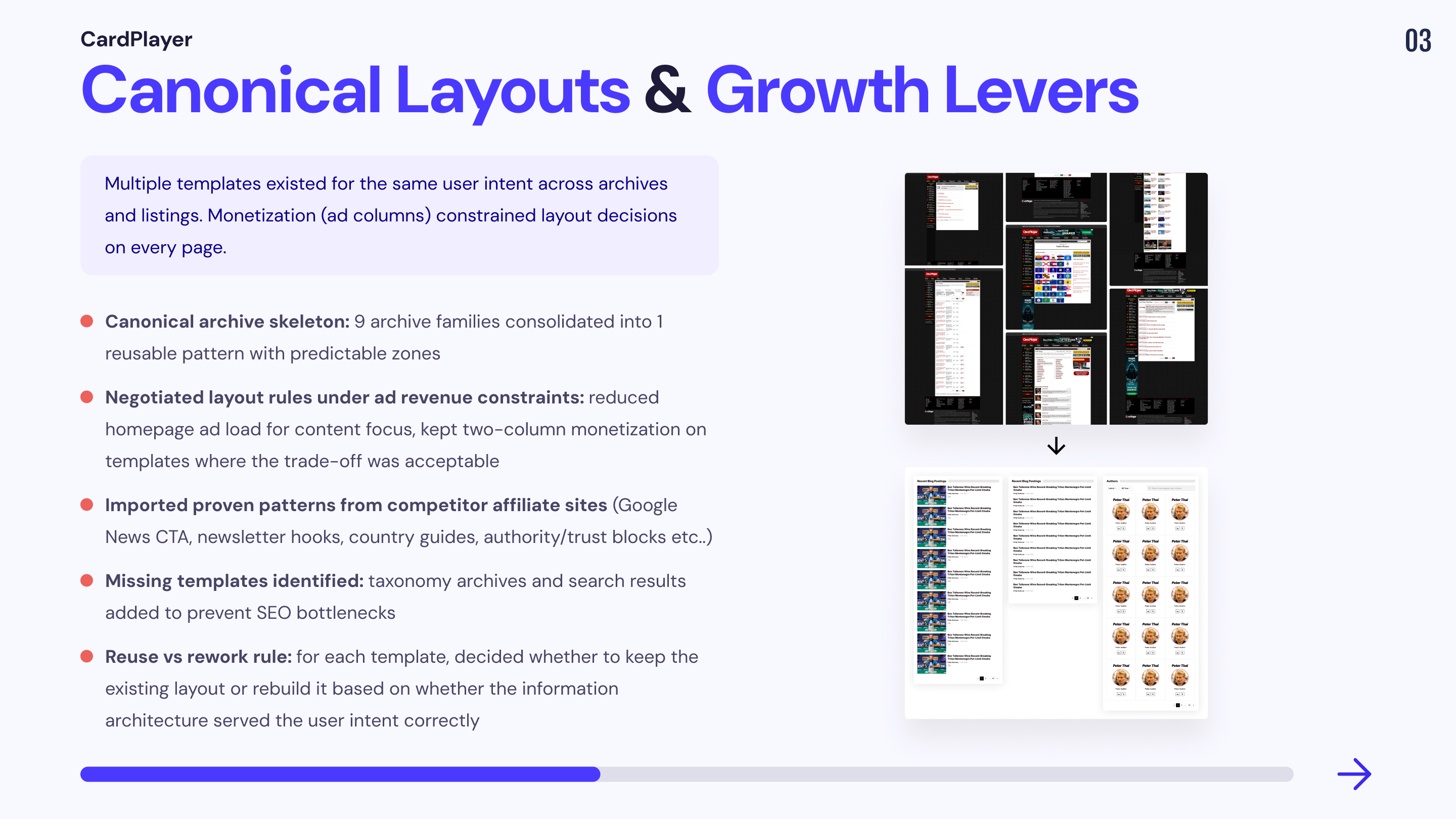
Mission 2: Canonical layouts and growth levers under monetization constraints
Multiple templates existed for the same user intent across archives and listings, fragmenting UX and multiplying maintenance cost. The goal was to modernize by defaulting to reuse, and reserving rework for cases where IA or navigation hierarchy was objectively inconsistent.
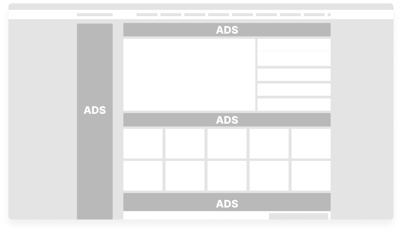
1.Layour Rework : Negotiated monetization constraints without degrading UX
📔 Context

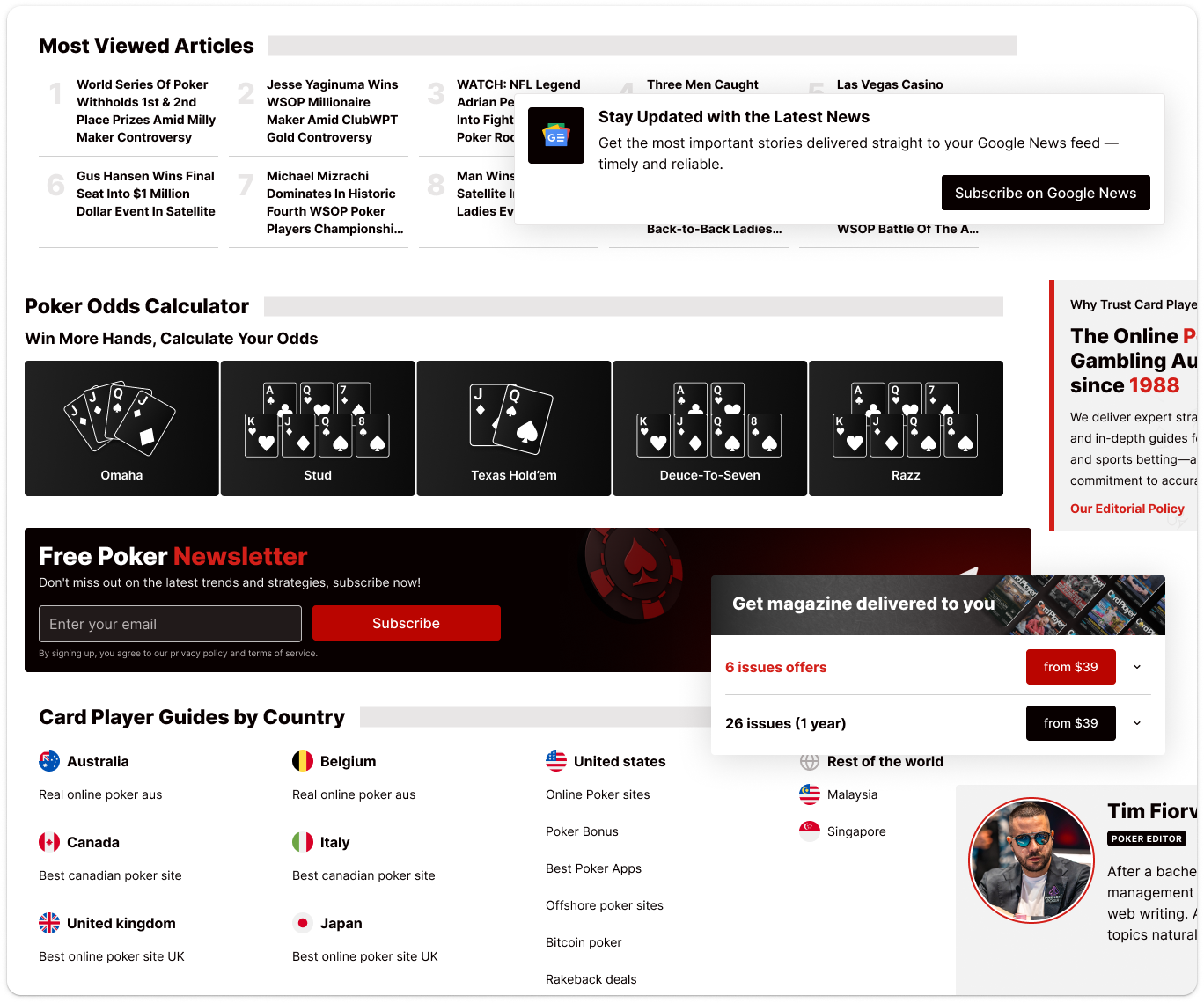
A major constraint was monetization: ad columns were a core revenue model. But the homepage also needed to perform as a credibility and discovery surface, not just an ad frame.
🚨 Problem
💊 Solution
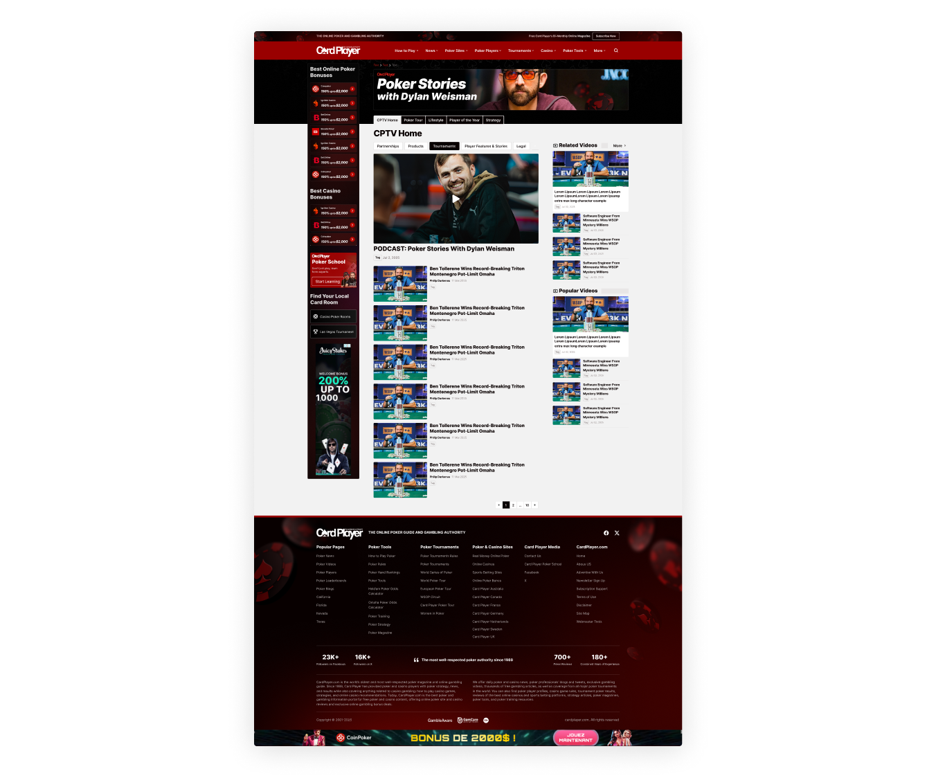
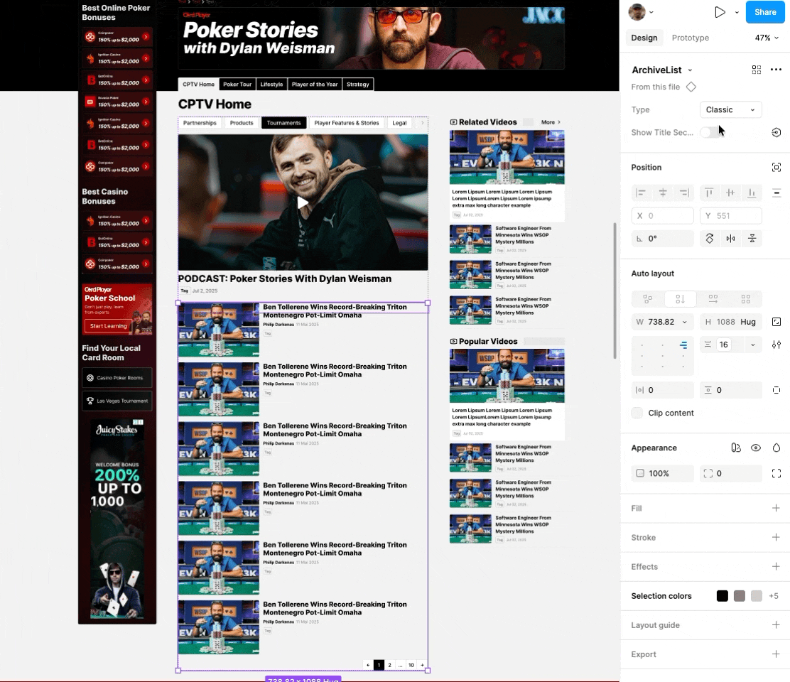
2. Canonical archive/listing system (reduce template sprawl)
📔 Context
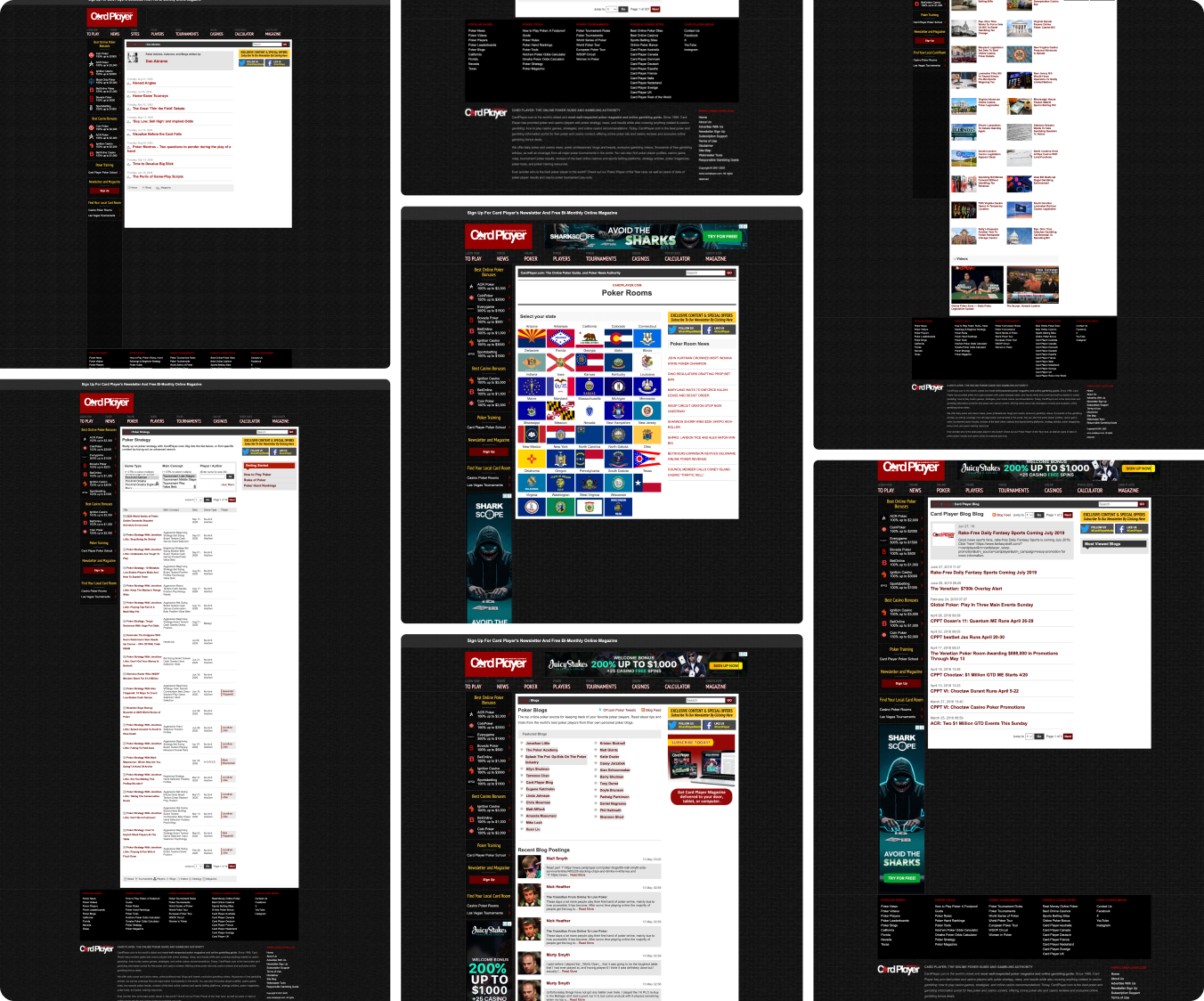
Archive/list templates represent the largest repeated surface area on SEO-driven media sites and drive a major share of traffic entry points and internal recirculation.
🚨 Problem
💊 Solution
Standardized a canonical archive/list skeleton with predictable zones:
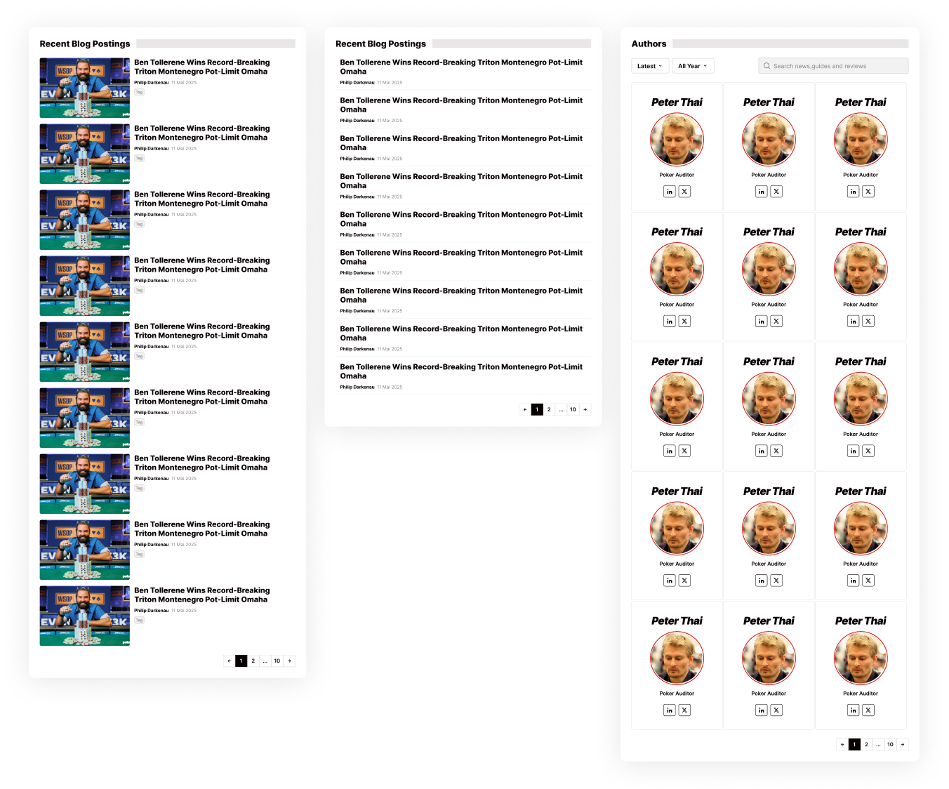
3. Growth opportunities: importing proven affiliate patterns
📔 Context
CardPlayer’s redesign wasn’t only about fixing inconsistencies. It needed to compete with modern affiliate poker ecosystems and maximize conversion surfaces already proven across competitor and sister sites.
🚨 Problem
💊 Solution
Imported proven patterns from competitor affiliate sites like:
Mission 3: Rework key templates to reduce variations and page count
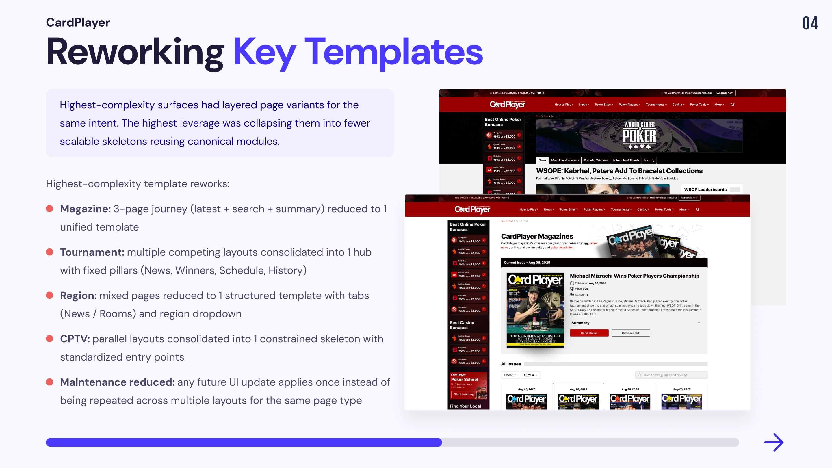
After defining canonical vs secondary templates in Mission 2, it became clear that some “unique” templates were generating disproportionate complexity: layered page variants existed to deliver the same intent, mostly due to legacy fast shipping and lack of global governance. These were not good candidates for controlled variation. The highest leverage move was to rework them into fewer, scalable skeletons, while reusing canonical modules wherever possible. The objective was to reduce template count, collapse variation layers, and improve discoverability and conversion pathways without relying on cosmetic changes.
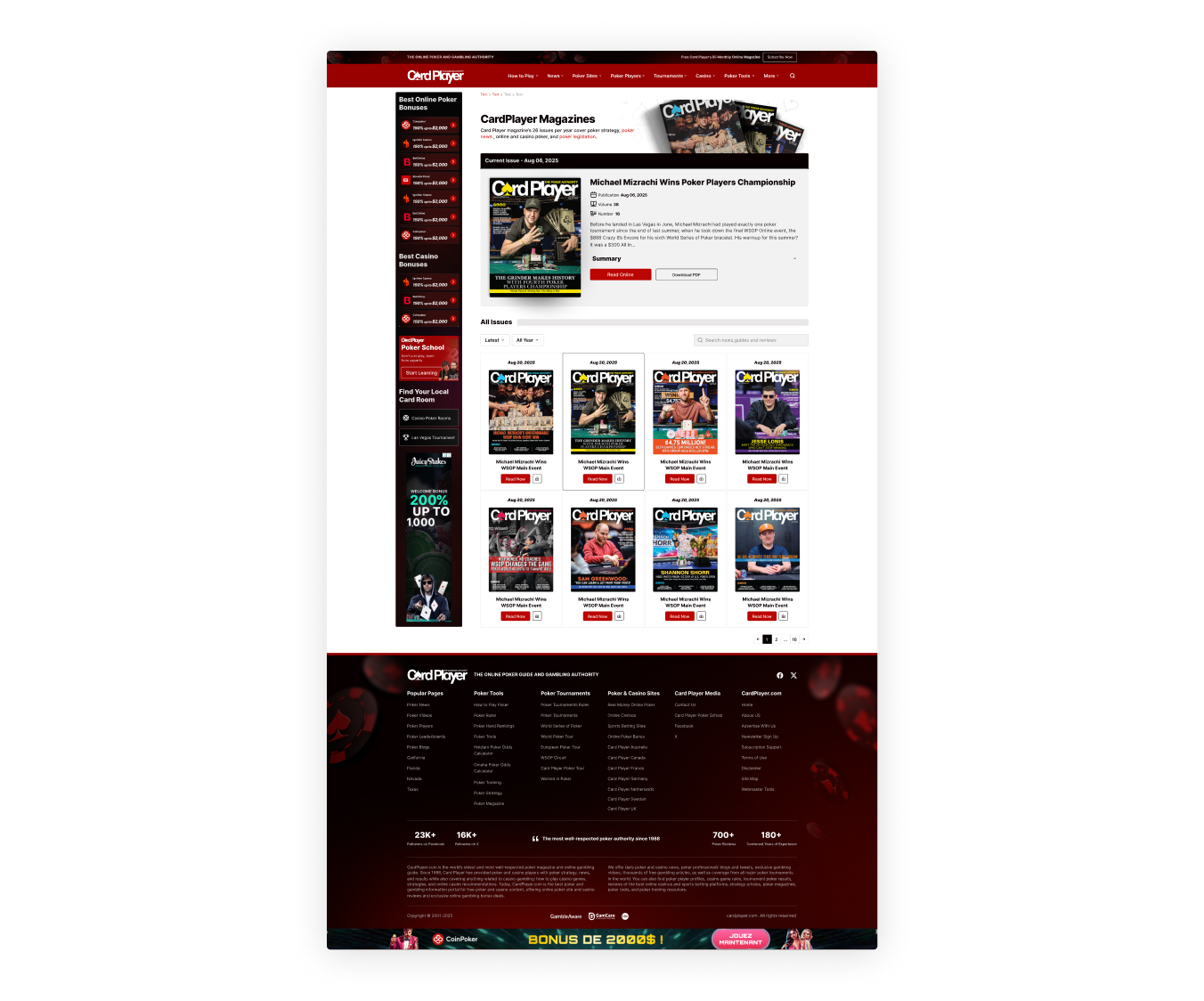
1. Magazine template rework
📔 Context
CardPlayer’s magazine experience supports a single user journey: discover issues, find a specific issue, then select it to view a summary (chapters) before reading online or downloading the PDF. The paid conversion lever is print delivery subscription, so the flow needs to be smooth and credibility-driven.
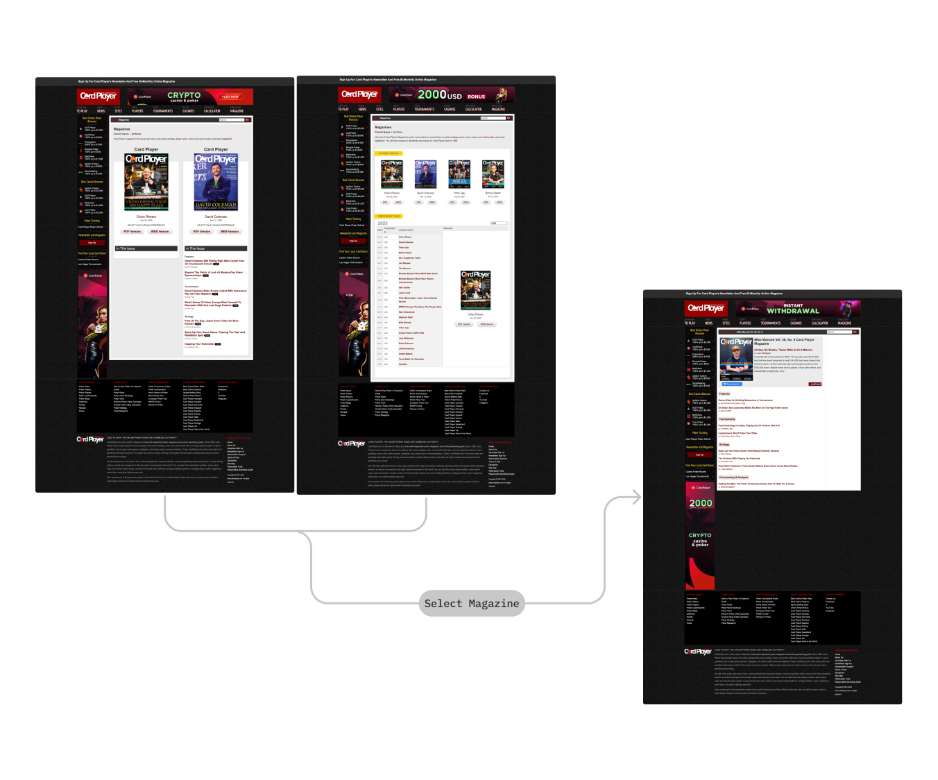
ℹ️ Latest issues and issue search lived in separate templates, with a third page for issue summary.
🚨 Problem
💊 Solution
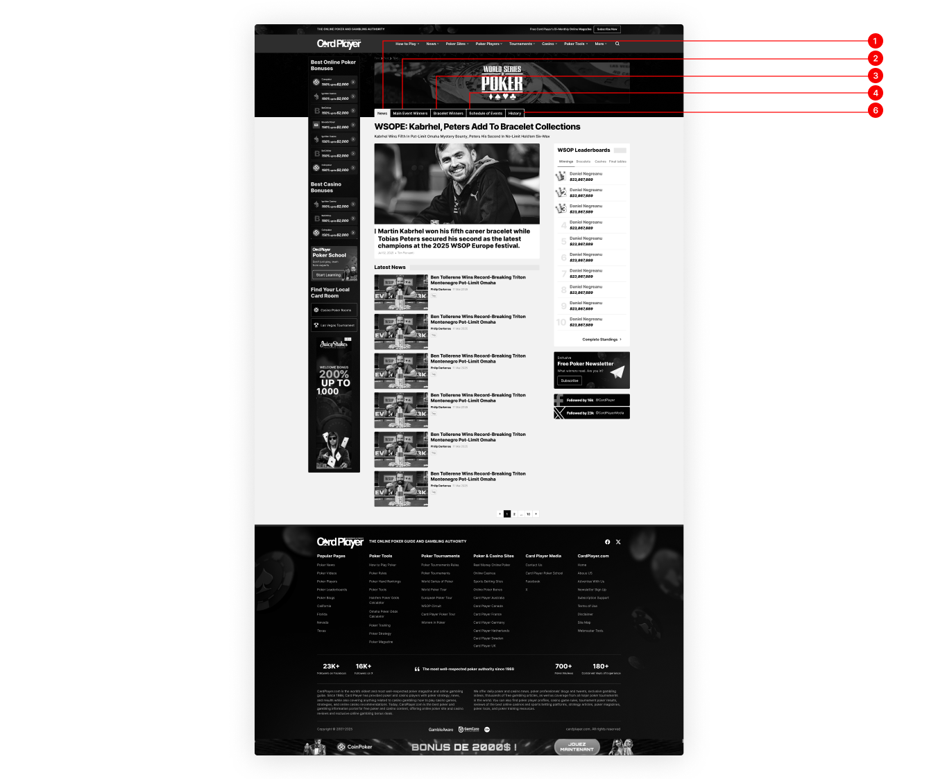
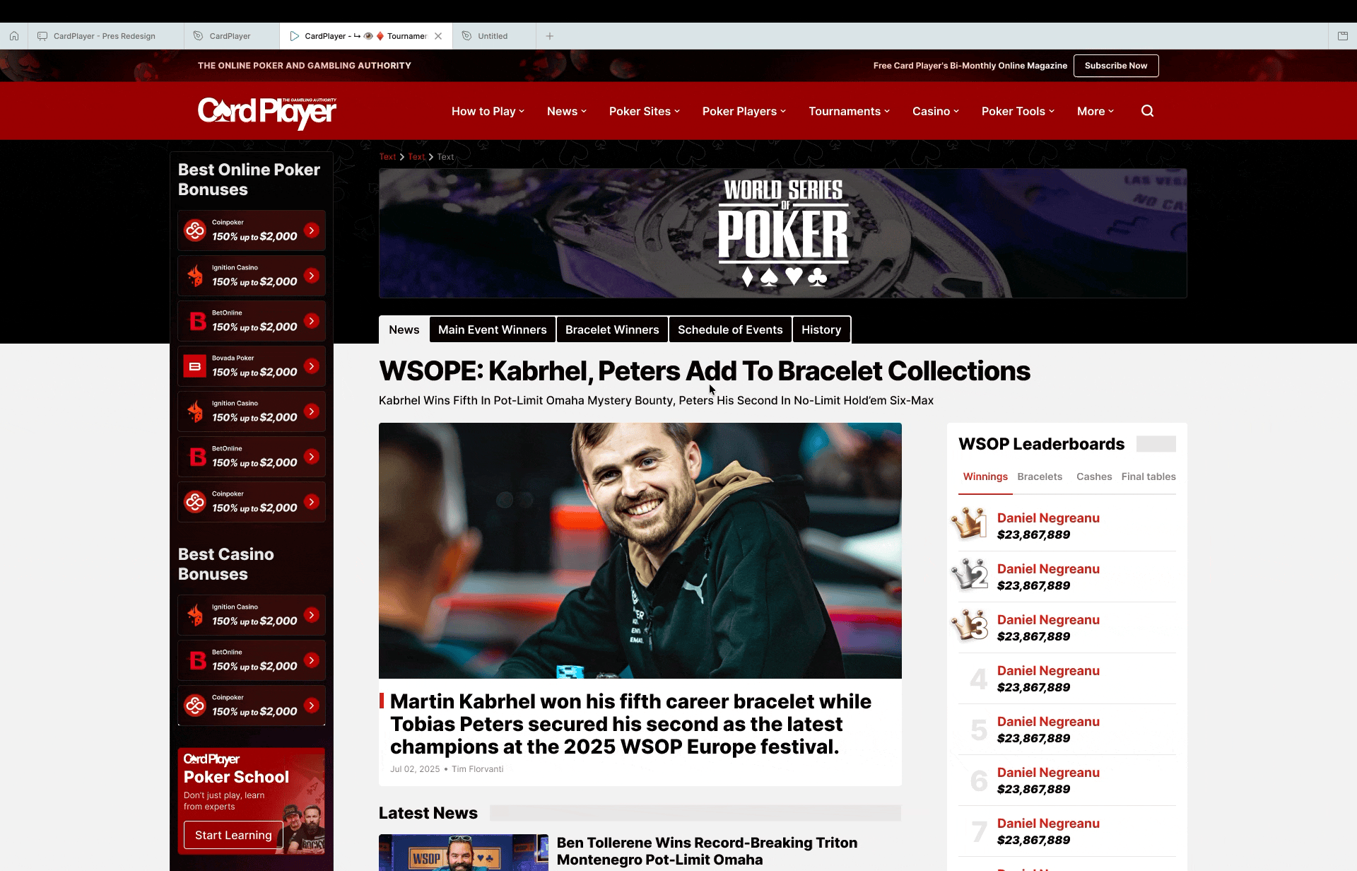
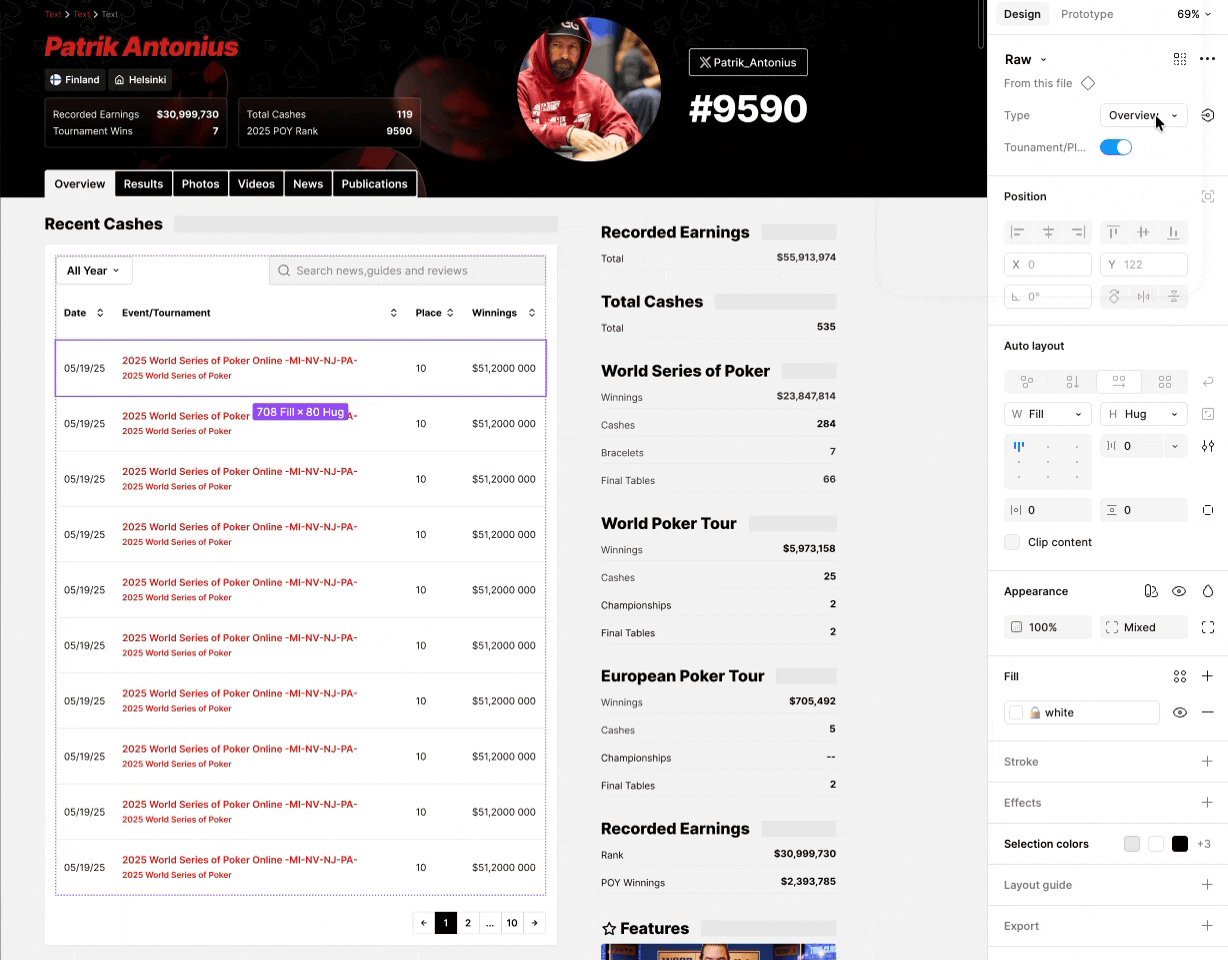
2. Tournament template rework
📔 Context
Tournament content is high-intent and information-dense. Legacy implementation tended to split behaviors across multiple layouts and variants.
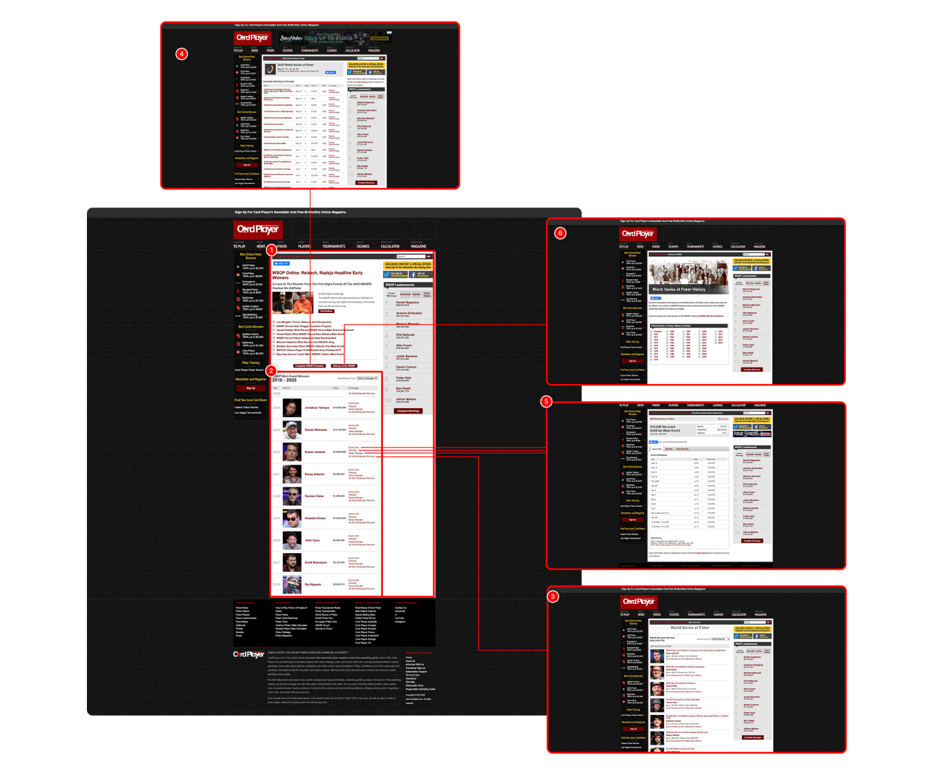
ℹ️ Tournament content was fragmented across multiple page types and navigation paths (news, winners, schedules, history), forcing users to bounce between templates to understand one event
🚨 Problem
💊 Solution
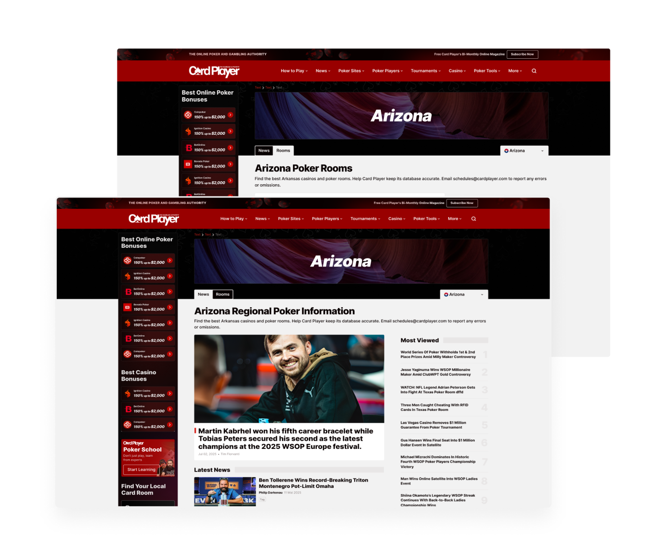
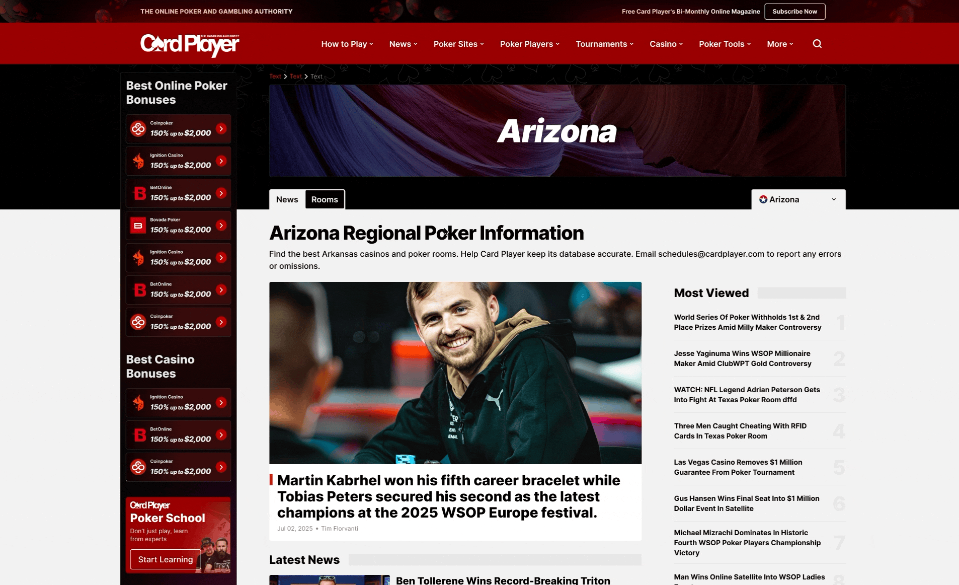
3. Region template rework
📔 Context
Region browsing is a high-intent entry point (local poker rooms + regional news). The legacy implementation mixed content types and didn’t reuse a canonical listing patterns, creating inconsistency and poor discoverability.
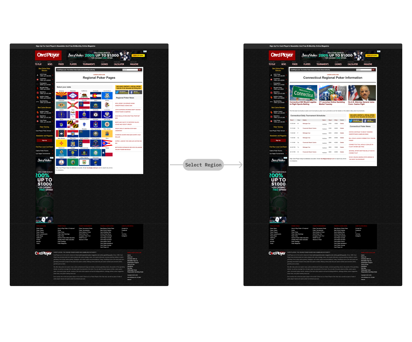
🚨 Problem
💊 Solution
4. CPTV template consolidation rework
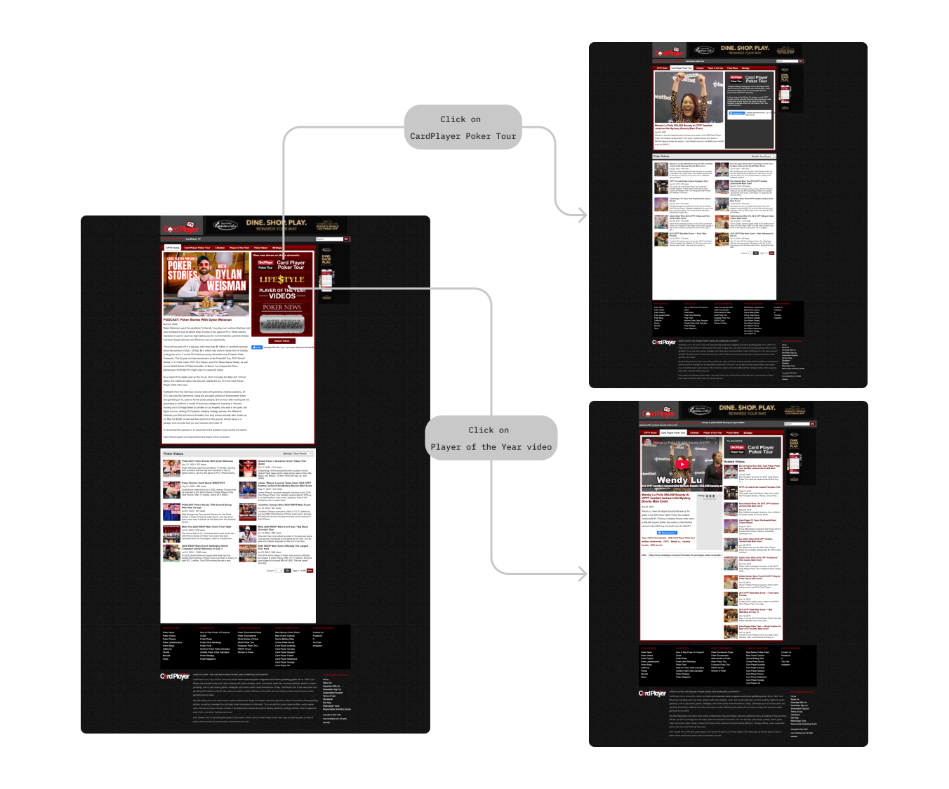
📔 Context
CPTV existed through several separate layouts, fragmenting the experience and creating a high maintenance surface.
🚨 Problem
💊 Solution
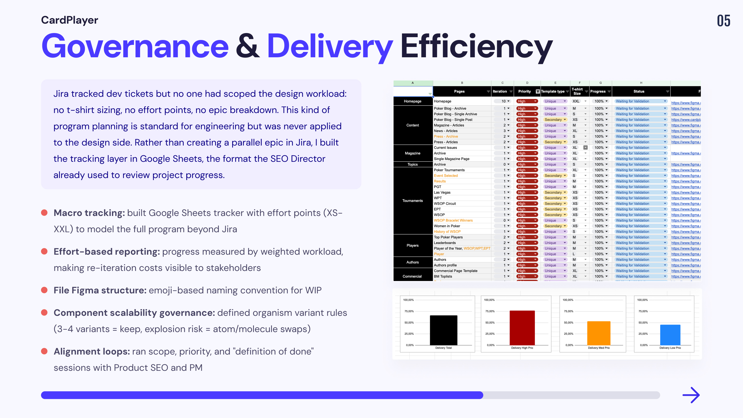
Mission 4: Governance, delivery efficiency, and stakeholder visibility
As the redesign progressed, the main risk shifted from design quality to execution: misalignment between Product SEO, PM, and Design on what “done” meant and what should ship first, plus a lack of shared visibility on WIP. The team was not operating with a redesign program mindset, so decisions drifted and progress was hard to communicate.
In parallel, the Figma environment created delivery friction: the legacy and new versions were mixed in the same file, which polluted the workspace and made it hard to isolate the redesign the way I normally do. Branching was not adopted as a standard workflow, so I had to drive governance, protect handoff clarity, and prevent future rework.
Finally, system scalability became a senior-level constraint: at CardPlayer scale, component and organism design can explode into variants and slow down the entire file if not managed with explicit rules.
1.Built macro governance on top of Jira
📔 Context
Jira tracked micro delivery (tickets, status, assignees), but the redesign was a program: stakeholders needed a macro view of scope, priorities, dependencies, and remaining work across multiples templates.
🚨 Problem
💊 Solution
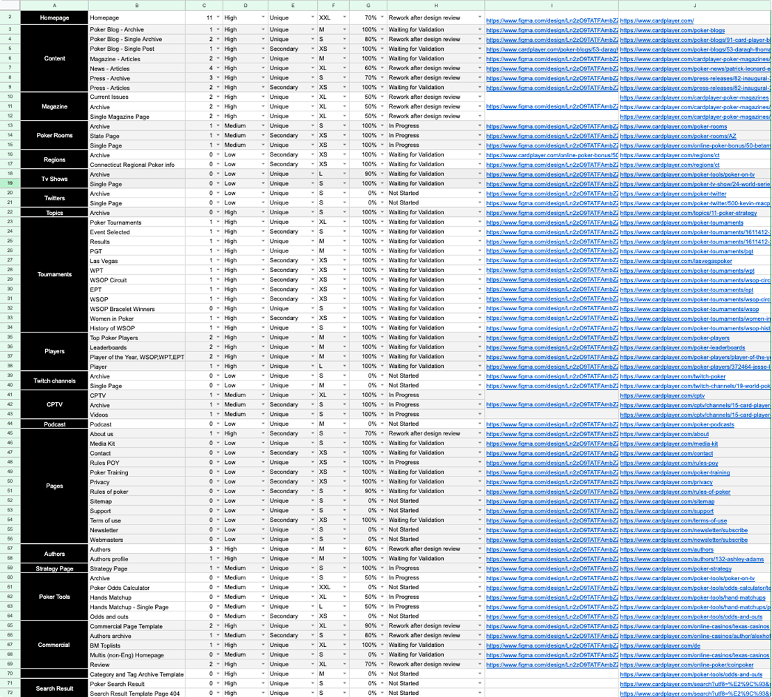
ℹ️ Google Sheets tracking tool that I created to communicate about my work in progress. You can access the template 👉 here
2.File Structure & Naming Convention
📔 Context
When I joined, the Figma file contained the live production design system and screens. I couldn’t delete or refactor legacy styles/variables because the team still needed to ship production updates in parallel (ex: A/B tests on toplists). On top of that, the company plan didn’t allow Figma branching, so I couldn’t isolate the redesign in a clean branch the way I normally do. As stakeholders were reviewing the file directly, the lack of structure created constant confusion about what was production, what was validated for the redesign, and what was still WIP.
🚨 Problem
💊 Solution
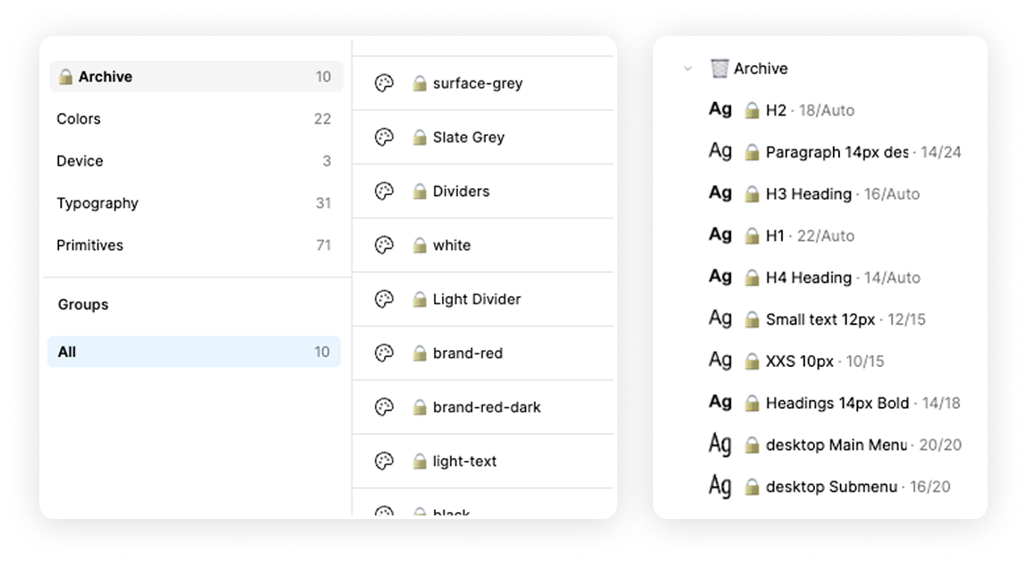
Solution
3.Components & Memory Usage Optimisation
📔 Context
At CardPlayer scale, the risk isn’t “missing components”, it’s overbuilding organisms. Too many heavy organism variants make the file slow, hard to maintain, and difficult for another designer to take over. The goal was to keep the system reusable while keeping Figma performance and handover clarity high.
🚨 Problem
💊 Solution
Keeping Organism variants under control
If 3–4 variants cover the need: keep controlled organism variants (file stays manageable)
Atomic & Molecular level optimisation
If variants would explode: build one master organism and generate variations by swapping molecules/atoms directly in context (“one master to rule them all”)
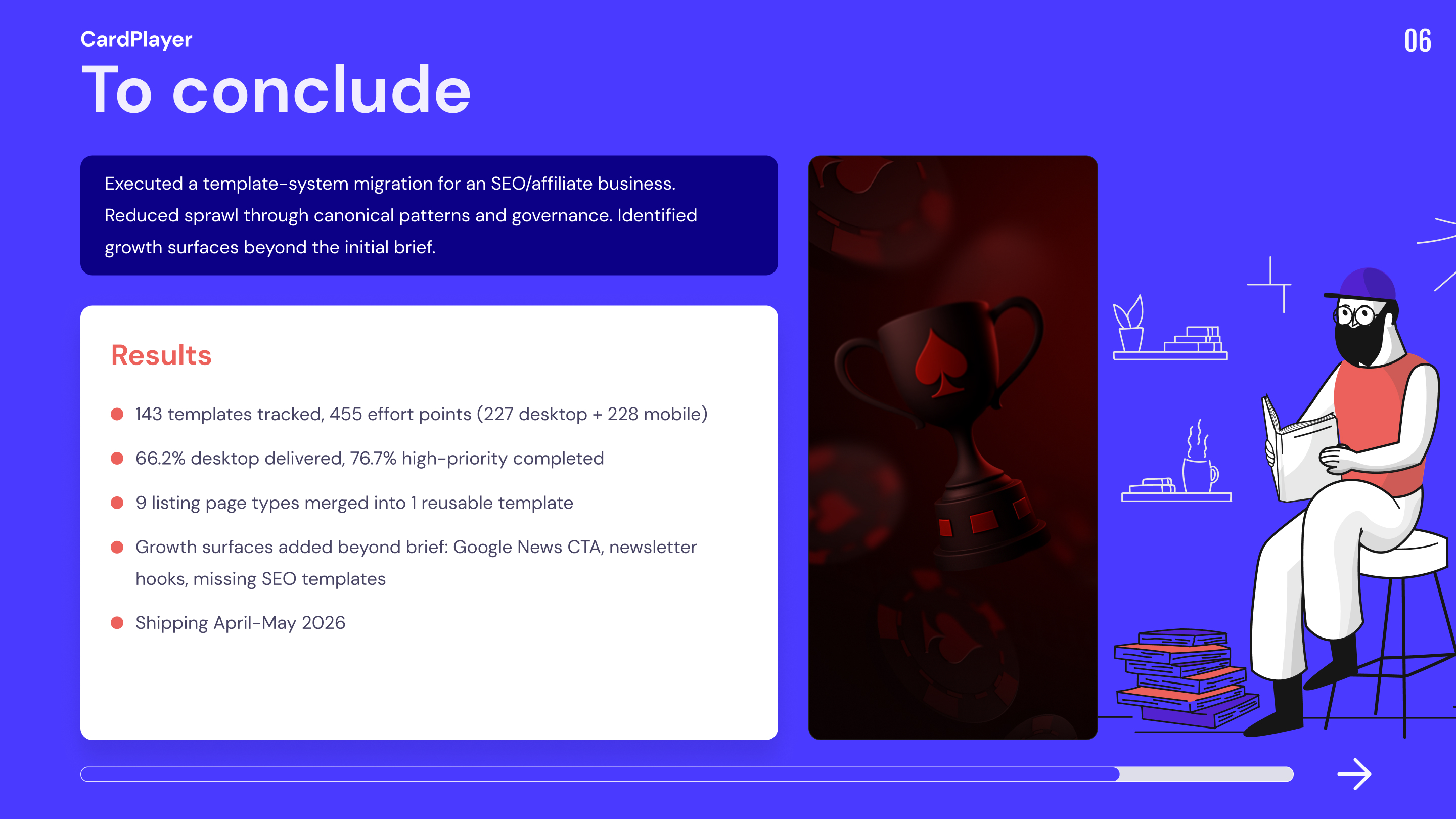
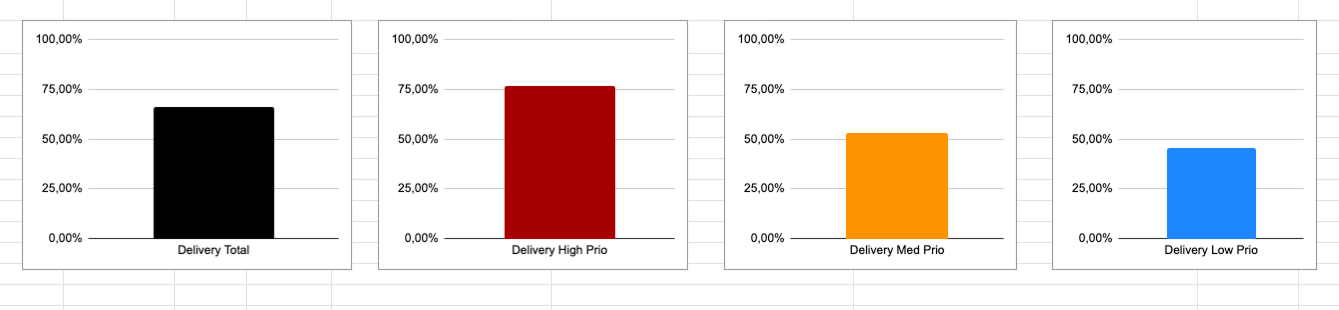
Key Result
Outcomes
Process constraints