🛂 Phygital Field Research
Idemia
Three of the studies I ran there were never written up, and they have the same shape: a land border post, an airport gate, and a speed camera operated from a gendarmerie car. In all three, the person using the product is outside, in a queue or on a roadside, and nobody can ask for help. The step that breaks is physical, not graphic. That is why none of them could be tested on a screen.
13 months, September 2020 to October 2021
UX Designer inside R&D, next to the engineers and the hardware lab
3 field studies, from storyboard to full-scale test
Find out where each product loses the person using it, before it is deployed to people who get one attempt and no help.
The method: rebuild the thing at full scale
Rather than show a prototype and ask people what they thought, we rebuilt the product at full scale and let people fail on it.
For the airport gate, we reproduced a working turnstile inside the engineers' lab, so the tests ran with the hardware and the screen together: the step where a traveller stops being guided is almost always a physical one.
For the border post, we marked out a car park and ran the whole crossing with recruited panels and a stopwatch.
For the speed camera, there was nothing to rebuild. The product already lives in the boot of a car, so I got in the car.
This is the part of the method I kept everywhere since, including on products with no hardware at all: what a person says about a flow and what they do on the real thing are two different research results, and only the second one is evidence.
Land border: twenty minutes per vehicle, brought down to ten
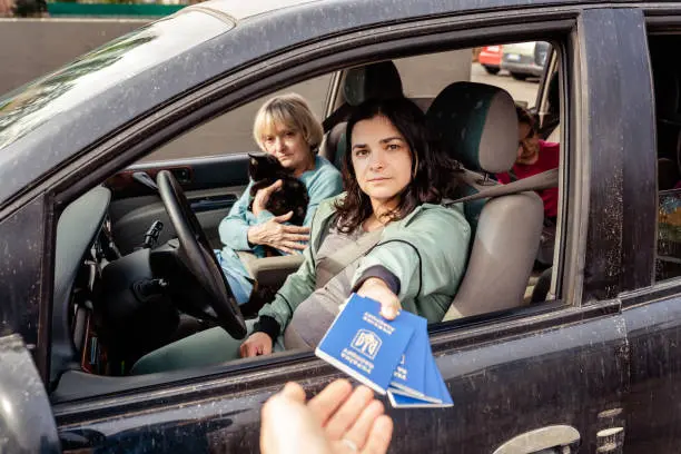
The European entry and exit system changed the rules at every border post. On top of showing a passport, every traveller now has to register their face and their fingerprints, at a post that was already saturated. The question was not how to design a screen. It was whether the crossing could absorb the new step at all.
I had a blank page: storyboards, then scenarios that treated hardware and software as one object. What came out was a portable terminal taken to the vehicle, which guides each passenger in turn without anyone stepping out of the car.
We proved it full scale, on a marked-out car park, with recruited panels and a stopwatch.
The decision that produced that number was to start from the traveller's journey rather than from the technology, and then to go and measure it rather than argue it.
Airport gate: guiding someone who will never read an instruction
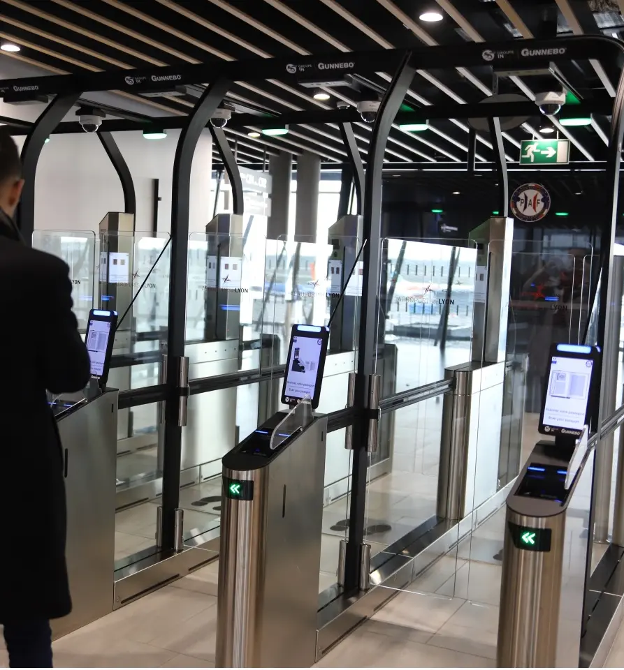
The traveller scans their passport, then a camera compares their face to the photo stored in the chip. The principle behind the gates already installed in the Paris airports.
I audited the existing gate first, then we rebuilt one at full scale in the lab to run user tests in workshop conditions.
What that setup showed is how much of the guidance is physical. Where somebody stands, where they look, whether they realise the machine is waiting for them: a screen alone cannot carry that, and a screen tested alone cannot reveal it.
Mobile speed camera: riding with the gendarmes
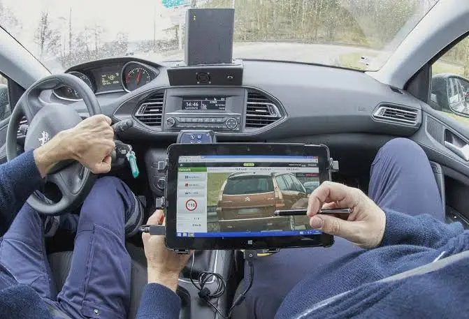
A camera that lives in the boot of a car, with a case, cables to connect, and a tablet interface.
I rode along with gendarmes during real checks. Shadowing is the only way to see what the product actually costs: the install before the shift, the cables, the moment the tablet is held in one hand while something else happens.
I came back with a field user journey, a list of usability problems ranked by what they cost in the moment, recommendations for the existing solution, and innovation leads for the next one.
This is the study that taught me the difference between a user who is a customer and a user who is on duty. A gendarme will not abandon a bad tool. They will work around it, every shift, and the workaround becomes invisible to everyone except the person paying for it.
What the 3 have in common
A finding on a screen is not a finding. The step that breaks is almost never the one the mock-up shows. It is a hand in the wrong place, a machine that looks idle while it is working, a cable to connect before the shift starts. None of these three produced its result until the thing being tested was the real one, at full scale.
Measure the journey, not the interface. The border result is a number of minutes per vehicle, not a satisfaction score. It is the only unit the people who commissioned the study could act on, and it is the one that survived the meeting.
Go where the product is used. Three different places, three different publics, and in each case the finding came from standing there rather than from asking afterwards.
Key Results
An airport gate audited and then rebuilt at full scale in the lab, so the guidance could be tested with the hardware and the screen together rather than on a prototype. A field journey of the mobile speed camera, brought back from real roadside checks, with usability problems ranked by what they cost in the moment and innovation leads for the next generation.
Outcomes
These three are the field half of thirteen months at Idemia. The other four studies, the access terminal, the program dashboard, FCODE and MBIS, have their own case studies.
What I kept from them is a rule the hardware lab made obvious. Rebuild the thing at full scale, then watch somebody fail on it. The failure is almost never on the screen.
Constraints
R&D means prototypes that are still open to change, and clients who are states, police forces and airports. Some of this work cannot be shown, which is why the only thing drawn here is the measurement, and not a single screen.
The other constraint was time. The UX team billed its work to the project teams that called it in, so a study ran for weeks, not quarters, and a second round of tests had to be argued for rather than assumed.