🚜 Loxam - Mobile App Design
Loxam
1.5 month
2 Squad Masters, 1 Stratégy Expert, 2 Prd, 1 Business Expert
Mobile
App
1 MOA, 1 Digital and Marketing Director, 1 Digital Customer Experience Manager, 1 UI
Build a user-centric e-commerce application for the B2B sector
Mission 1 : Understand
Project planning
- Kick Off
- Recruitment of 18 to 24 users for the tests
- Preparation of user tests
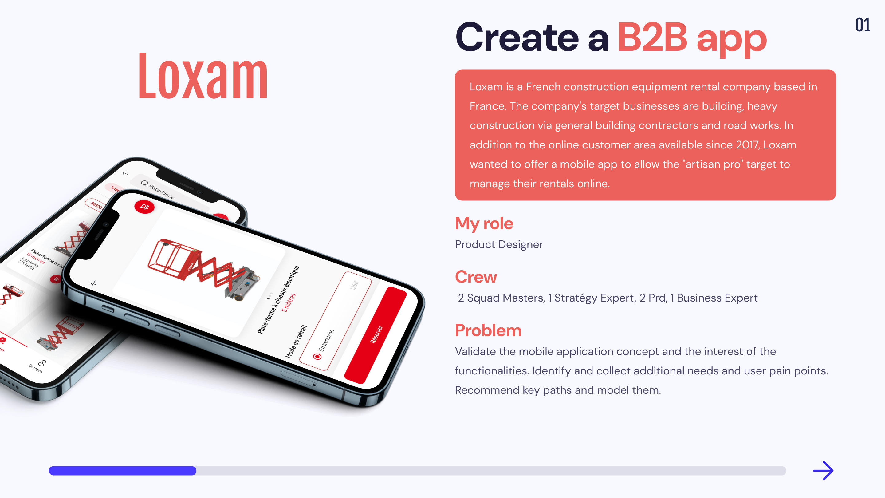
- Realization of the mock-ups
📦 Expected deliverables: 18 to 24 testers, maintenance guide, mock-ups, design system
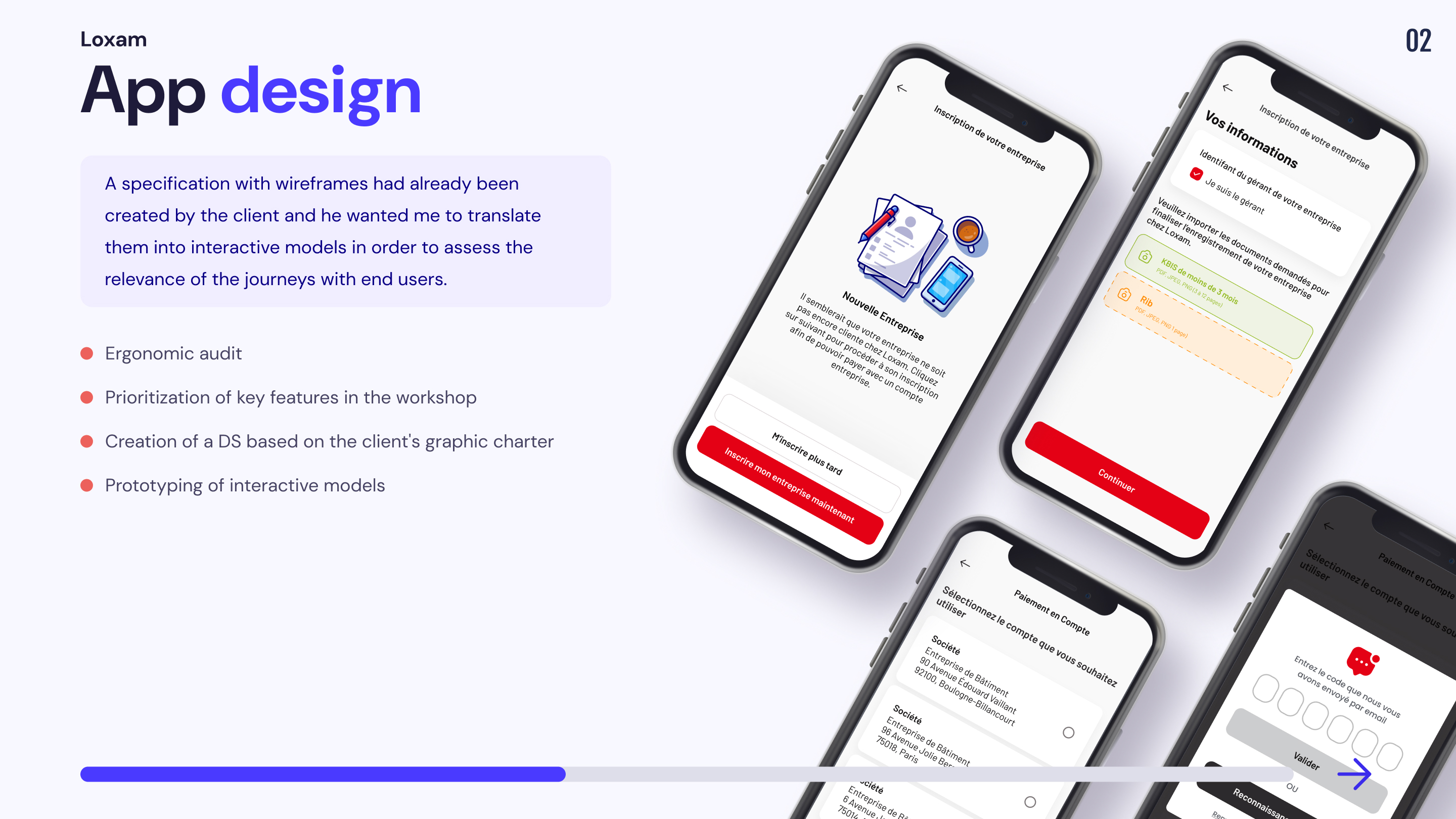
- RITE test (test & modification of models)
- Analysis & Recommendations
📦 Expected deliverables: Synthesis & Recommendation ppt, mock-ups, design system
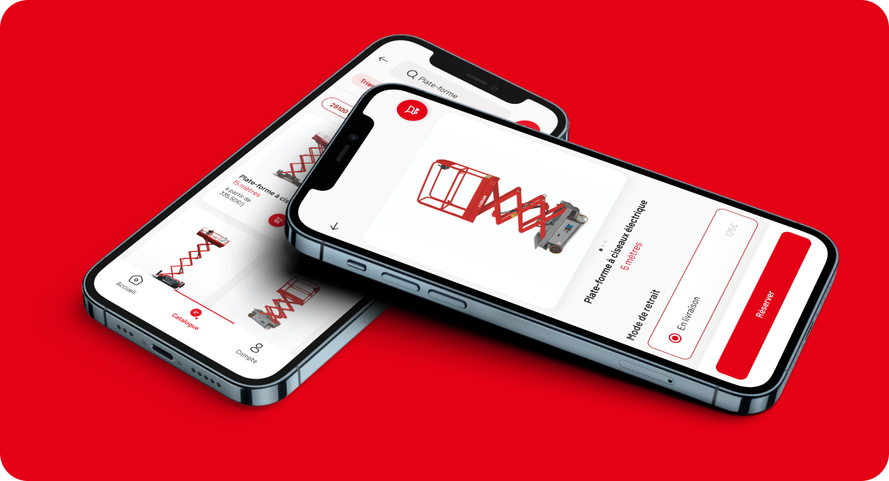
- Operating features (booking)
- A dashboard providing a clear and global vision (Manage your contracts and rental machines)
- A conversational platform (Interact with the agency)
I first conducted an ergonomic audit of the interfaces and an analysis of the existing user path.
Userflow
Map the different paths of the solution by associating the different corresponding screens.
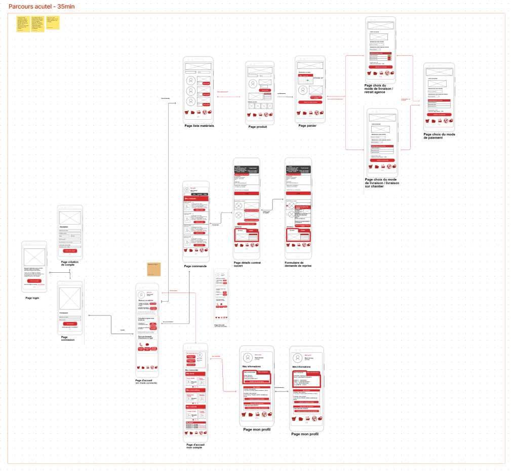
1. Several paths mentioned in the specifications did not appear in the wireframes delivered
2. Several features were confusing
3. Many inconsistencies were present in the sequence of paths
Mission 2: Prioritize key features
We prioritized together the features that should appear in v1 of the application during a workshop with the client.
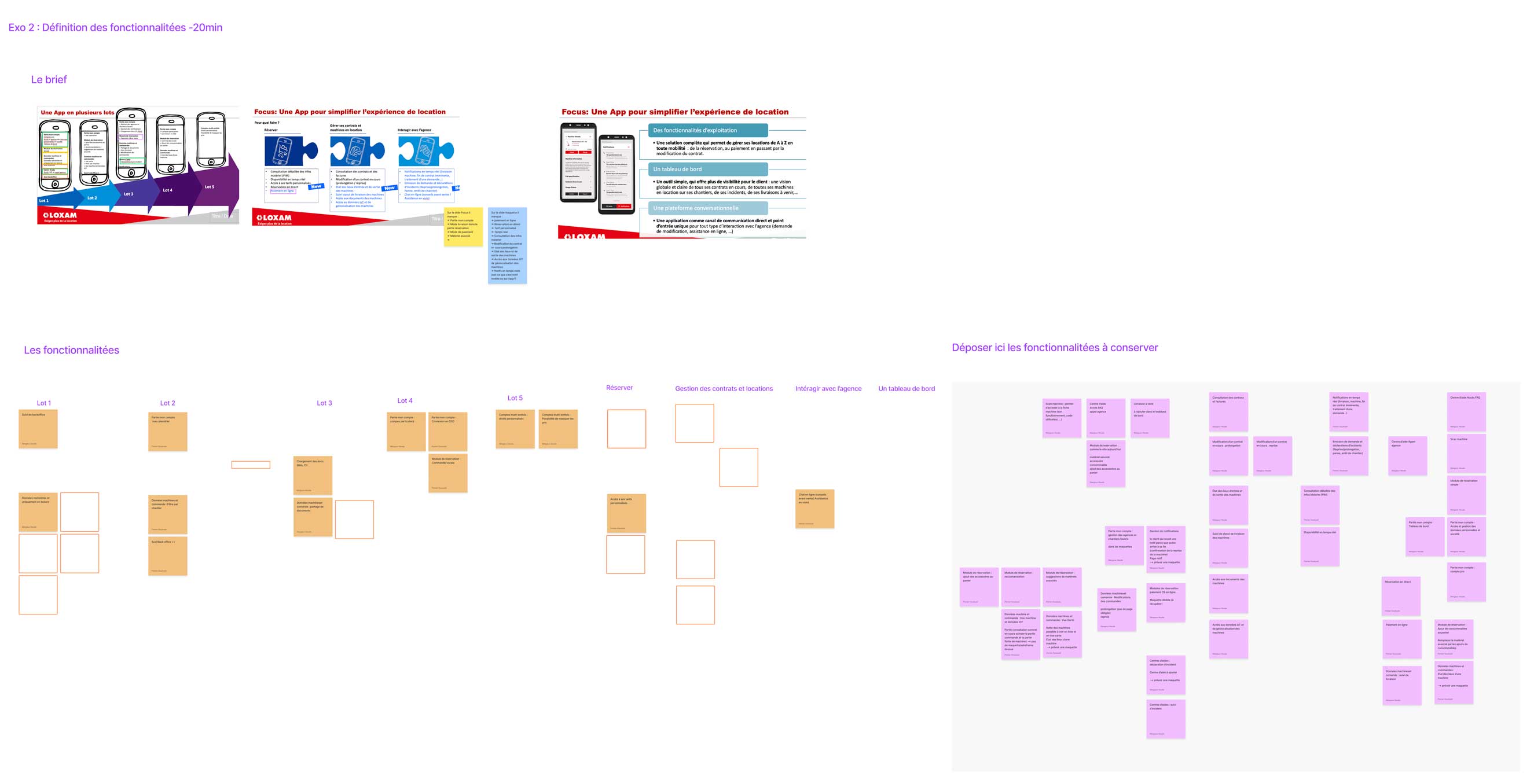
- The list of key features to keep or add
- An understanding of the various technical specifications of the product
- The definition of the different user journeys to be tested
- A list of wireframes to create or modify on the client side
Mission 3: Prototyping
Once all the paths were validated with the project manager, I was able to create a design system based on Loxam's graphic charter and to create interactive mock-ups using figma.
Mission 4 : Test
In order to meet loxam's objectives, I carried out test RITE during 1 week with different types of users. The tests were done remotely and in person depending on their availability. In order to evaluate the relevance of the solution we needed to evaluate it with users from the core target of Loxam.
These users are field employees (site manager, craftsman, manager) belonging to small and medium-sized companies with between 10 and 100 employees, used to placing orders, spread over various geographical areas. We also needed a variety of user profiles:
Test RITE
3 sessions of tests were conducted during 1 week with one test per day every 2 days. Each test lasted 45min. The non-test days were design days where I worked with another designer in support to revise and adapt the prototype based on the results. This means we had 3 design days to iterate and refine the prototype for this RITE study.
Mission 5 : Analysis
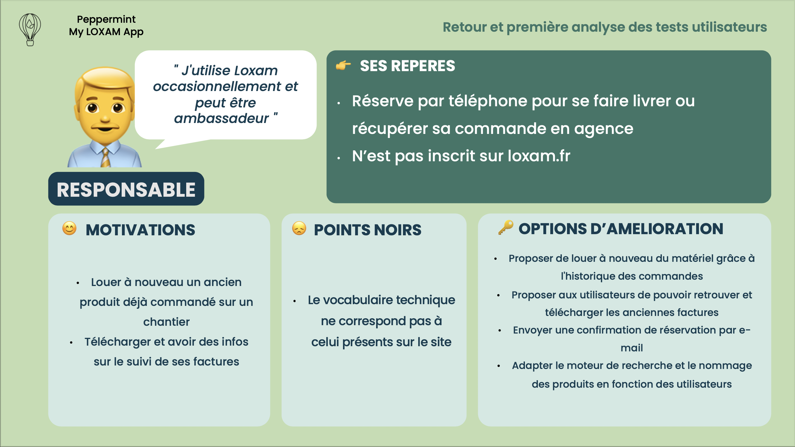
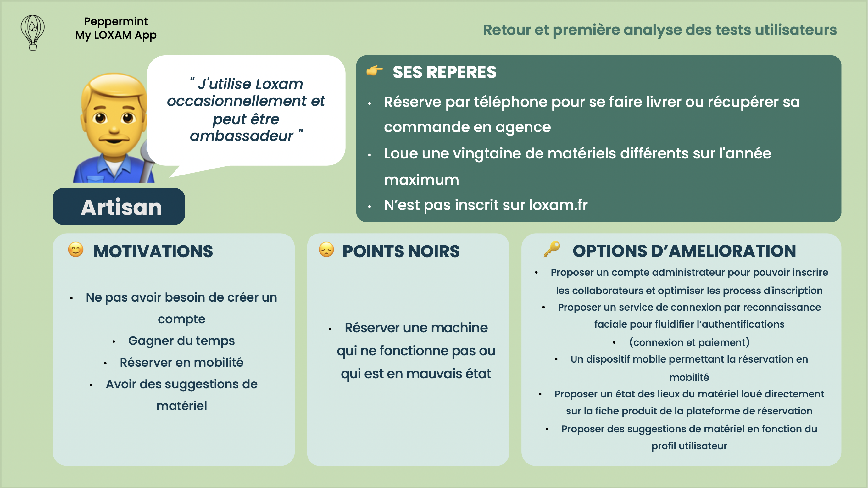
To carry out the analysis of the tests on Miro, I applied a tagging plan to identify the benchmarks, motivations, pain points and improvement options of each target. I presented the results obtained in the form of personae and at the same time proceeded to modify the models in order to stage the new paths.
Users personae
Definition of the personae according to the data collected during the test
- Validation and invalidation of test hypotheses
- Discovery of new features requested by users
- Prioritization of key paths
- Removal of paths and features that do not meet any need
Mission 6: Presentation of results
Potential users of the My LOXAM App are heterogeneous in terms of their appetite for using a mobile application, however, they all agreed that they were missing some services within their current journey.
I prioritized the various issues as follows :
Here you can consult the details of the synthesis
2 key paths solving user problems have been selected: Registration in 2 minutes and reservation in 45 seconds in mobile.
✍️ Registration in 2 minutes
📦 Booking in 45 seconds
- Reservation in mobility
- Reduce the number of contacts in the booking process
- Limit travel with 24/7 real time machine availability
- Save time on your reservation thanks to the possibility of re-renting an item already ordered
- Saves time in the 24/7 registration process
- Benefit from personalized product suggestions based on my profile
- Reduction in the number of telephone calls (reservations, inquiries about availability and status of machines)
- Time saving for sales teams thanks to autonomous prospect registration
Key Results
Outcomes
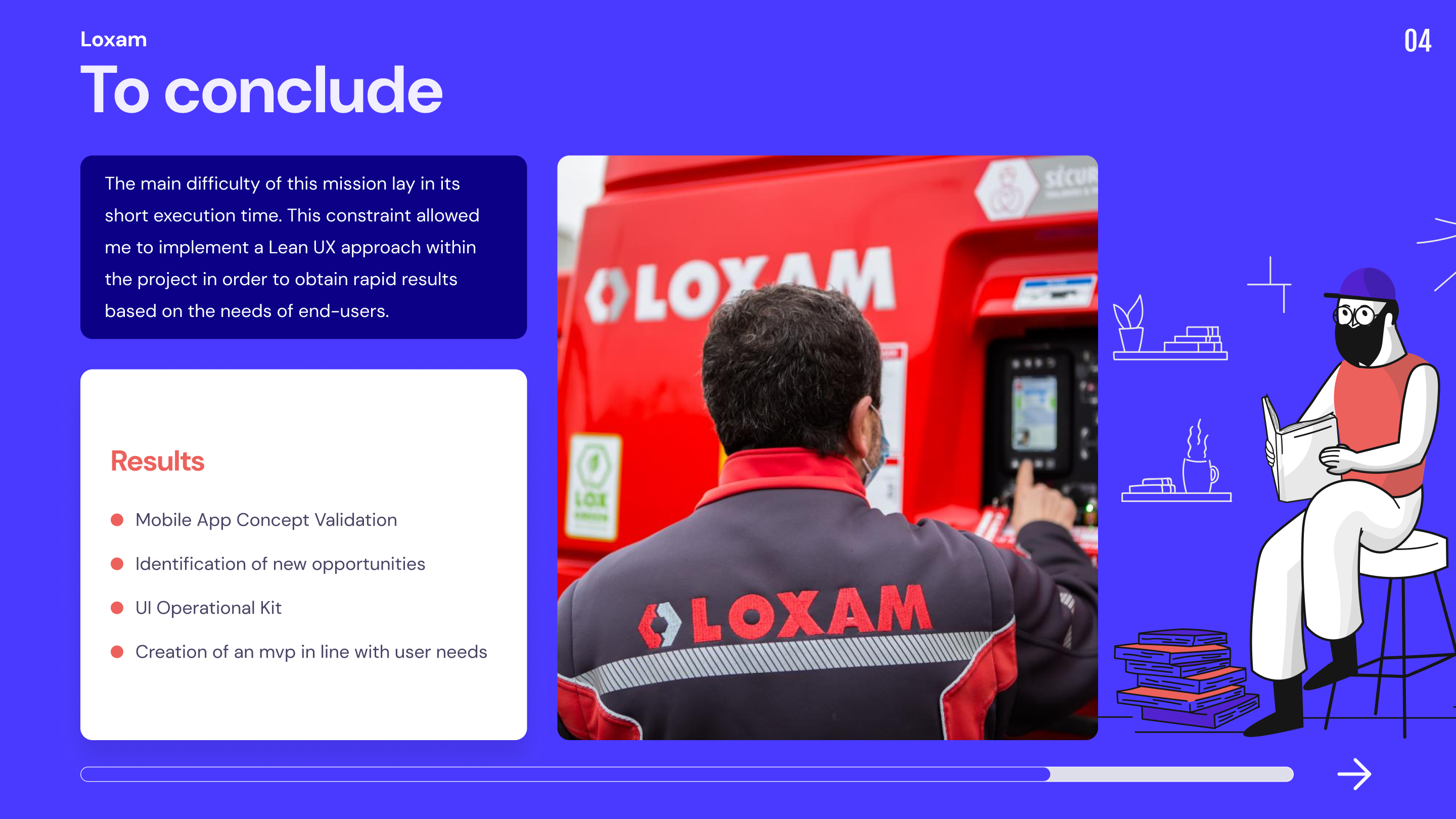
Taking advantage of Loxam's database to meet the end users of the application was extremely valuable.
Thanks to their feedback we were able to validate the mobile application concept with Loxam, identify new opportunities and propose a realistic mvp to achieve that meets real user needs.
Process constraints
With hindsight I realize that the RITE method should not be used to reduce the time spent on user research, it also makes it more difficult to evaluate the importance of a usability problem because of the limited number of participants between each iteration.
Consequence: We were not able to evaluate all the pathways at each test because time forced us to reduce the scope of the evaluation, which skewed the final results. We should have either proposed to extend the time frame to do a research workshop and then a test intervention or chosen to do only research to propose more relevant recommendations afterwards.