🔍 MBIS - Fingerprint Identification Software for Criminal Investigation
IDEMIA, for Interpol
“Florian's design skills (animations, advanced animation of prototypes) helped a lot the UX team and the different projects he worked on.”
 Ando RazafindrainibeUx Designer at Idemia
So I rebuilt it instead. Twenty pages of observation, written from a recording, became six screens: open a case and try to get past the first dialog, prepare the evidence, isolate a trace, enhance the image, encode the minutiae, compare candidates.
It runs here. Each step frames the part of the screen that matters, at a size the software never gave the examiner, and says what he hit there. Enlarge it for more room, or open it on its own page.
A tool that grew for years without anyone asking what it cost its users
Latent print examiners work under time pressure on evidence that decides cases. MBIS gives them a full suite of image editing, selection and enhancement tools, including minutiae processing, the ridge detail that makes an identification hold up in court.
The product had grown feature by feature for years, each addition justified on its own. Nobody had asked what the accumulation cost the people using it. A first study had been run a year earlier by another designer and had not led anywhere, which is why I was brought in.
So the question I was actually answering was not how to make the screens nicer. It was which of this toolset earns its place, and what the product should stop doing.
Three decisions, and what each one cost
I turned a recording into a journey map, frame by frame
IDEMIA gave me a session they had filmed: an examiner working through two real cases, one simple and one complex, commenting and complaining as he went. Without access to the software, that tape had to become a document. I went through it image by image, cut the work into its real steps, and wrote twenty pages: at each step, what he was trying to do, what the interface answered, and where it broke.
Six frames of the case, off the tape, at the size the recording had. This is the whole of my access to MBIS: I could read these, and never touch one of them. Cutting the work into these six steps was already an interpretation, because the software has no notion of them. The column is narrower than the recording, so each frame is shown reduced: open one to read its interface at the size it was captured.
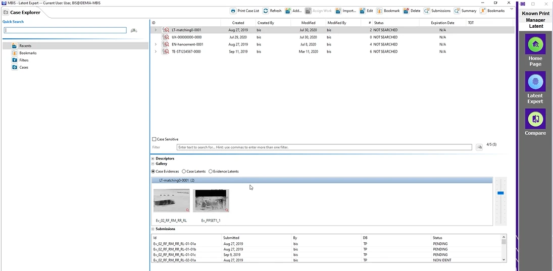
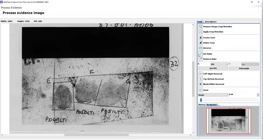
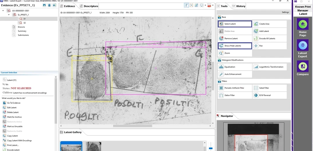
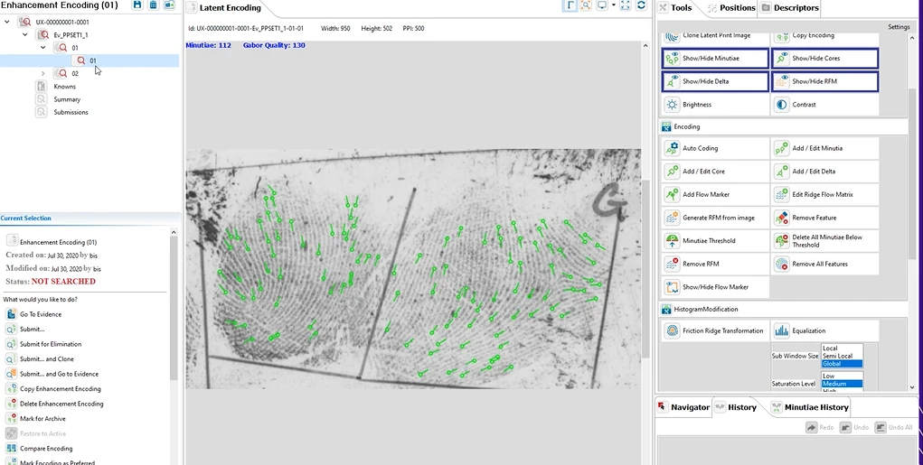
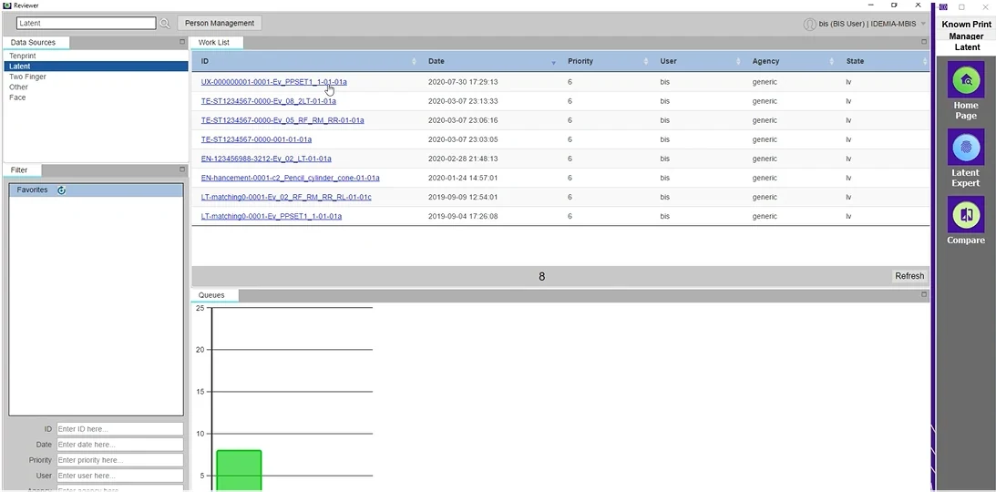
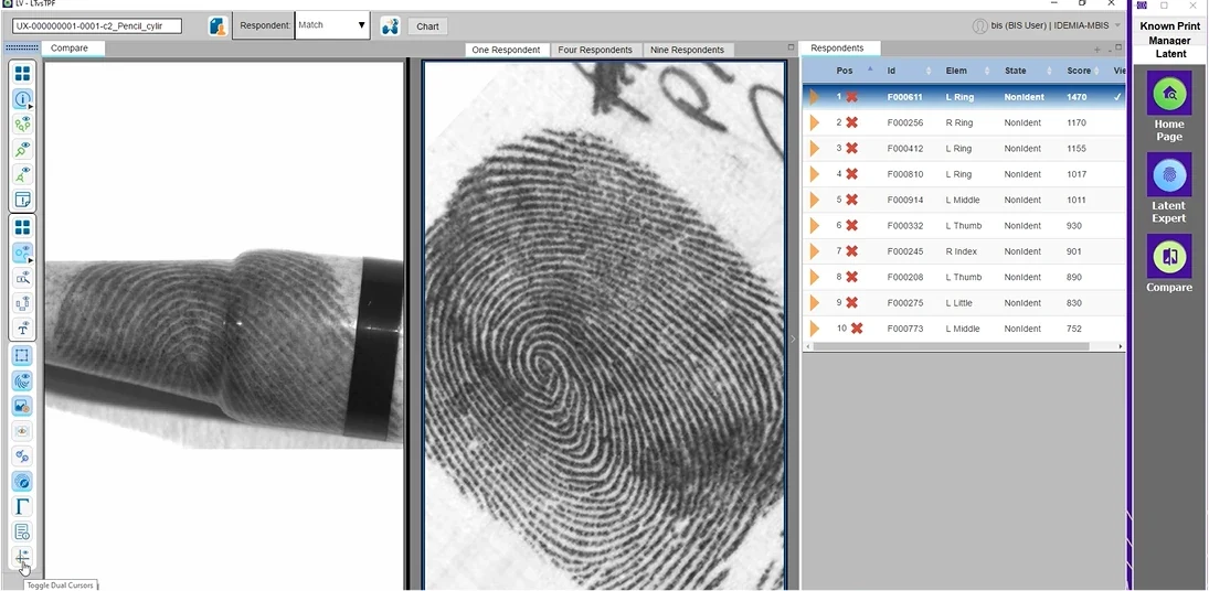
What it cost. A second-hand understanding. I could never test a hypothesis myself, never try the alternative path, never check whether an irritant was a one-off or a pattern.
I cut the interface down to one tool per card, so experts could rebuild it
Classic card sorting categorises website content, which was the wrong instrument here. So I cut the key screens up on a Mural board, down to the individual tool rather than the panel, and had five end users re-sort the interface itself, one session each over video.
What it cost. An unfamiliar format to explain before anyone could start, and results no benchmark can be compared against. I traded comparability for relevance.
The brief was interface quality. The problem was trust in automation.
Examiners did not mainly struggle with how the interface looked. They struggled to know what the software had done to the evidence on their behalf, and whether they could still defend the result. One of them called a powerful filter "magic", and meant it as a warning, not a compliment.
What it cost. A recommendation the sponsor had not asked for, which took longer to land than a list of screen fixes would have.
One examiner called a powerful filter "magic", and meant it as a warning, not a compliment.
Five independent sorts converged on the same four tools to bring forward
Running the five sessions individually rather than as a group was deliberate. A group sort produces one consensus, negotiated in the room, usually by whoever speaks first. Five separate sorts produce five independent rankings, which can be compared: what everyone put at the top is a finding, what only one person put there is a specialism, and the disagreements are where the interesting questions are. It costs five sessions instead of one. On a tool with this few expert users, that is the right price.
The sort is not research output. It is a prioritisation.
This is the part that matters for the product and not just for the study. Three bands of cards, compared across five independent sessions, are three product decisions waiting to be made: what stays in front, what steps back, and what the product stops carrying. A ranking that five experts converge on is not an opinion any more, it is an argument a product manager can act on. What I handed over was not a list of usability findings but an ordered set of calls, with the evidence for each one attached:
I wrote an intervention guide first: context and stakes, objectives, the hypotheses under test, and the protocol that would answer them. Without it, a session like this produces opinions instead of evidence.
Three questions ran underneath it. Which tools do you use, and which ones have you never opened. Which features deserve to be in front, and which should step back. And in what order, from most to least important, would you place what is on this screen.
The post-it annotations mattered as much as the sorting. People explain a ranking while they make it, and that is where the reasoning surfaced: not that a tool was bad, but that nobody trusted what it did to the evidence.
Last part of the session: each participant drew their ideal interface, using the insights we had just collected together. The drawing comes out of what they themselves have decided matters, laid out in their own hierarchy, while it is all still fresh.
A card sort for an interface, not for content. The classic format sorts the pages of a website. I needed to know which of a very large toolset the examiners actually reached for, so the screens themselves became the cards. Cut to the individual tool, not to the panel: at panel level people only reorder blocks somebody else drew, whereas at tool level they can genuinely rebuild. The finer the pieces, the more freedom, and the more the result belongs to them rather than to my framing.
Keep, and bring forward
- Minutiae history
- The navigator, zoom, and image property controls
- Encoding
- The original image, reachable at any point
Step back
- Obsolete functions still sitting at the same level as daily ones
- Everything a screen shows at once, into progressive disclosure
Drop
- The right-hand menu: the first thing examiners said they were ready to lose
- Showing the other traces in the case, which nobody asked to see
- Tools nobody had ever opened, kept because removing things is harder than adding them
Deciding what to remove is the harder half, and the one a product designer is actually paid for. Adding costs a sprint; removing costs an argument with whoever shipped it. The five independent rankings were what made that argument winnable, because nothing in the list was my preference.
The rest of the recommendation followed from the same material: fully automatic and fully manual paths separated, the modification history visible and ordered, and the original image always within reach.
How each session ran, in three parts
Talk first, screen later. An interview guide, to understand the context of use before anything is shown: how the work runs, what the examiner does in a day, where the pressure comes from. I also asked which other software they use, all of it, to map the conventions they already live in. Nothing of MBIS on screen yet, on purpose: open the board first and every answer calibrates itself on what is visible.
Then open the board. The interface, cut to the individual tool rather than the panel, re-sorted by value. At panel level people only reorder blocks somebody else drew; at tool level they can genuinely rebuild.
Draw at the end. The ideal interface, sketched while everything that just surfaced is still fresh. Asking people to design is usually a trap, because you get feature requests. Asking at the end of a session where they have described their own work and ranked their own tools is different.
Five end users, one at a time, over video, each on their own Mural board. Three parts per session, in this order.
Trust drops exactly where the software takes over
A journey map of a product nobody on the design side had ever used, built from one filmed session and twenty pages of notes. It plots what the examiner trusted, step by step, and marks where the software acted without him. It was never a heuristic review of the screens.
- 01
Open the case
- He lost time, not confidence. Three refusals, no format ever stated
- He lost time, not confidence. Only one of three fields marked so
- 02
Prepare the evidence
- He lost time, not confidence. Ruler first, and nothing says so
- He lost time, not confidence. “Cannot work out Uncurve. No help available.”
- He lost time, not confidence. All three buttons stay greyed
- 03
Isolate the trace
- He lost time, not confidence. Handles that will not resize
- He lost time, not confidence. “Create Area is not useful”
- He lost time, not confidence. Panels fold, then open elsewhere
- 04
Enhance and encode
Here the automation takes over
- The software acted and said nothing. No sign of when auto coding acts
- The software acted and said nothing. “Magic”, and so left alone
- The software acted and said nothing. History gone after heavy edits
- He said this one works. Minutiae matches shown in colour
- 05
Submit and wait
He only believes the queue he counts himself
- The software acted and said nothing. Sent to Reviewer, a second app, no handover
- The software acted and said nothing. Would rather stay in MBIS, on another task
- The software acted and said nothing. Counts the queue himself: 8, not 7, then 7 again
- 06
Compare and decide
He takes the decision back, then screenshots his own work
- He lost time, not confidence. Eighteen icons, no labels
- The software acted and said nothing. Non-match fails, match works
- The software acted and said nothing. No record of what he has seen
- He said this one works. The Chart button sums it up
- The software acted and said nothing
- He lost time, not confidence
- He said this one works
That curve is the argument. It is why the recommendation was not a tidier screen but a separation: fully automatic on one side, fully manual on the other, and in both cases a permanent, ordered history with the original image always one click away. An examiner has to be able to defend, months later and in front of a court, every change made to a piece of evidence. A tool that cannot show that work is not one he can use, however good its algorithms are.
Almost none of the friction was about how it looked
Most of the friction was about orientation, not aesthetics.
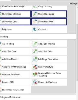

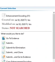
And what they asked to keep, which matters just as much: minutiae history, the navigator, zoom, image property controls, encoding.
Billing the research to the project team bought weeks, never enough to verify
Inside IDEMIA's R&D, the UX team operated like an internal consultancy: each intervention was billed to the project team that requested it. That funding model decides the work before it starts. It buys a few weeks at a time, which is enough to find problems and rarely enough to verify them, and it means teams call design once the thing is already built.
On this project it produced a conversation I had to have rather than avoid. The project team had allocated me a certain amount of time and expected findings they could drop into their roadmap. I had to tell them that what I had after the first pass were observations, not recommendations, and that turning one into the other required checking recurrence with more users than I had seen. Saying that costs credibility in the short term. Saying the opposite costs it permanently.
That is also why I pushed on the funding model itself rather than only on the deliverable, and argued internally that bringing design in before the build, to check whether the technology answered a real need, would cost the company less than correcting afterwards.
I would fight for thirty minutes of the software, and I would not deliver in slides again
Two framing interviews and five individual sessions is a real sample for a tool with this few expert users, but not enough to call every finding recurrent, and I said so at the time rather than dressing them up as certainties.
I would fight harder for supervised, time-boxed access to the software itself. Even thirty minutes with someone watching, because the gap between reading an interface and using it is where the real friction lives.
And I would not deliver the analysis as a slide deck again. A deck freezes research the day it is written, which is exactly what made the previous study so hard to inherit. That point outlived the project: it is why I argued afterwards for atomic research in the team, and set up a session between my team and the founder of Glean.ly. We did not get the tool while I was there.
What was delivered
They worked with me
Florian brought real user-research rigour to our innovation projects, from the field through to prototypes tested on our own technology. Professional, autonomous, and full of initiative, he left a very good impression on our teams.
Amaanie Hakim, Vice President Innovation, IDEMIA
I worked alongside Florian at IDEMIA's Innovation Lab. In the field and in workshops alike, he knew how to get users talking, then turn what we observed into concrete recommendations for the engineers. A rigorous designer, who documents everything and moves the team forward.
Israël Agbotse, Product Designer, IDEMIA
When I joined IDEMIA, Florian trained me on our processes and research methods, then handed his projects over to me. His handover was clear and documented: I could pick the work up without losing time.
Simon Destanque, UX/UI Designer, IDEMIA
Client and product named only from material IDEMIA published itself: the IDEMIA and Interpol partnership press release of April 2021, the MBIS product page, and coverage in Usine Digitale and Silicon. The screens on this page come from IDEMIA's own demonstration dataset, the one the filmed session was run on: the case is labelled Use case 1, easy latent, and every identifier on it is a demonstration value. No real case data appears anywhere.