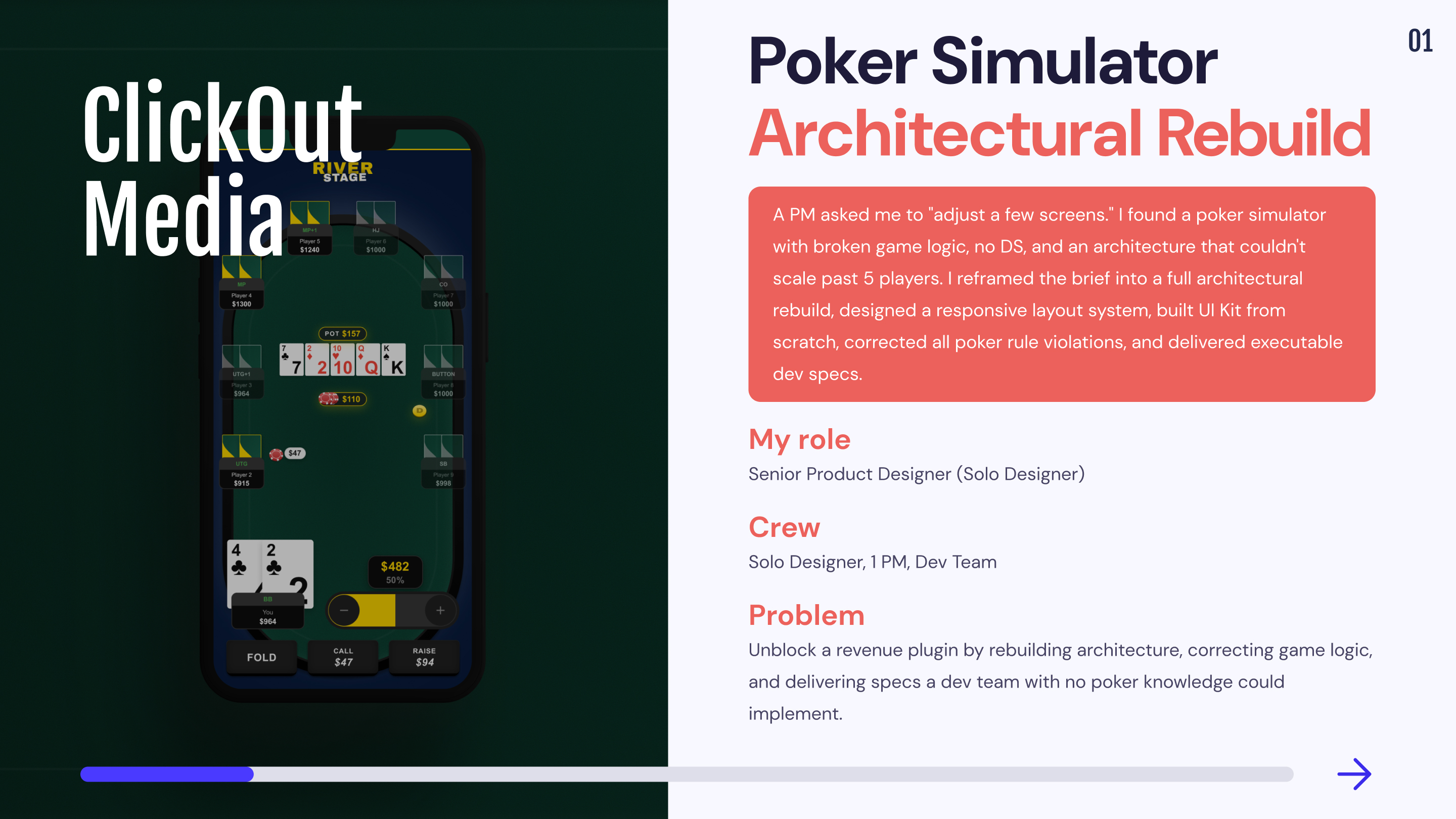
🕹️ Poker Training Simulator - Plugin for ClickOut Media
ClickOut Media

1,5 month
Solo designer, 1 PM, Dev team
Game Simulation
Unblock the launch of a revenue-generating engagement plugin for ClickOut's poker affiliate network by rebuilding the product architecture, correcting game logic that would have damaged brand credibility, and delivering a design system that a dev team with no poker domain knowledge could implement without ambiguity.
Remote from Bangkok (GMT+7) with structured async handoff across EU timezone.
Mission 1: From "adjust screens" to full rebuild
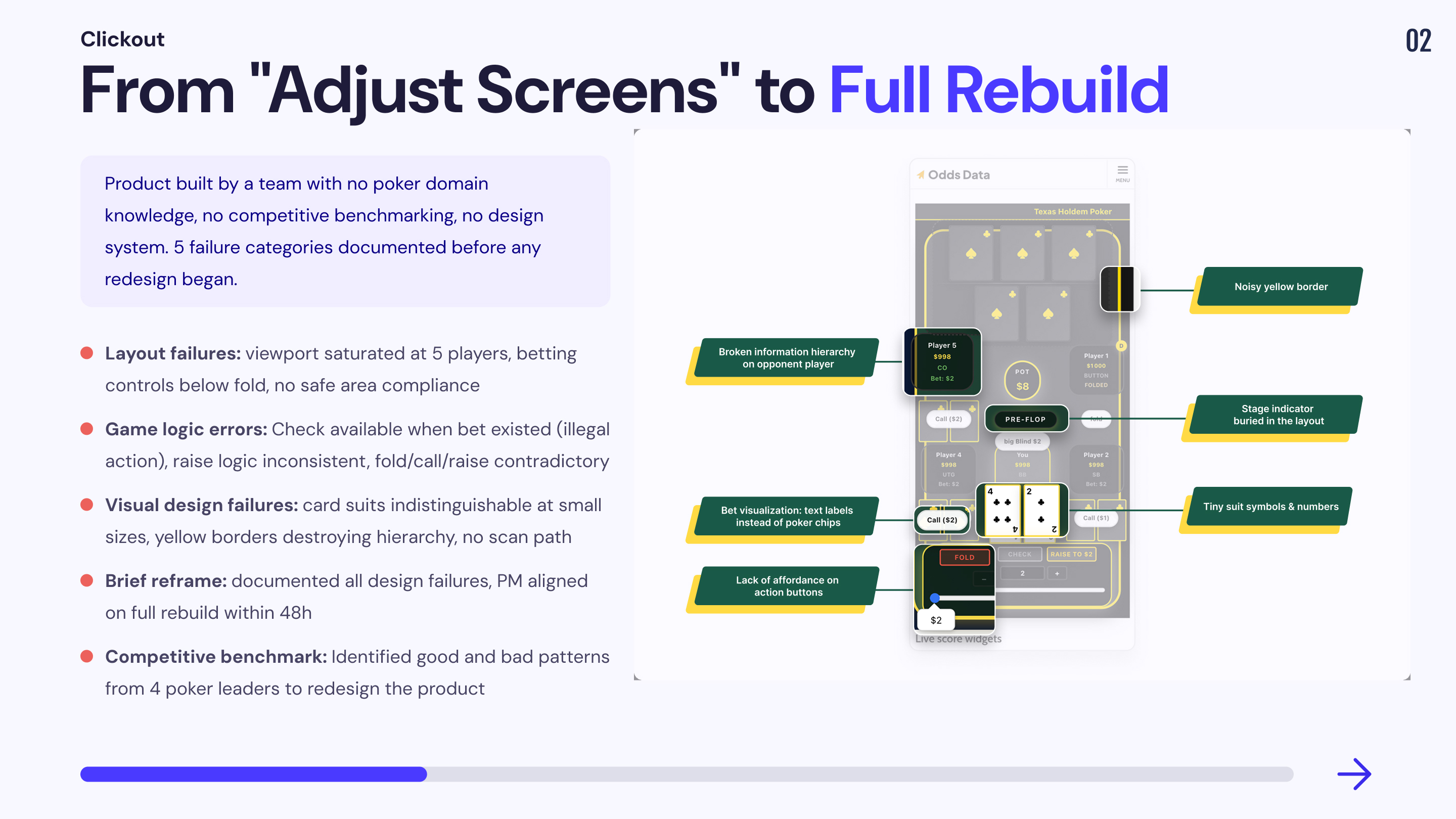
The PM's initial request was narrow: make room for more players. The implicit assumption was that the existing layout was structurally sound and only needed visual adjustments. A quick audit of the production build revealed this assumption was wrong at every level not just layout, but interaction logic, game mechanics, visual hierarchy, and brand identity.
This was not a design polish problem. It was a product that had been built entirely outside the domain of poker, by a team with no exposure to real poker applications, and with no benchmarking against any existing product in the category.
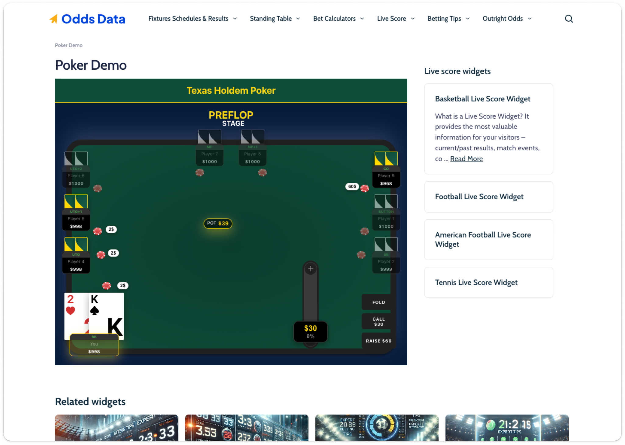
1. Layout architecture failure
📔 Context
The production build consumed over 80% of vertical viewport space with 5 players. Player seat positions were hardcoded, not adaptive. Adding seats was physically impossible without redesigning the entire spatial system.
🚨 Problem
💊 Solution
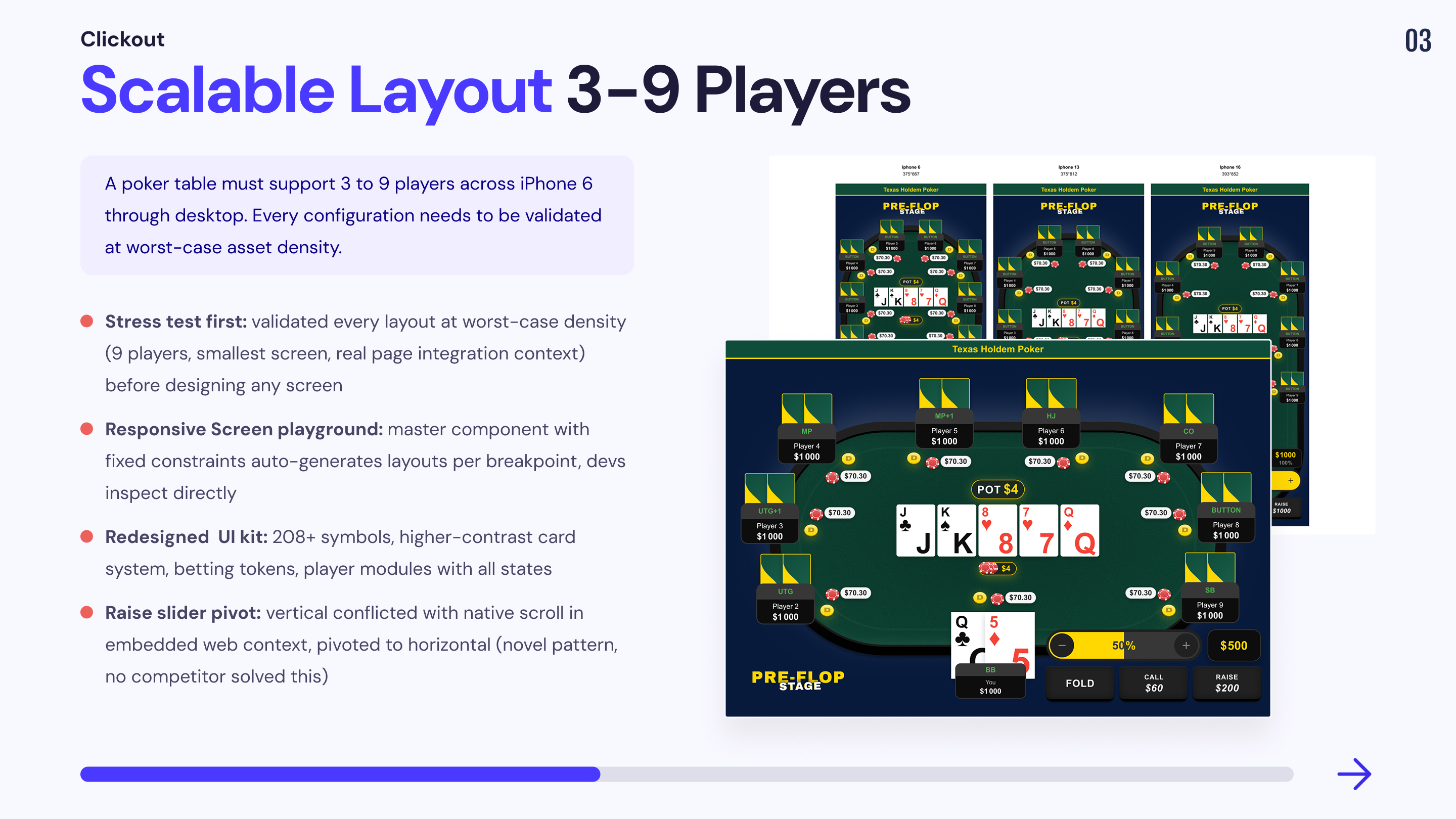
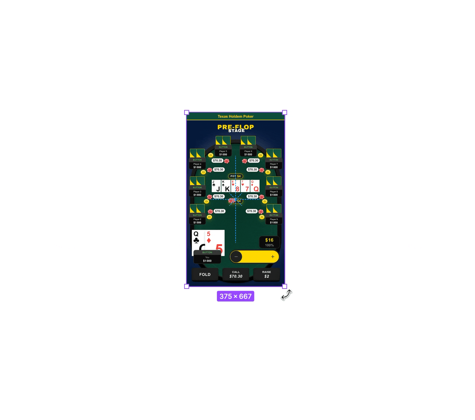
Built a Mobile Integration Stress Test combining two validation layers: worst-case asset density (every visual element active simultaneously) and real deployment context (plugin embedded inside actual Odds Data page template). If the layout holds under maximum load inside the real page, it holds in any production scenario.
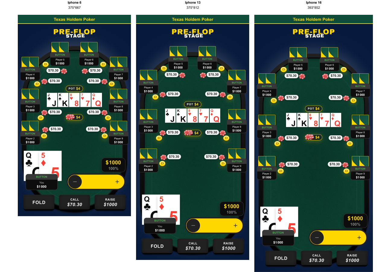
Defined a responsive layout playground for the dev team fixed constraints on the master component generate screens for iPhone 6, 13, and 16 with zero extra effort.
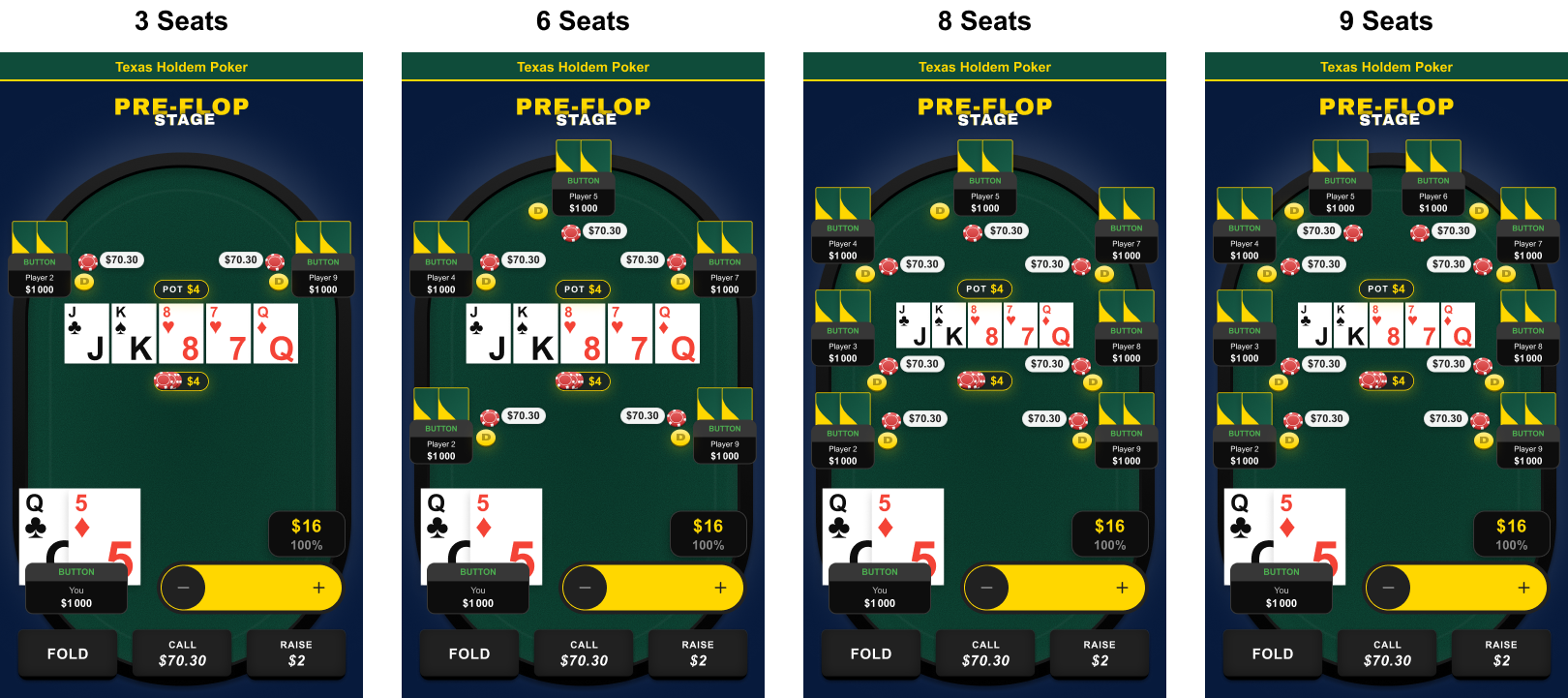
Seat positions designed as adaptive repositioning and resizing proportionally from 3 to 9 players.
2. Game logic errors in production
📔 Context
This was the most critical finding. A simulator that teaches incorrect poker rules is not a neutral product it actively damages user trust and brand credibility. Several interaction states shipped in the existing build represented impossible or illegal game situations.
🚨 Problem
💊 Solution
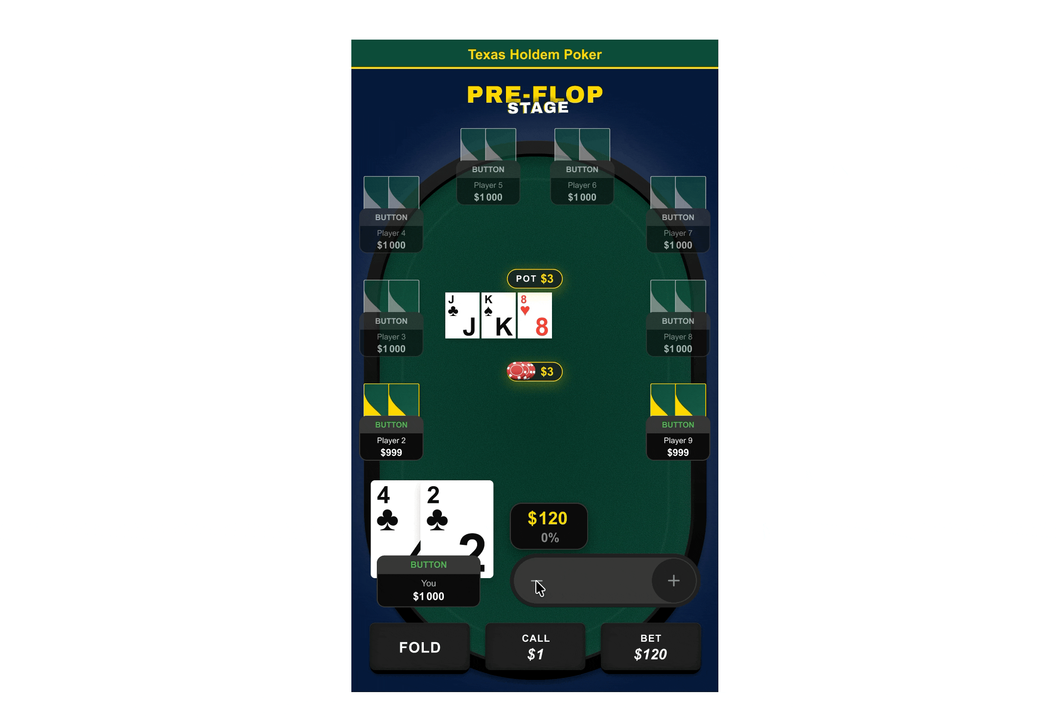
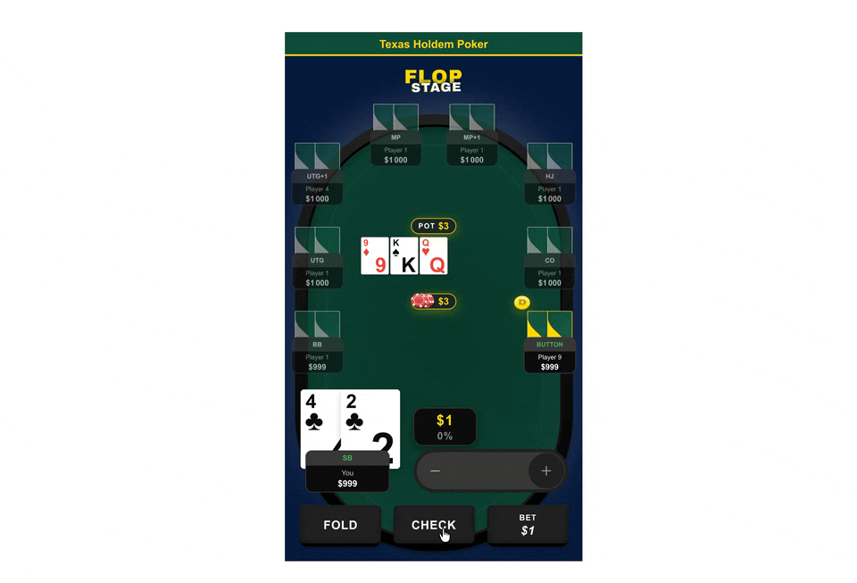
Mapped every game state against Texas Hold'em rules: pre-flop, flop, turn, river, showdown. Defined explicit action availability rules per state: which buttons are active, which are disabled, and why. Flagged all production errors formally to the PM — each described as a user-facing credibility risk, not a design issue. Built and documented a complete scenario strip (Pre-Flop → River → Result) to validate component placement at every game stage.
3. Competitive benchmarking: building domain authority
📔 Context
The dev team had built the original product without looking at a single real poker application. No benchmarking, no competitive analysis, no reference to industry conventions. Before proposing solutions, I needed to establish what "correct" looked like not from personal opinion, but from documented evidence across the market leaders.
🚨 Problem
Zero competitive references in the project. PM and dev team had no framework to distinguish standard conventions from arbitrary decisions. Without evidence, every design recommendation would be perceived as subjective preference.
💊 Solution
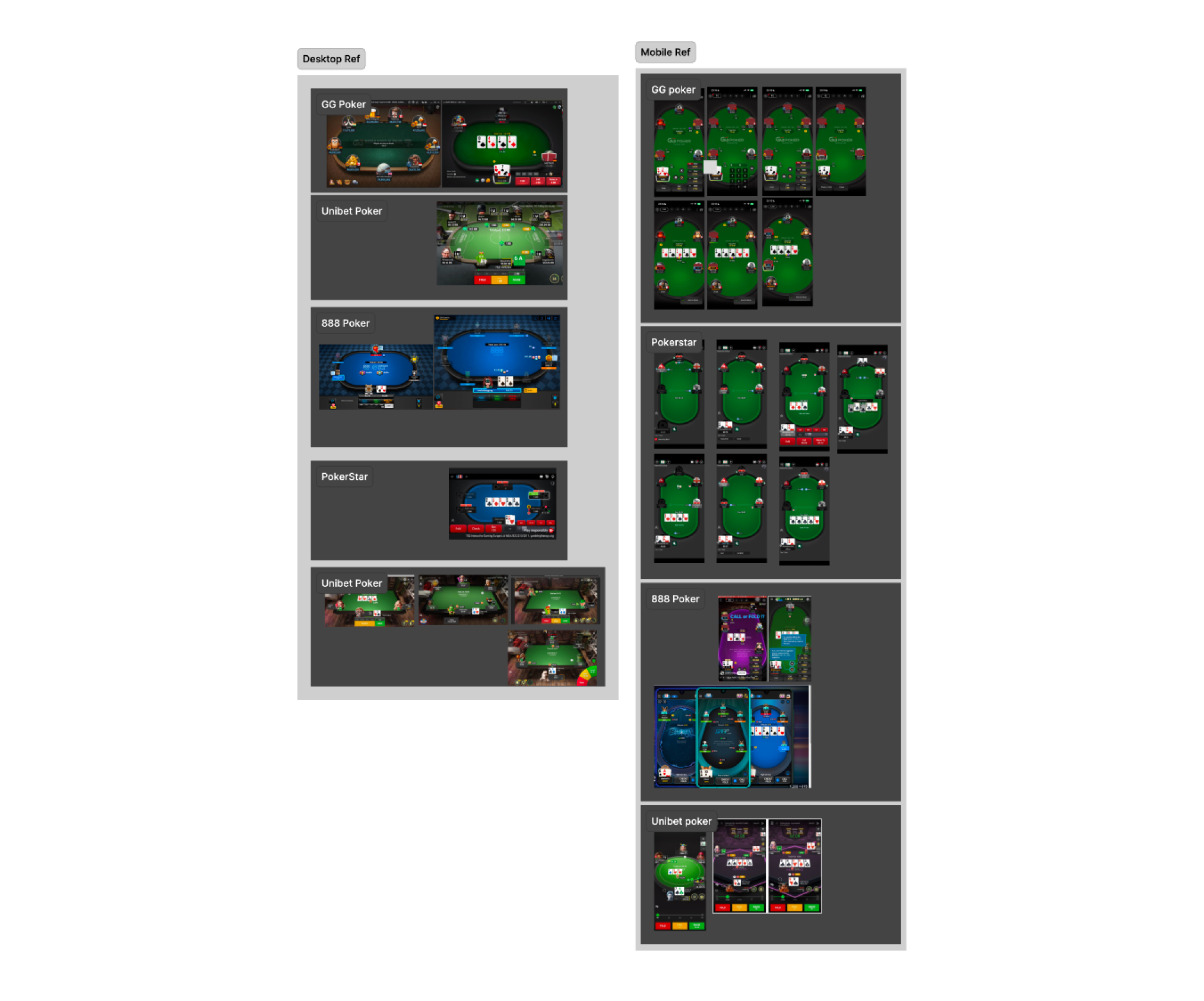
Conducted a structured competitive audit across 4 market leaders on both mobile and desktop: GG Poker, PokerStars, 888 Poker, Unibet Poker — capturing 26+ screens. Key findings extracted per competitor: GG Poker (largest action buttons, clearest pot hierarchy), PokerStars (strongest card legibility, most consistent seat scaling), 888 Poker (most explicit bet labelling), Unibet (best fold/call/raise colour coding). Compiled as persistent Figma reference pages for the full team. Every subsequent design decision backed by at least one benchmark reference.
4. Visual design failures & information architecture a product with no domain awareness
📔 Context
Beyond layout and game logic, the existing build suffered from deep visual design and information architecture failures that only someone with real poker product experience would identify. The dev team had designed every visual element cards, suits, player modules, table surface, stage indicators without any reference to how real poker applications solve these problems. The result was a product that looked like a generic card game prototype, not a poker simulator. Every visual decision had been made to "look like a game" rather than to serve the actual information needs of a poker player making real-time decisions.
🚨 Problem
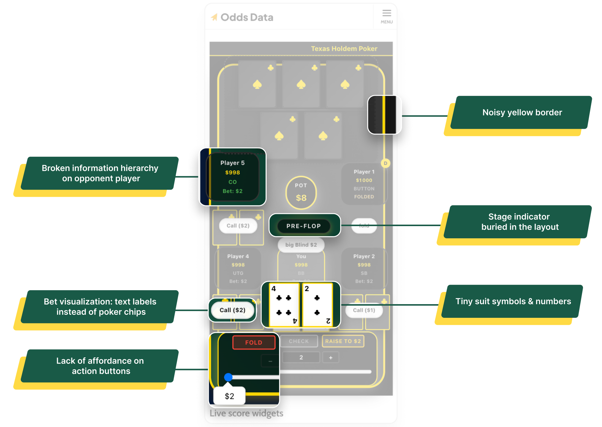
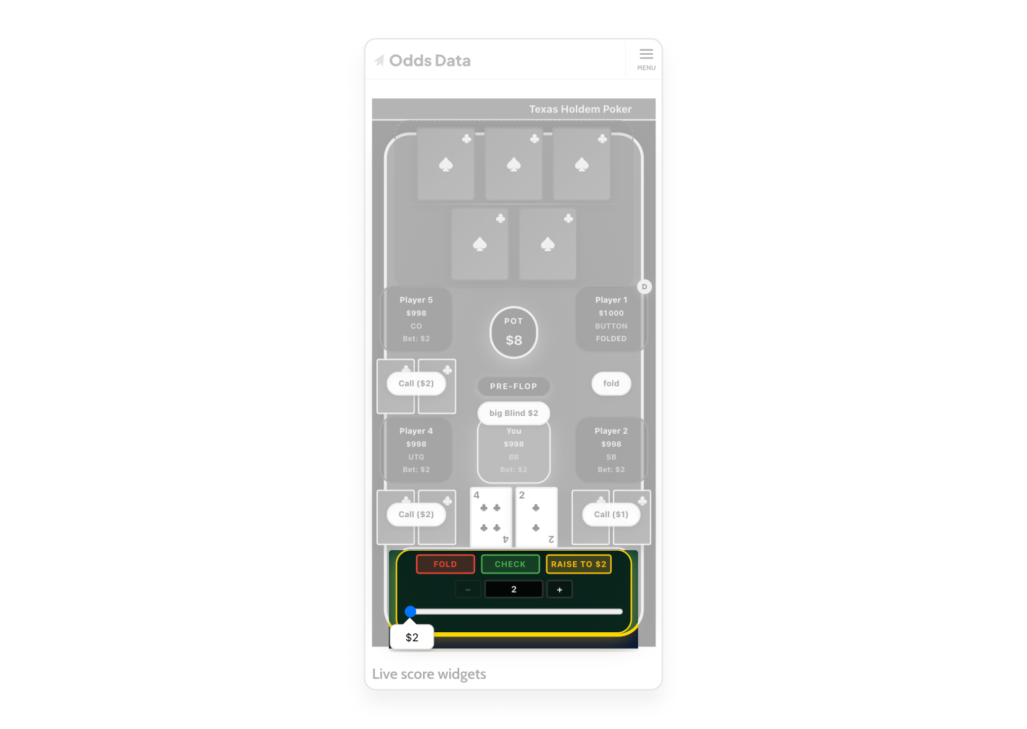
Card suit symbols (♣/♠) indistinguishable at small sizes, dev team compensated by oversizing cards, consuming vertical space needed for player seats. Yellow borders on every element destroyed visual hierarchy. Player modules displayed all info (name, stack, position, bet) at equal typographic weight, no scan path. Stage indicator buried in the layout. Bet amounts displayed as text labels inside player modules instead of poker chip tokens on the table surface.
💊 Solution
Cards: Redesigned internal layout enlarged suit symbols and rank numbers within a smaller card footprint. Board cards reduced in size while becoming more legible. Domain-specific fix from BetRivers experience.
Hierarchy: Yellow borders eliminated. Visual hierarchy rebuilt using green felt surface, state-driven player module treatment (yellow highlight = acting, desaturation = folded), and subtle table edge framing.
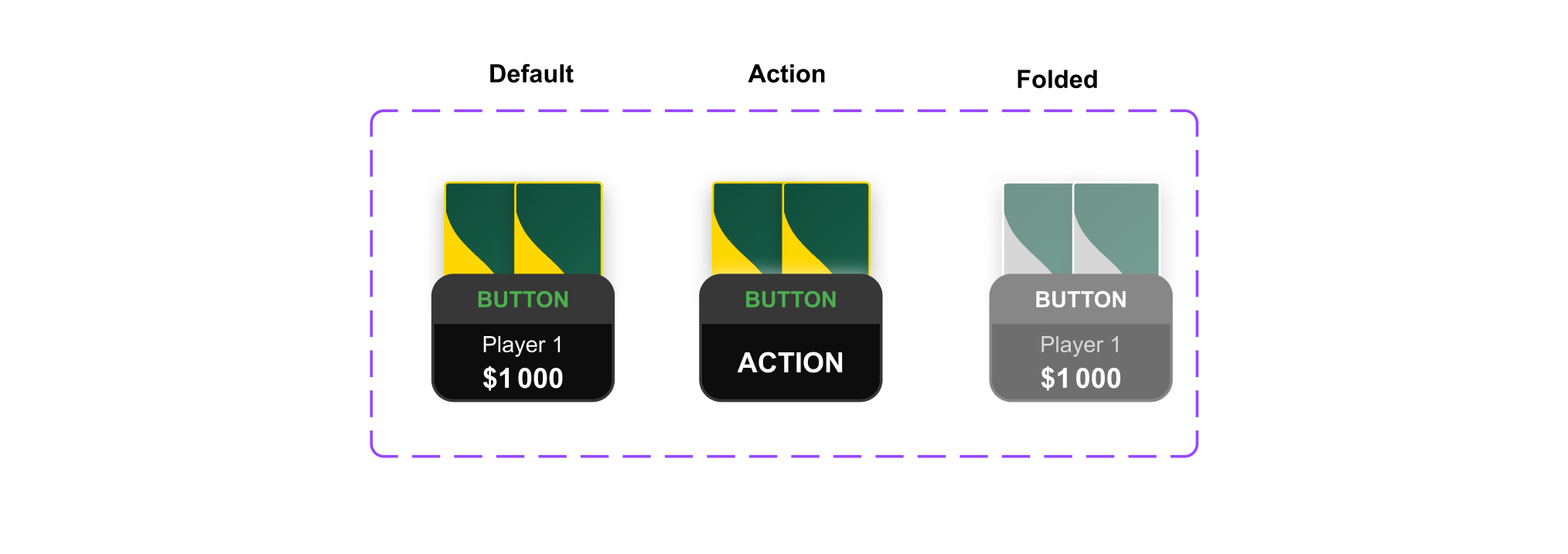
Opponent actions: Static "Call ($2)" labels replaced with a 3-state temporal system: Default → Action (2s notification flash) → Folded (permanent desaturated state). Matches GG Poker and PokerStars patterns.
Stage indicator: Repositioned with high-contrast yellow typography visible at all times.
Bet visualization: Text labels replaced with animated poker chip tokens on the table surface. Validated against 888 Poker's chip-in-front-of-player pattern.

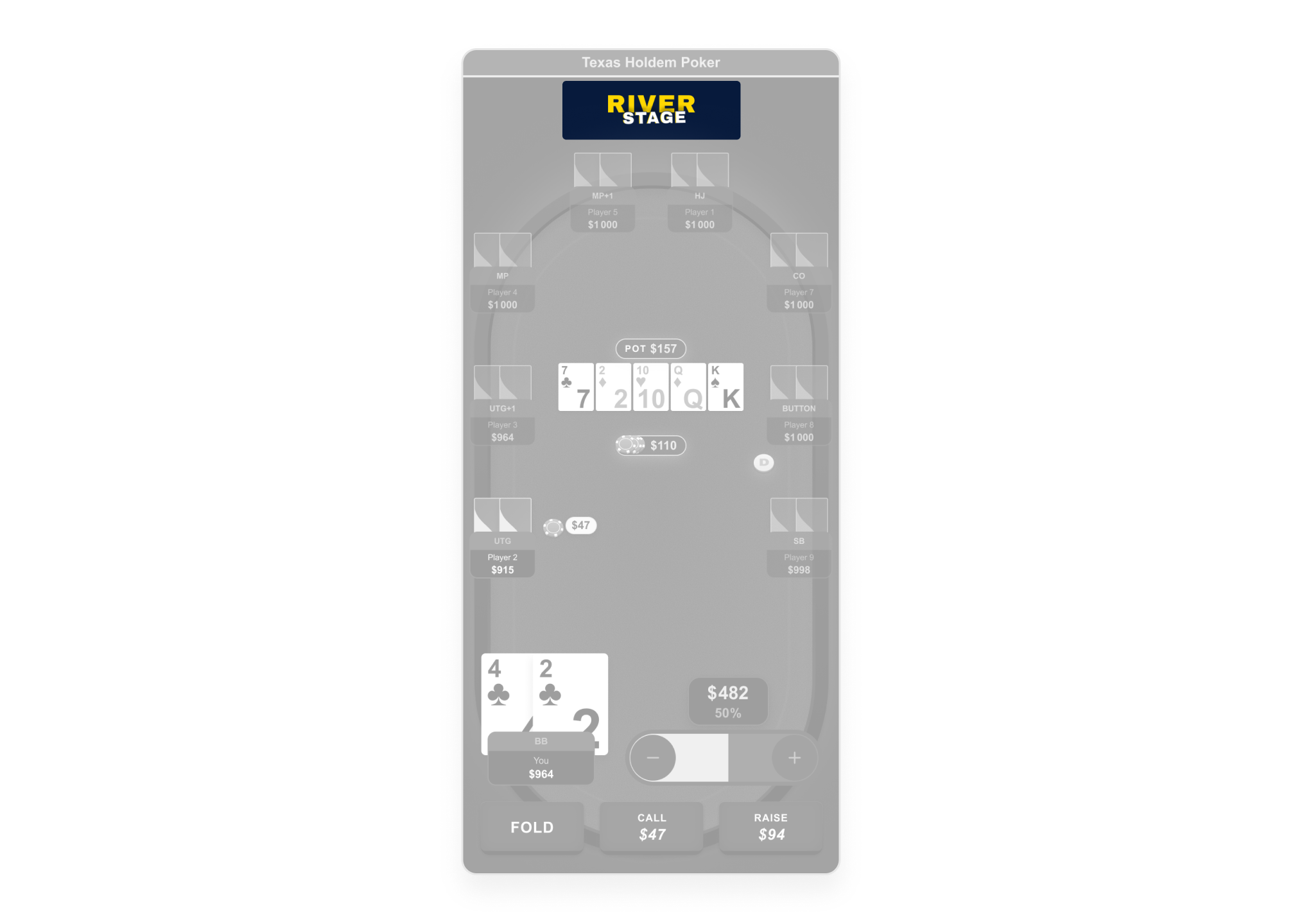
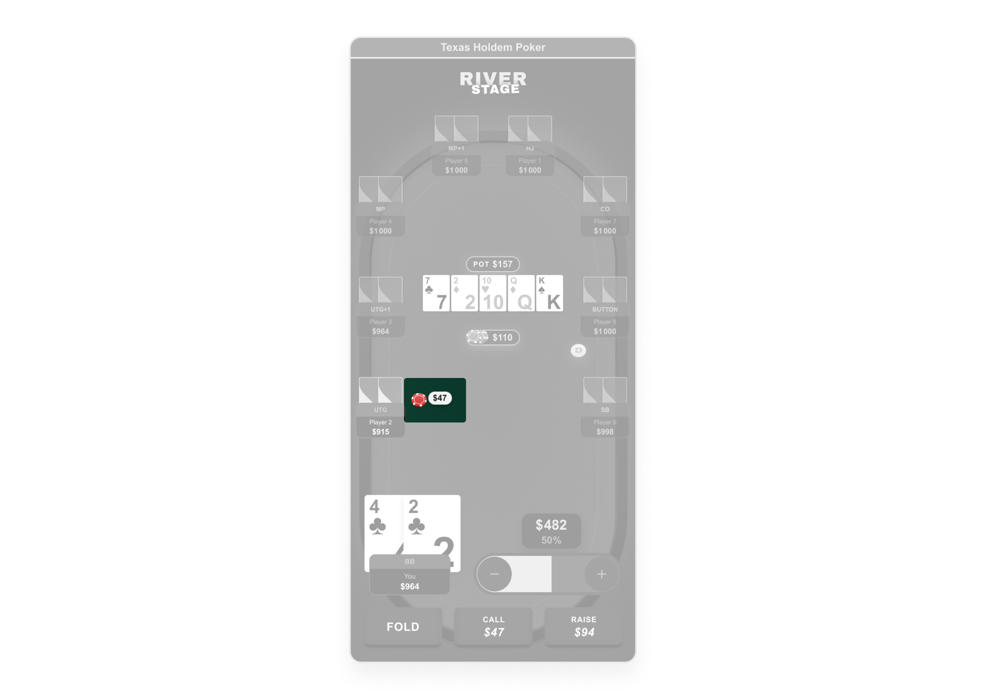
When the PM reviewed worst-case stress-test frames, she interpreted them as realistic gameplay screens raising feedback about bet sizing, open frequencies, and chip display. None of these were layout issues. The risk was clear: if the purpose of each frame type was not clarified, the design process would derail into out-of-scope concerns and confidence in the system would erode.
I clarified the distinction in writing: "these are not gameplay simulations, they are worst-case UI layout validations. The goal is to prove the layout holds under maximum load." Then I separated the two workstreams explicitly: stress-test frames (structural validation) vs. interactive prototypes (realistic gameplay demonstration). Both were delivered, each serving its purpose without conflating the two. This kept the PM as a partner in the process rather than a source of misaligned feedback.
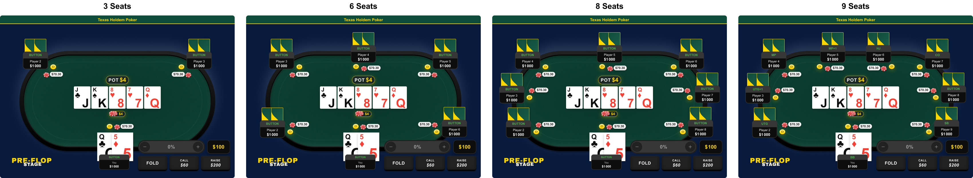
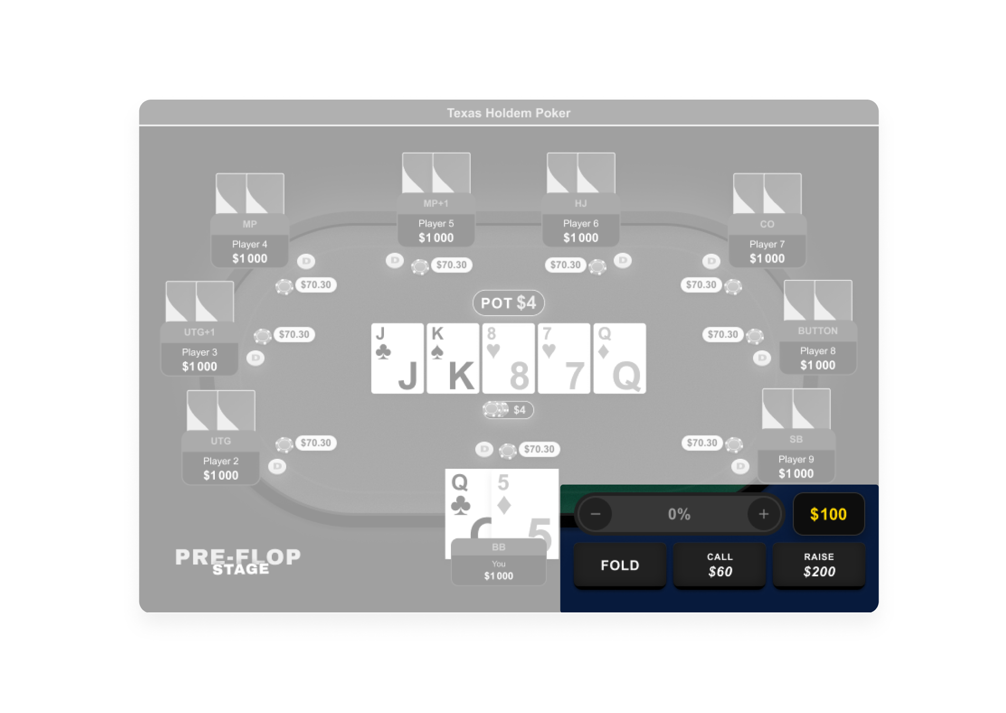
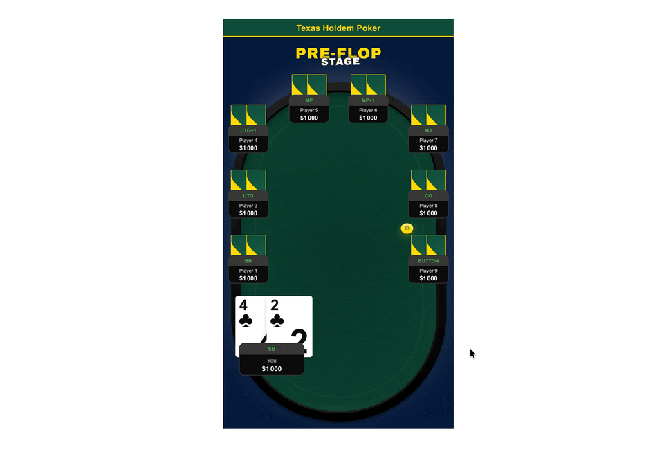
Mission 2: Scalable layout: 3–9 players, 4 breakpoints
With the PM aligned on scope, the rebuild began from zero. The starting point was not the existing design it was the constraints: how do you fit 9 players, a full board, a pot, betting controls, and a raise slider onto a 375px wide screen, inside a scrollable web article, without breaking a single interaction? This is a harder problem than it looks. Real poker apps sidestep most of these constraints because they are native apps with full screen ownership. This plugin had none of those advantages.
1. Component library rebuild
📔 Context
The existing build had no coherent component system. Elements were one-off, inconsistently sized, and used visual metaphors that bore no relationship to real poker products betting tokens looked like generic UI chips, cards collapsed visually at small sizes, player states had no clear hierarchy.
🚨 Problem
No coherent component system. Elements one-off, inconsistently sized. Cards illegible at small sizes. Betting tokens using generic UI metaphors. Player module states undefined. No modal system for hand results.
💊 Solution
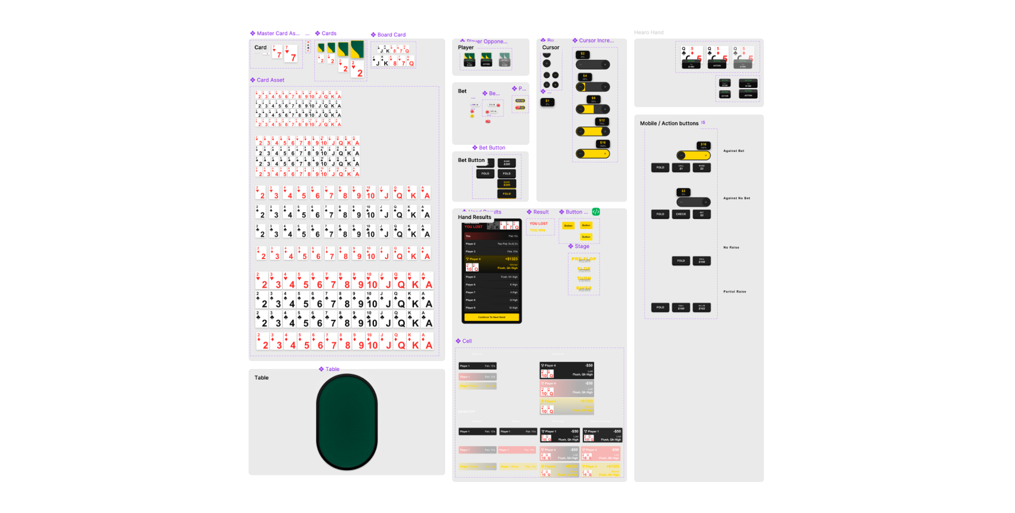
Redesigned full component library: higher-contrast card system legible at 9-player worst-case, betting tokens matching industry-standard poker chip metaphors, player modules with all states defined (default, active, folded, all-in, winner), full modal system for hand results and transitions. All components in a single Figma section with explicit usage rules for engineering.
2. Raise slider: solving the scroll conflict
📔 Context
My initial design used a vertical raise slider, the standard pattern across every competitor in the benchmark (GG Poker, PokerStars, 888 Poker, Unibet). Moving your finger upward increases the raise amount. It's intuitive, it's universal, and it was the obvious choice based on competitive evidence. But during prototyping, I caught the problem: this plugin is embedded inside a scrollable web article. A vertical swipe gesture on a scrollable page triggers page scroll, not slider movement. The industry-standard pattern breaks completely in this specific deployment context. No competitor had solved this because none of them ship as embedded web plugins they are all native apps with full scroll ownership.
🚨 Problem
💊 Solution
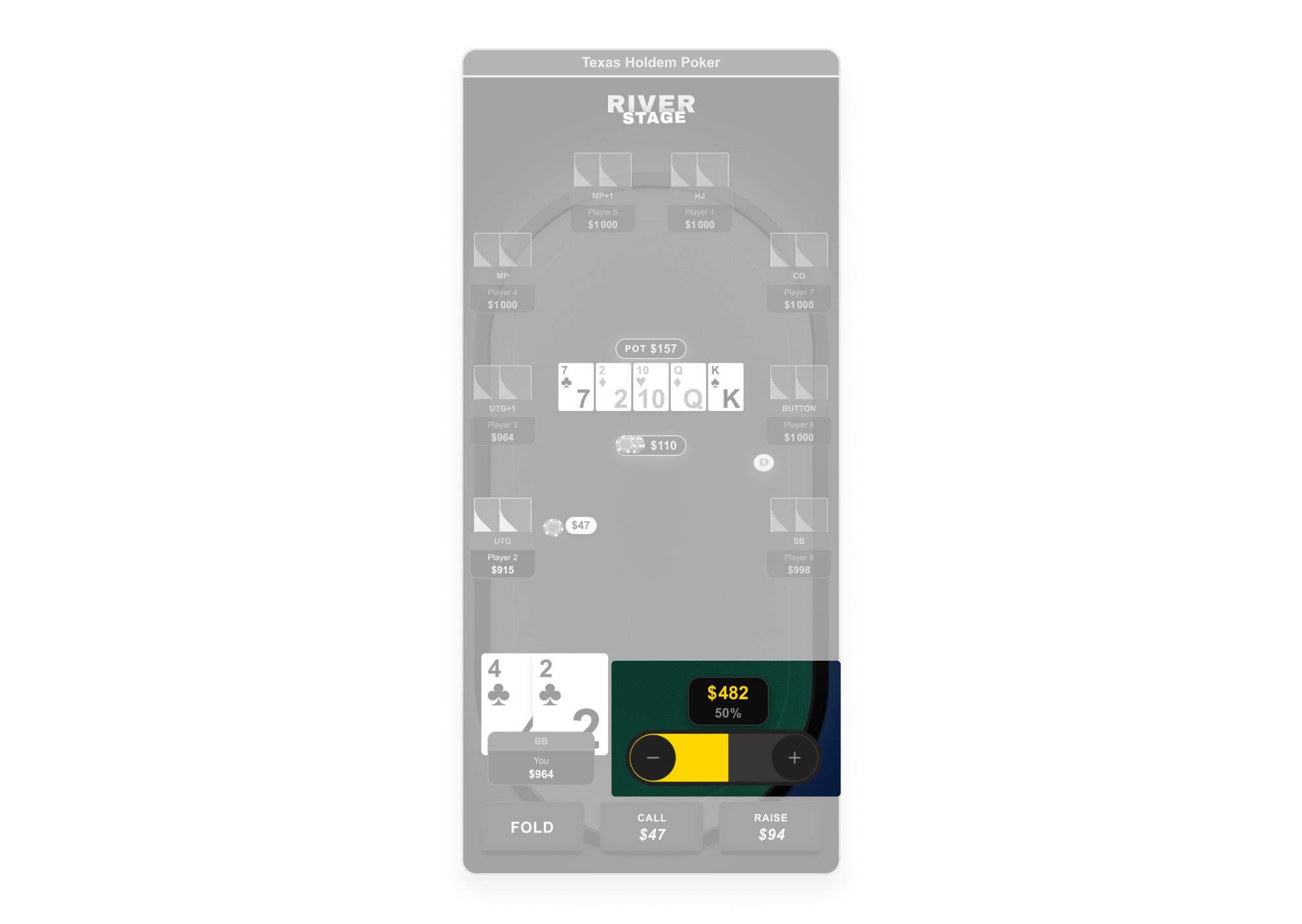
Caught the scroll conflict during prototyping before it reached development. Pivoted raise slider from vertical to horizontal as horizontal swipe doesn't conflict with vertical page scroll. Documented the rationale in Figma annotations to prevent regression during implementation. A novel interaction pattern: no competitor had solved this because none ship as embedded web plugins.
3. Desktop version: integration context and cross-platform validation
📔 Context
The desktop version could not be designed as a scaled-up mobile layout. The plugin embeds inside Odds Data article pages,a two-column layout with a sidebar (live score widgets, related widgets). The dev team's previous attempt had simply stretched the mobile layout horizontally, wasting screen real estate and breaking spatial relationships between players.
🚨 Problem
Existing desktop build was a stretched mobile layout. No adaptation to wider viewport or page context. Seat distribution broke in landscape. Hand Results modal not designed for desktop.
💊 Solution
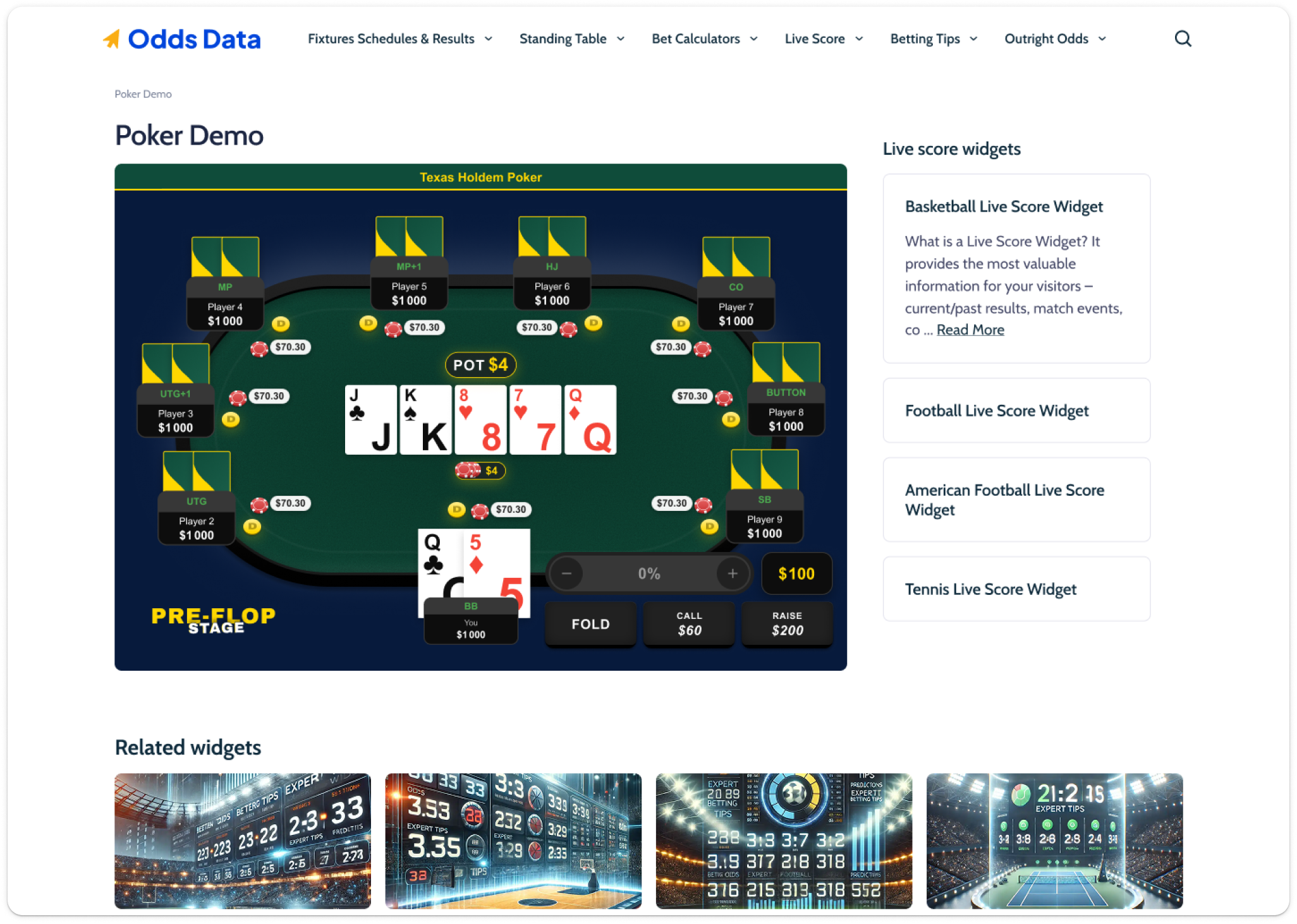
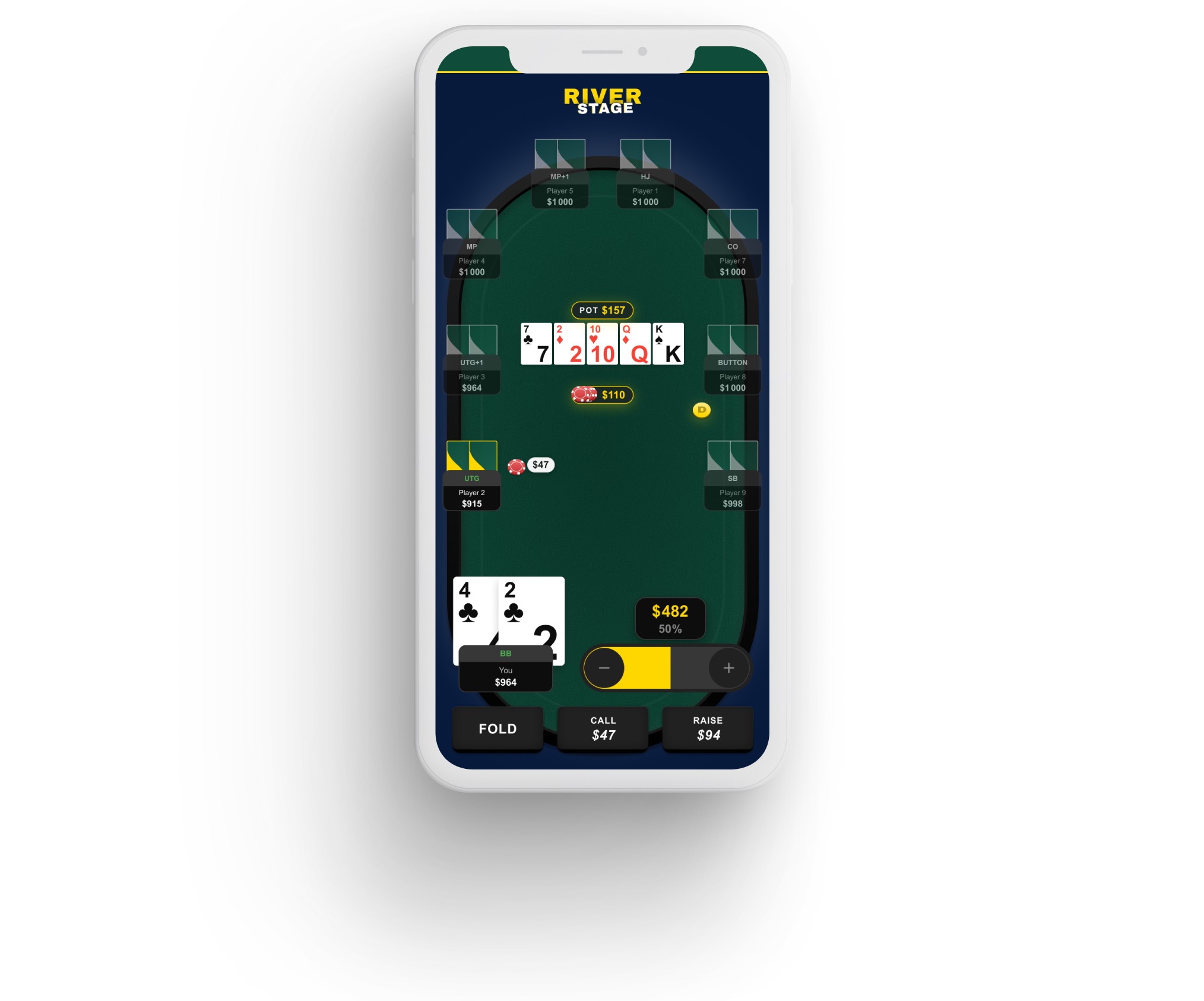
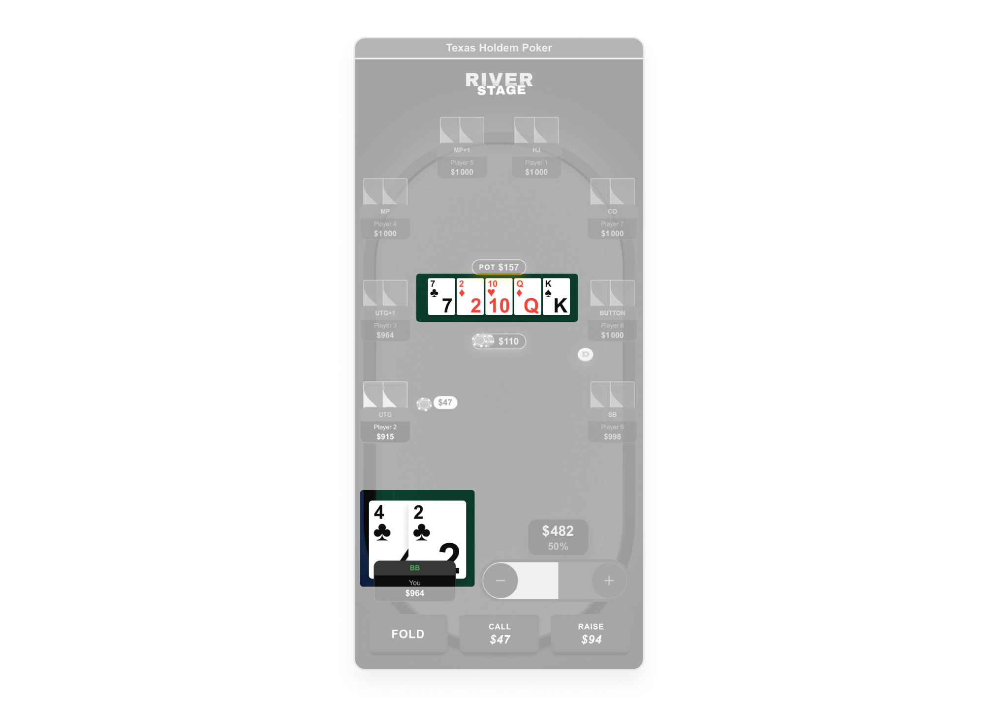
Built Desktop Template Master validating all 4 configurations (3/6/8/9 players) at desktop scale. Designed complete desktop scenario strip: Pre-Flop through Hand Result, mirroring mobile 1:1 for cross-platform parity. Solved Hand Results responsive layout: single-column ≤7 players, two-column 8+. Action zone repositioned to leverage horizontal space.
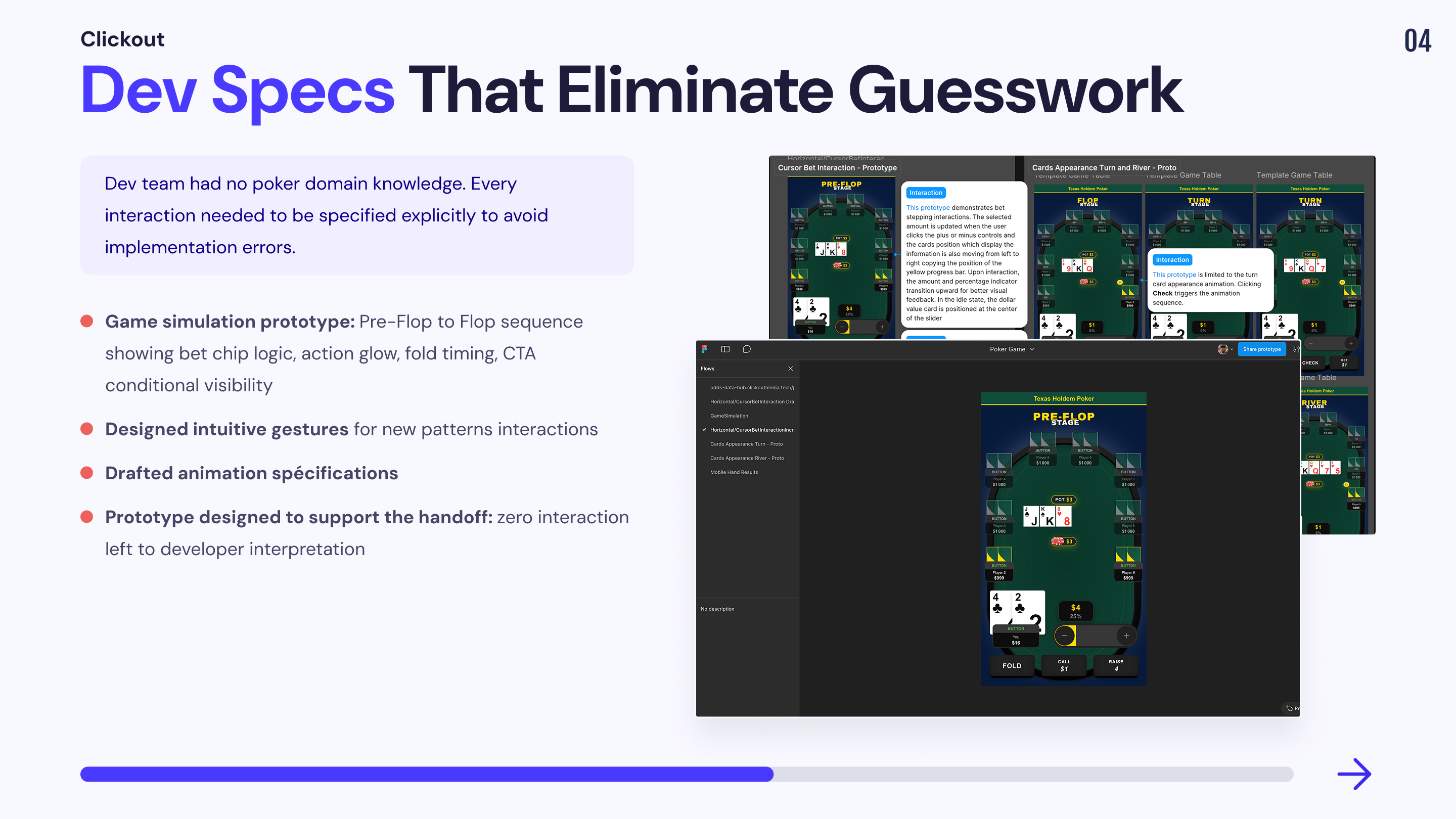
Mission 3: Dev specs that eliminate guesswork
Static mockups document what should happen they can't communicate how it should feel. For a dev team with no poker domain knowledge, implementing interactions from annotated frames alone would guarantee misinterpretation. I built targeted interactive prototypes, each isolating one critical interaction layer, as executable specs the dev team could implement against.
1. Game Simulation
📔 Context
A poker game is not a collection of independent components it’s a sequence of tightly choreographed micro-interactions where timing, order of appearance, and state transitions are the product. The PM, dev team, and QA had zero poker domain knowledge. Their previous work was static pages and simple embeddable plugins. In their initial implementation, everything on the table was static: bets appeared and disappeared without movement, opponent actions had no visual feedback, CTAs were permanently visible regardless of whose turn it was. They did not understand that a poker simulator even a simplified one requires a layer of sequential animation logic that static specs cannot communicate. I did not prototype every possible hand scenario that would have been excessive and counterproductive. Instead, I selected the key interaction dynamics that define the feeling of a poker game: the moments where, without guidance, the dev team would default to static rendering and break the experience.
🚨 Problem
Dev team's implementation was entirely static: no animation sequence, no state transitions, no temporal feedback. Opponent actions had no visual signal. Bet chips appeared instantly with no spatial logic. PM and QA couldn't identify these issues no reference for how a poker game should behave dynamically.
💊 Solution
Built a GameSimulation prototype selecting only the indispensable interaction dynamics , not an exhaustive scenario, but a curated sequence of key moments illustrating the transition between Pre-Flop and Flop. Prototype demonstrates: bet chip spatial logic (animate from player onto felt), action glow (highlight on acting player), fold state timing (2s flash then greyed-out), CTA conditional visibility (buttons only on hero's turn), pot merge choreography (chips animate to center at end of street).
2.Raise slider Animation
📔 Context
The raise slider is the most technically specific interaction in the product. The horizontal pivot (solved in M2) was only half the problem, the slider also needed real-time amount feedback, percentage tracking, and a visual confirmation for all-in. None of this could be communicated through static frames alone.
🚨 Problem
💊 Solution
Prototyped the continuous drag mode the only interaction that static specs cannot communicate. Demonstrates the feedback loop between finger position, fill progression, real-time amount update, and the yellow fill trigger at all-in. Both modes (incremental tap + continuous drag) share the same UI logic. All states annotated in Figma dev mode.
3.Card reveal sequence
📔 Context
Board card reveal is the central visual moment of each hand. Without a playable reference, devs would animate all cards simultaneously or introduce layout jitter.
🚨 Problem
Without a playable reference, devs would likely animate all cards simultaneously or introduce layout jitter.
💊 Solution
Built a dedicated Cards Appearance prototype showing which card animates in, which stay static, and how layout remains stable during the reveal.
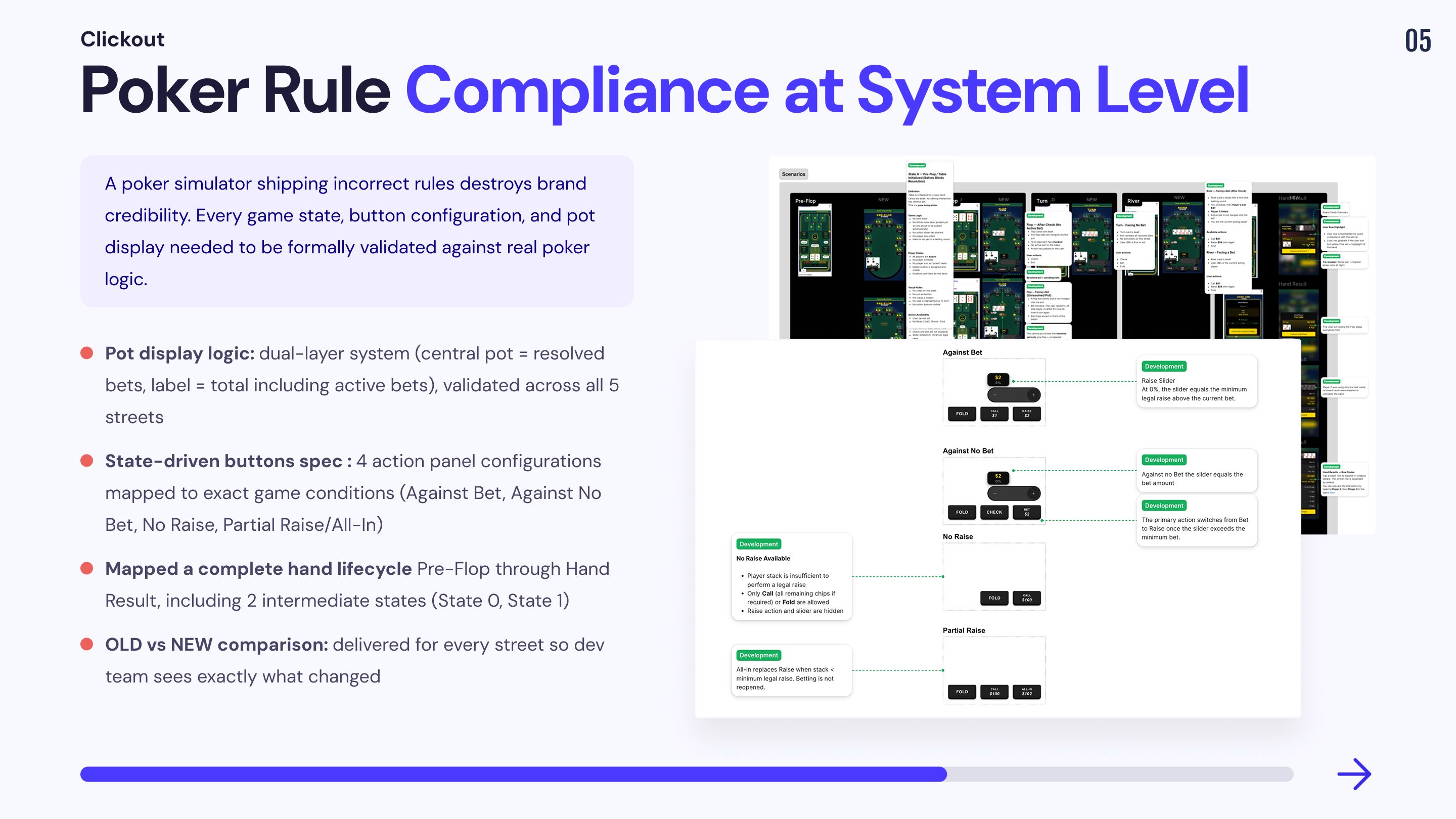
Mission 4: Poker rule compliance at system level
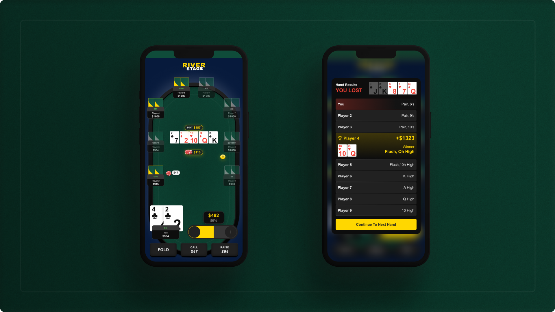
A poker simulator that ships incorrect game states teaches wrong behaviour and destroys credibility. The original build had no formal state architecture. I designed a complete game state system covering every street, every action availability rule, and every pot display logic, validated frame by frame against Texas Hold'em rules.
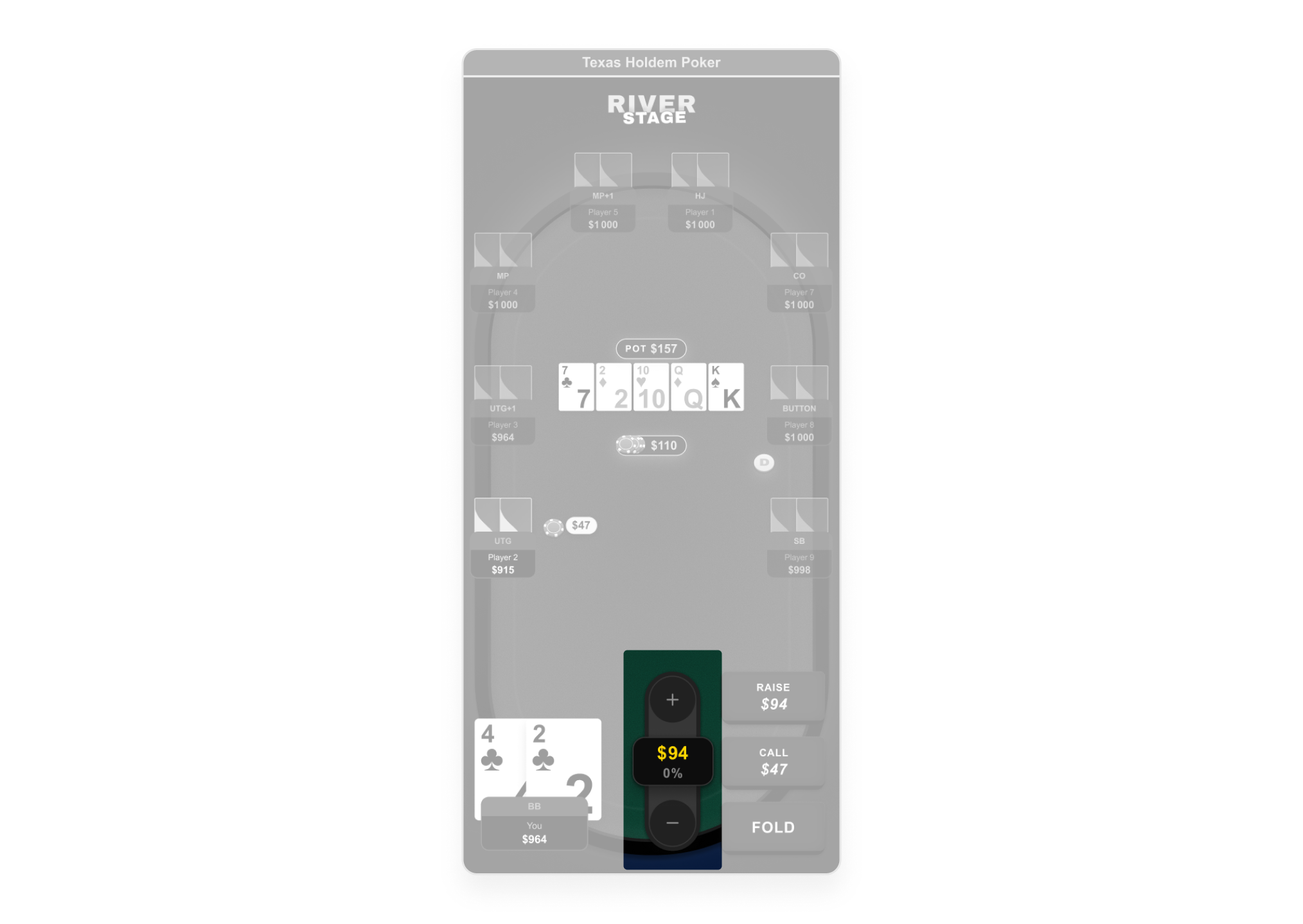
1. Pot display logic: resolved vs. active bets
📔 Context
Pot display in poker is not a single number it represents different things depending on the betting phase. The original build displayed a single pot number with no distinction between resolved and unresolved bets, creating visual confusion about the actual pot size.
🚨 Problem
No visual distinction between resolved pot and active bets. Players couldn't tell whether the pot number included the current bet they were facing.
💊 Solution
Designed a dual-layer pot display system validated across all 5 streets: central pot chips = resolved bets only, pot label = resolved + active bets (total amount winner would take), active bet chips = displayed in front of each player, physically separated from central pot.
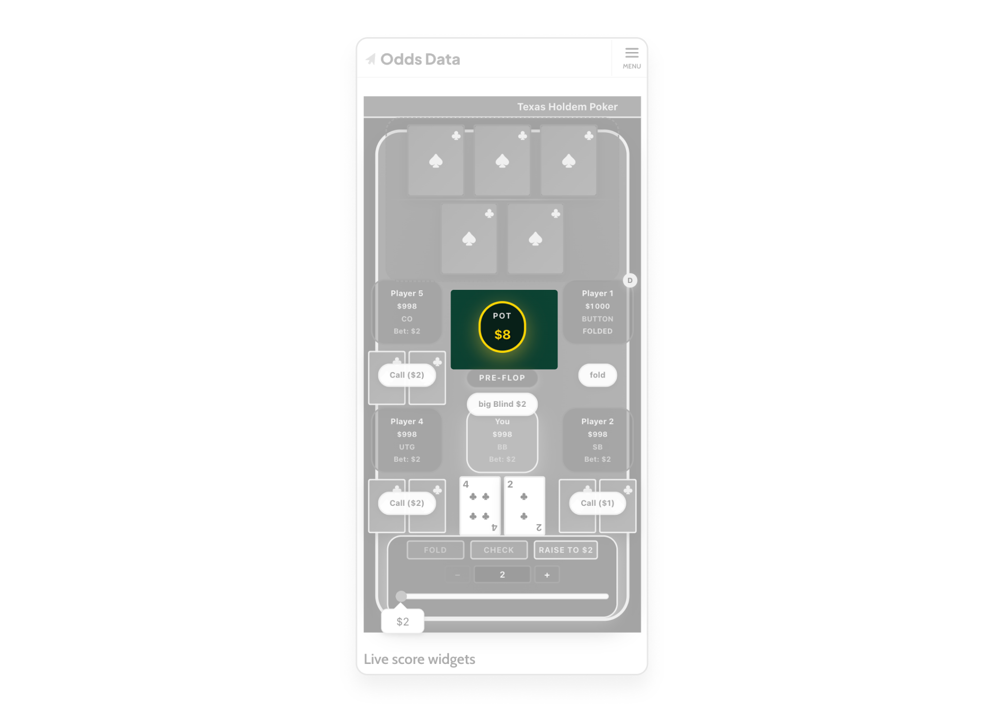
2. State-driven button logic
📔 Context
Which buttons appear on screen is not a UI decision, it is a poker rule. The original build got this wrong. I designed an explicit state matrix that engineering could implement as a lookup table instead of guessing.
🚨 Problem
Check button available when a live bet existed and created illegal action. No formal logic connecting game state to button availability.
💊 Solution
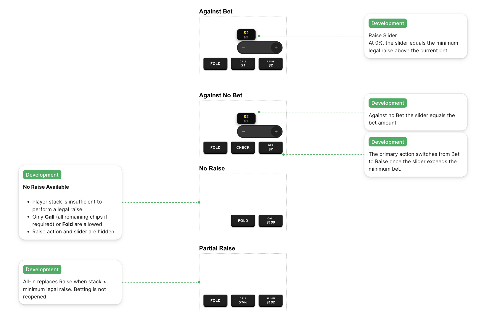
Documented all 4 action panel configurations: Against Bet (Fold/Call/Raise), Against No Bet (Fold/Check/Bet), No Raise (Fold/Call only), Partial Raise/ALL-IN (Fold/Call/All-In). Each maps to an exact game condition. Dev team implements a state lookup, not a chain of assumptions. Validated across all game states in the scenario strip. Behaviour prototyped as an interactive Figma spec devs see the exact label switch moment, not just the rule.
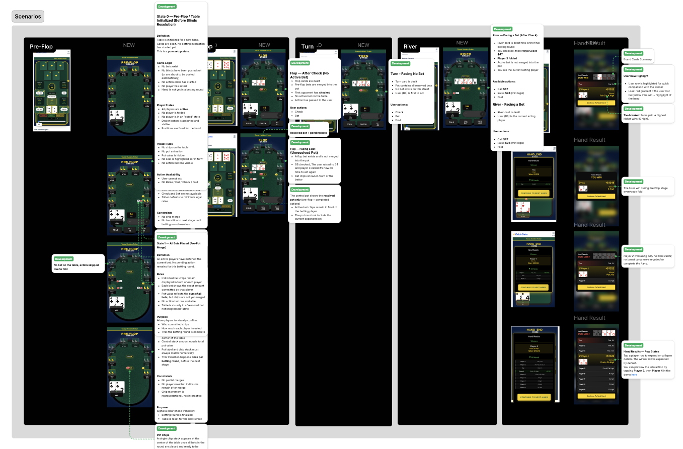
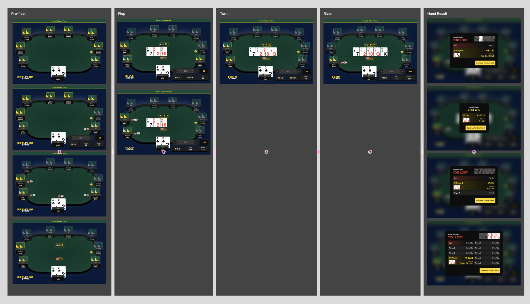
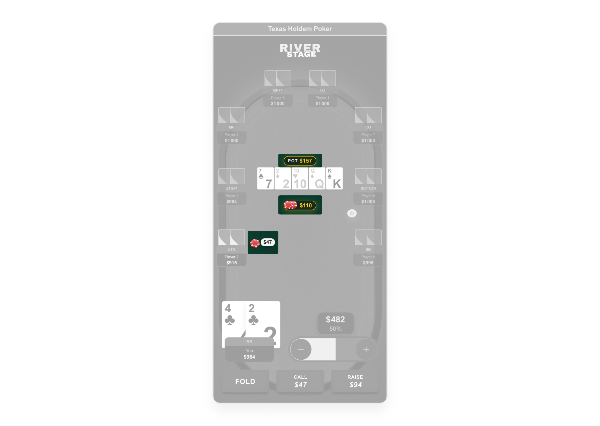
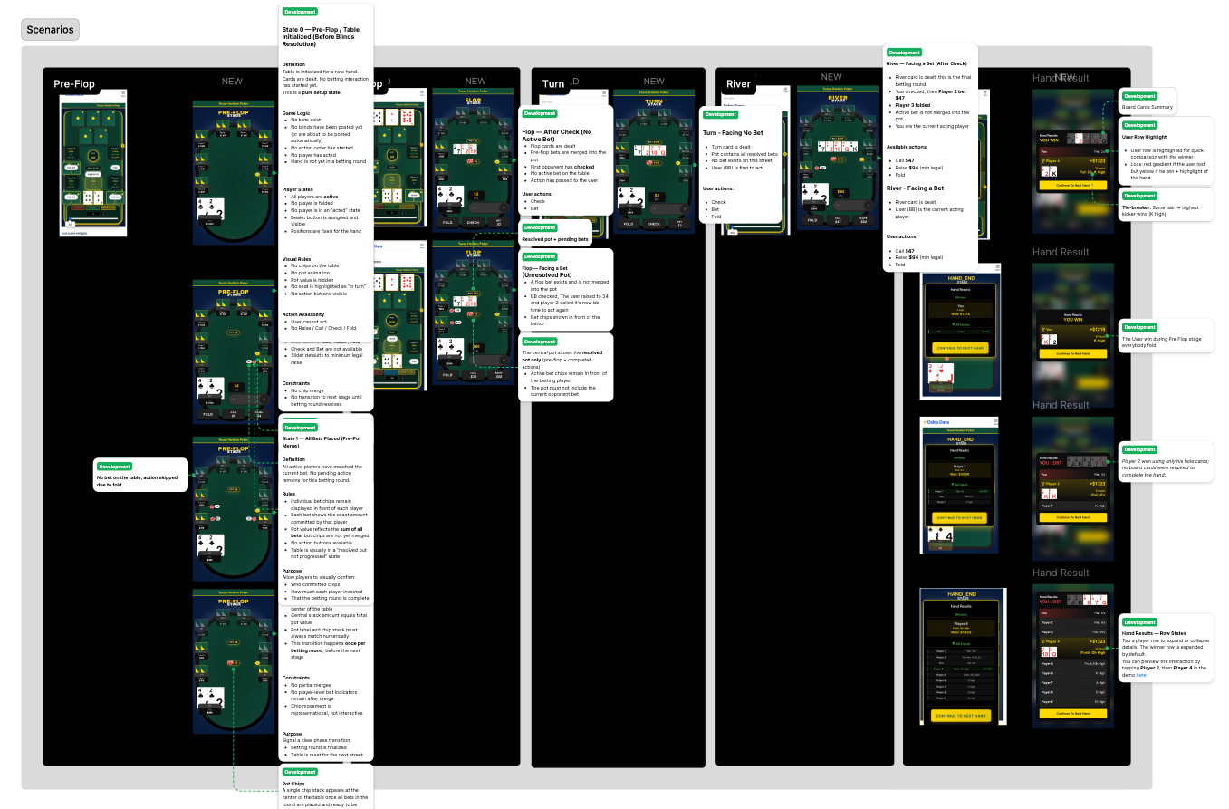
3. Scenarios: full hand lifecycle validation
📔 Context
Each poker street (Pre-Flop → Flop → Turn → River → Result) changes what the player sees: new board cards, bets merging into the pot, action resetting to the first active player. The original build had zero documentation for any of these transitions. Developers were guessing what the UI should display at each stage.
🚨 Problem
No formal spec defining what the table looks like at each stage. Developers implementing transitions without understanding game state changes.
💊 Solution
Designed 14 game state frames covering the complete hand lifecycle: Pre-Flop (6 frames), Flop (2), Turn (1), River (1), Hand Result (4). Two critical intermediate states formally specified — State 0 (table init, zero state) and State 1 (pre-pot merge) — states developers would typically skip or hardcode incorrectly. OLD vs NEW comparison delivered for every street.
Key Results
Product rescue delivered in 1.5 months. From broken prototype to production-ready system, shipped on mobile and desktop.
Session depth (target: 3+ hands/visit) · Return visit rate · Affiliate CTA click-through from result screen · Dev implementation fidelity vs. Figma specs
Outcomes
Process constraints