🕹️ Poker Odds Calculator - SEO Growth Tool for PokerScout
ClickOut Media
2
months
Solo Designer , Product SEO Director, PM, 3 Engineers
SEO Growth Tool on Affiliate Platform
Capture high-intent organic traffic across 5 poker variants that editorial pages cannot rank for. Increase on-page session depth from ~45s (editorial average) to 3-6 minutes through interactive engagement. Create a measurable conversion path from tool usage to poker room sign-ups via contextual affiliate modules. Reduce future development cost by shipping one scalable component system serving all 5 variants. Deliver implementation-ready specs (animation curves, responsive breakpoints, validation logic) eliminating design-dev interpretation gaps.
Remote from Bangkok (GMT+7) with structured async handoff across EU timezone.
Mission 1: Interaction Design & Edge Cases
Poker players use tools one-handed on mobile, between hands, under time pressure. The UX needed to match this reality: fast card selection, clear Win/Tie % output, and robust error handling across 5 variants with different rules. Every edge case (minimum players, maximum per variant, dead cards, reset) needed explicit handling with clear feedback.
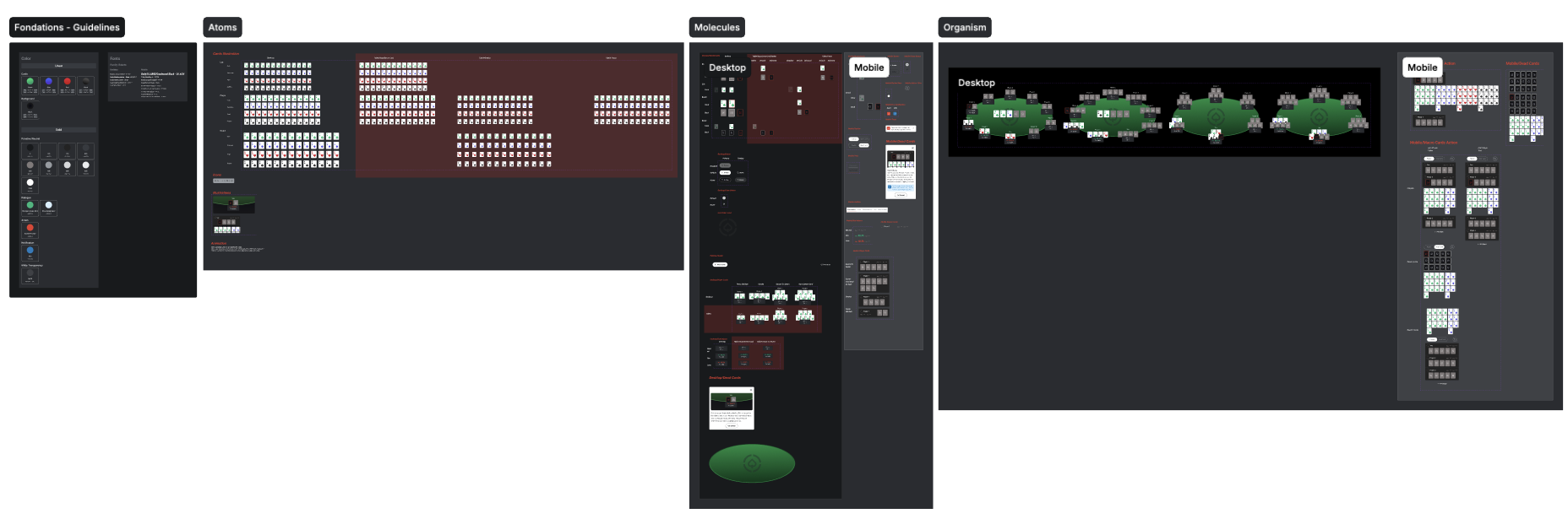
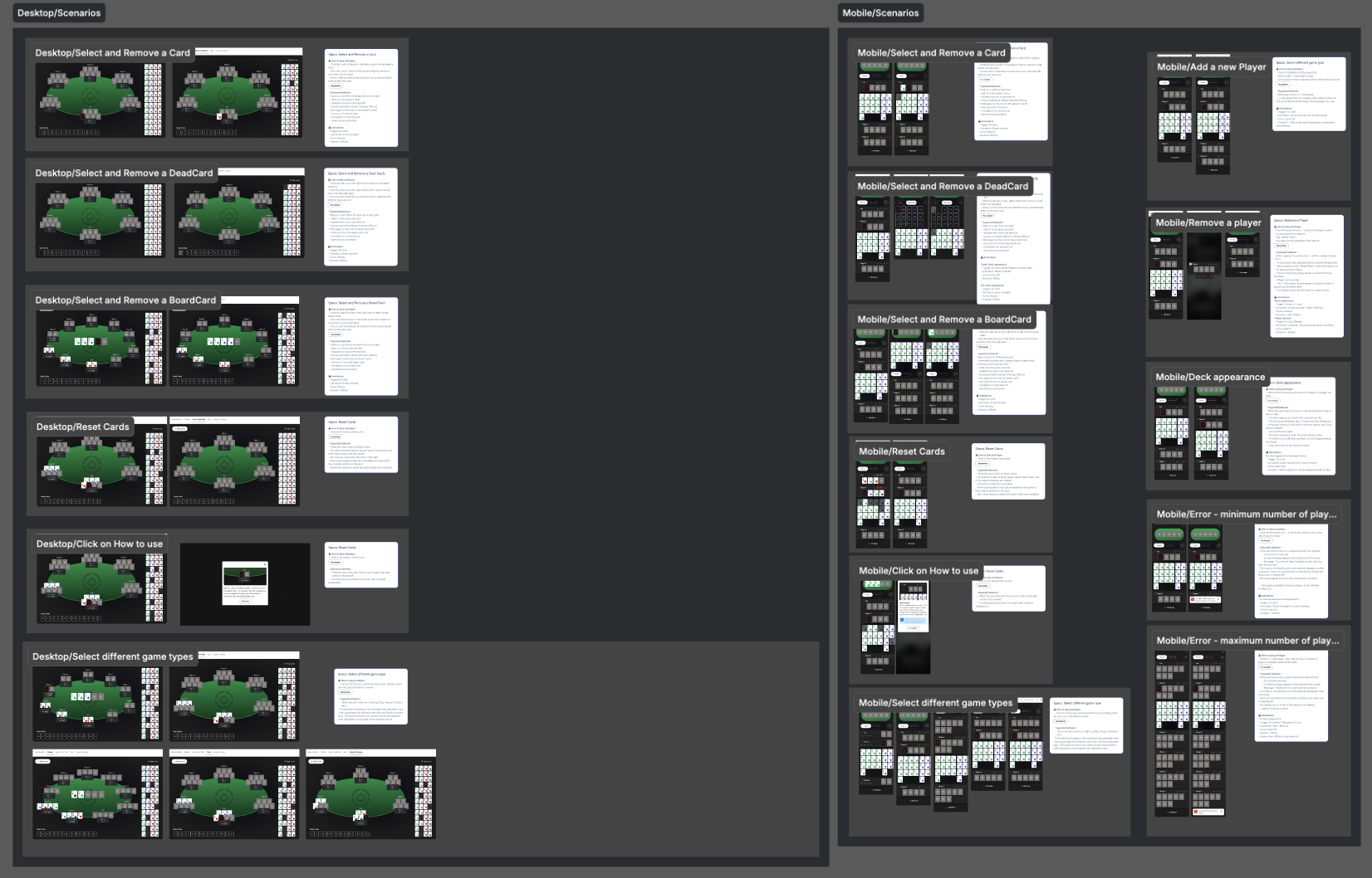
1. Component architecture: 1 system, 5 poker variants
📔 Context
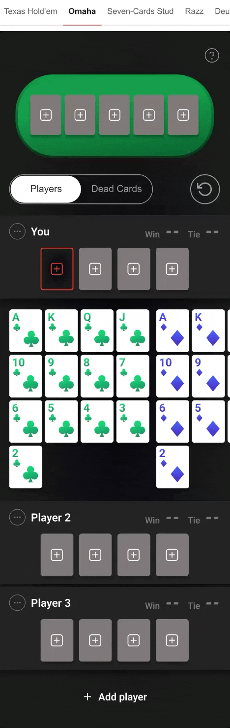
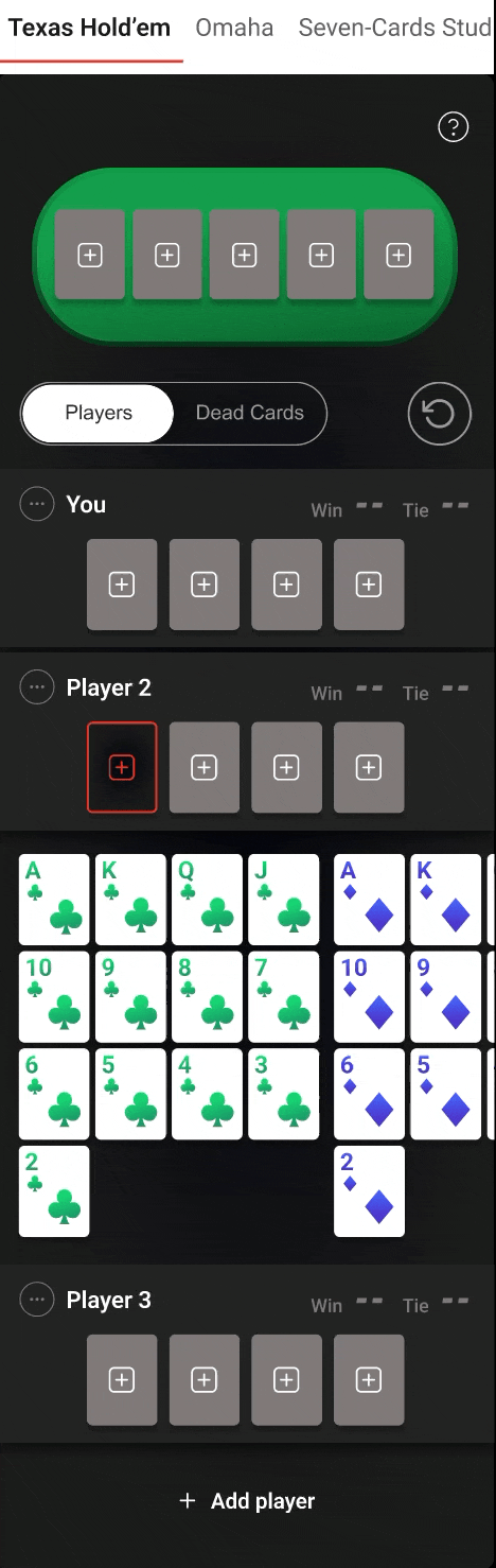
A multi-variant poker tool has a specific color challenge: 4 card suits need to be instantly distinguishable at small sizes on both light and dark backgrounds. Typography must work at table-view scale (10 players, percentages per player) and mobile card-picker scale. The brief started with Texas Hold'em only, but PokerScout covers 5 variants editorially (Omaha, Seven-Card Stud, Razz, Deuce-To-Seven), each with different card counts, player limits, and hand evaluation rules. Building 5 separate tools would multiply dev cost and design debt. The component library needed to serve all 5 variants, 3 platforms, and multiple interaction states per element from day one.
🚨 Constraints: Competitors failed to deal correctly with the different game types

💊 Organism: 1 template, 5 variants
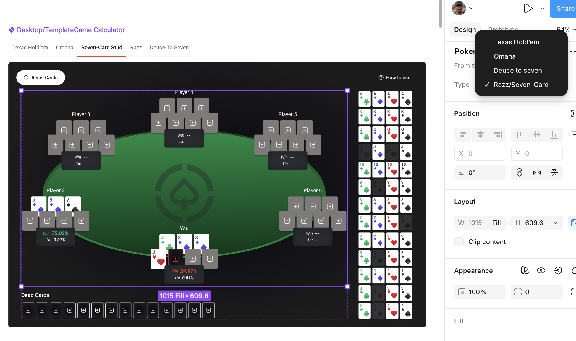
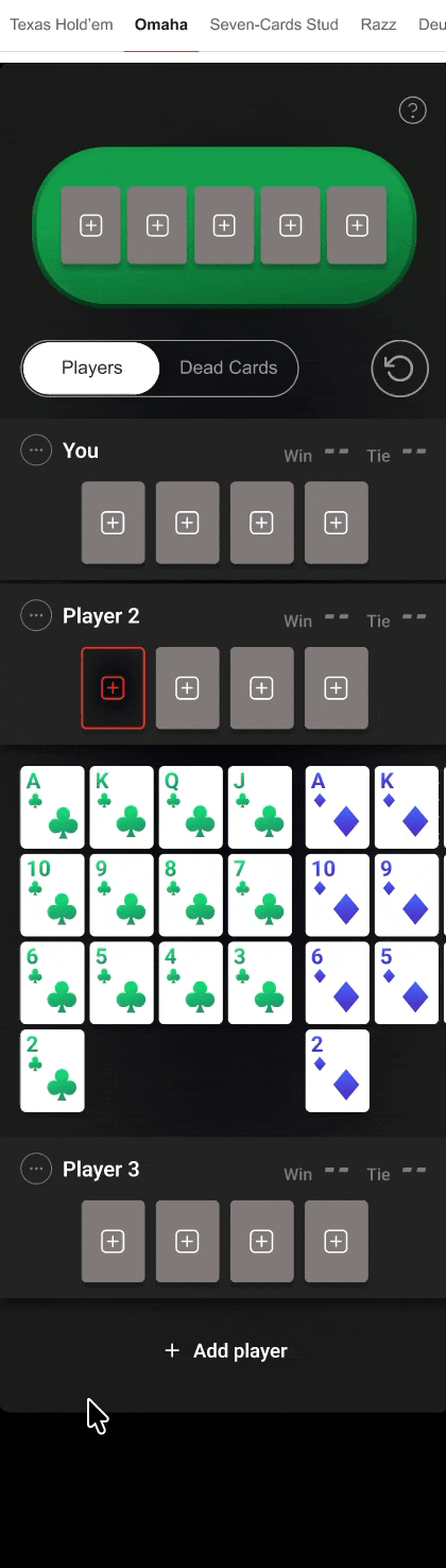
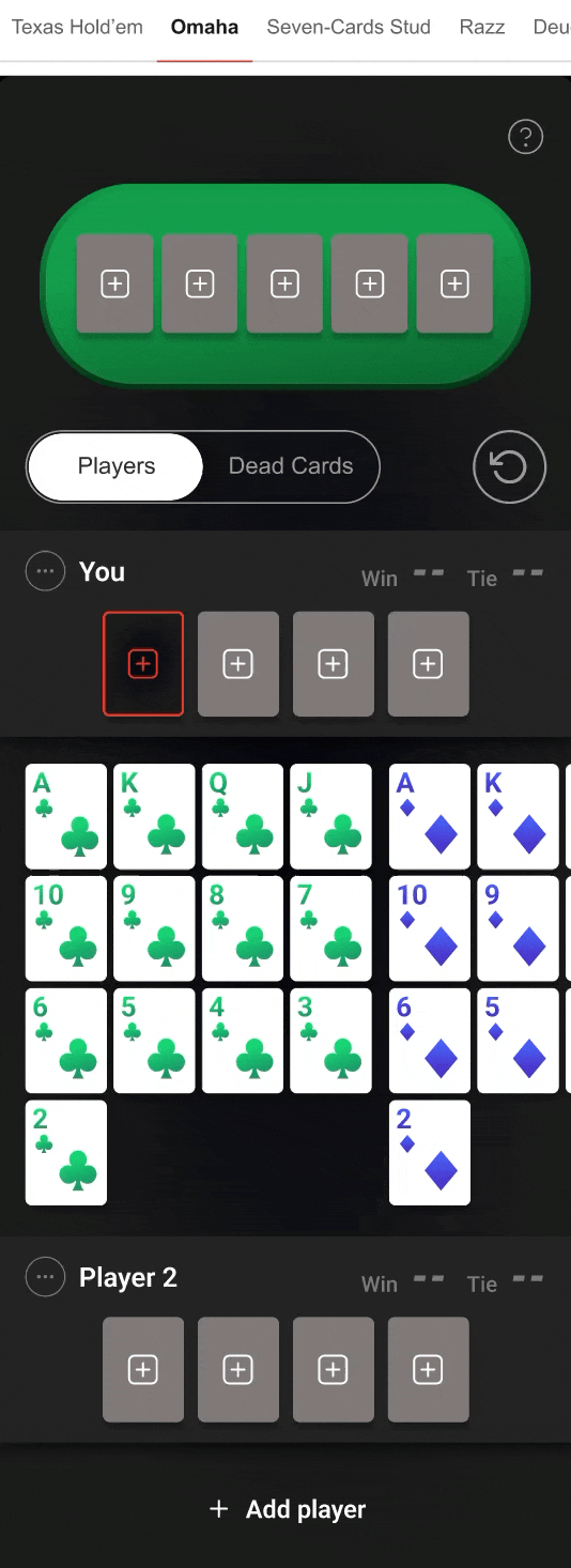
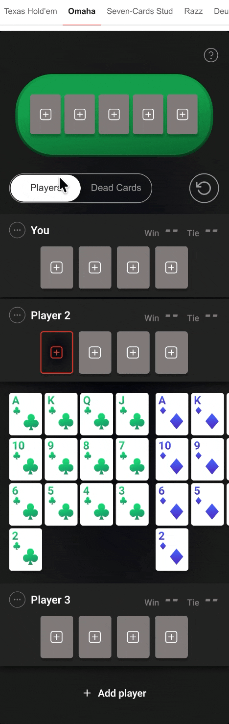
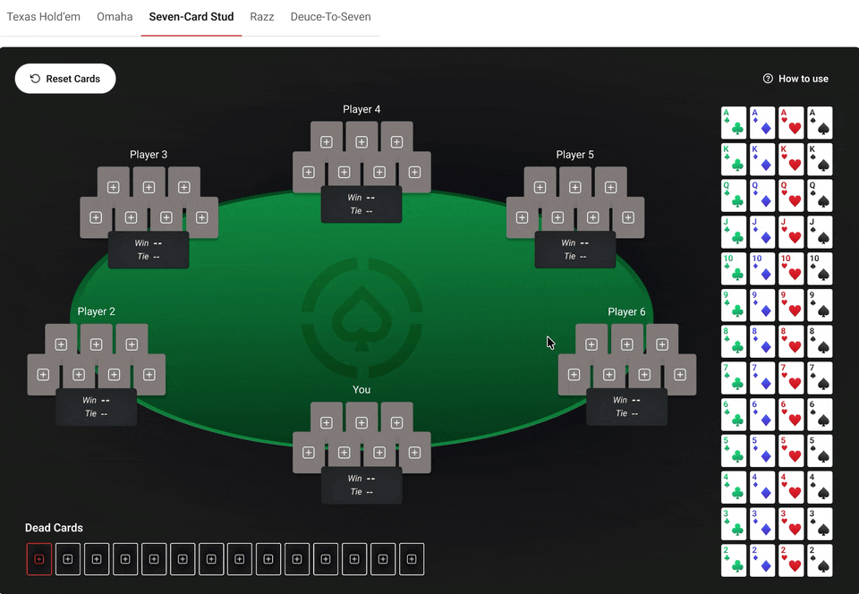
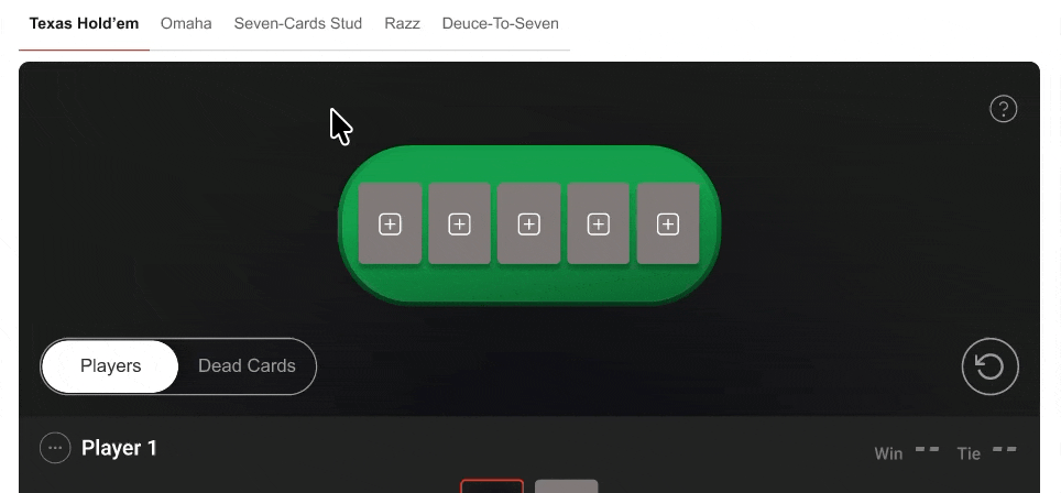
Single Template layout with configurable zones: player hand slots, board card slots, and deck all adapt to variant rules. Top navigation tabs switch calculation engine and card rules while keeping interaction model consistent. One component library in Figma serves all 5 variants through variant properties, not duplicated frames.
2. Designing card selection
📔 Context
With the component architecture defined, the next challenge was the core interaction: how users select and remove cards. The dominant competitor pattern is a two-step selection flow (click empty slot, pick from separate panel or dropdown). On mobile, most competitors escalate this into a full-screen modal that blocks visibility of the table entirely.
🚨 Problem
| Competitor | Desktop | Mobile |
|---|---|---|
| Casino.us | Double action to remove a card: click card, then click small X icon. Two gestures for one intent, creating friction during fast multi-hand setups | Full-screen modal blocks odds display entirely. Cannot remove a selected card while in modal. Must close modal, return to main screen, locate the card, then delete it |
| PokerListings | No critical card selection issue identified on desktop | Full-screen modal blocks odds. Close/remove button sits adjacent to Reset Cards CTA and card slots, creating miss-touch risk. Global Reset Cards placed below Add a player, requiring scroll |
| PokerNews | Results displayed in statistical table format. Users need to know poker hand names, then cross-reference with board state to understand who is winning | Semi-transparent overlay (70% opacity), odds completely hidden. Separate "Stats" CTA required to view any results |
| Omni Calculator | Form-style dropdowns for rank and suit as separate inputs. Zero visual representation of the deck | Same dropdown pattern on mobile. Slowest possible interaction on touch devices |
💊 Solution
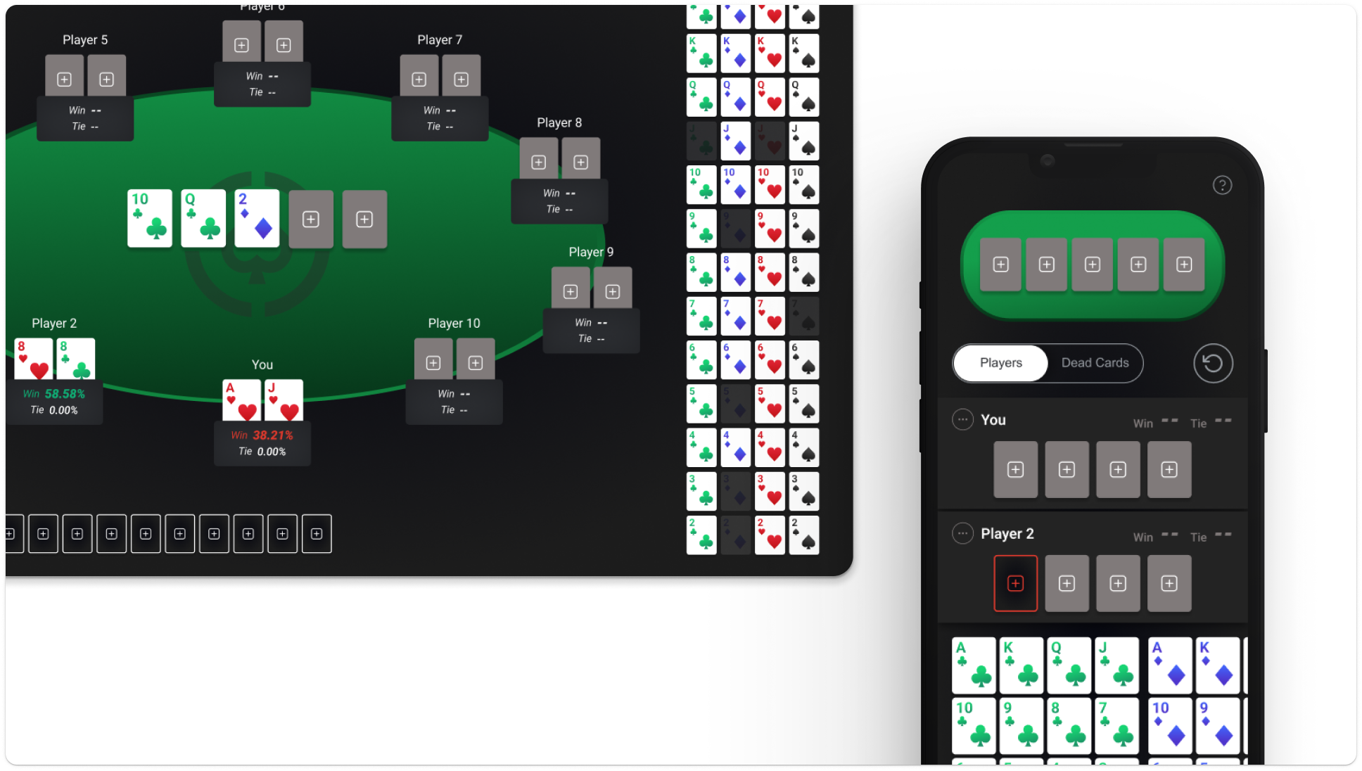
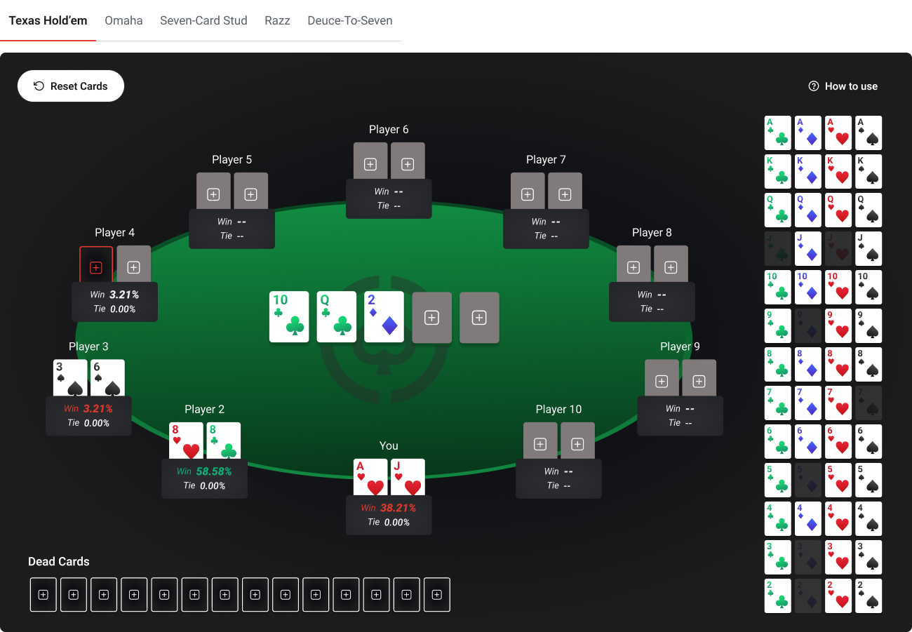
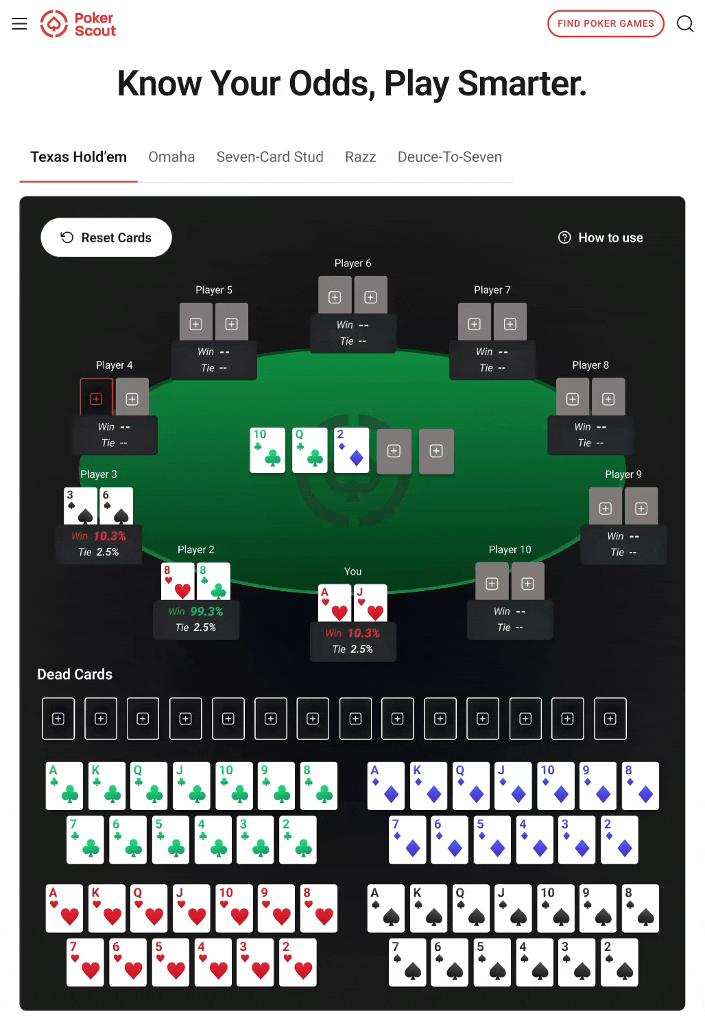
Designed a full 52-card visual grid that eliminates the modal isolation pattern found in Casino.us and PokerListings.
Desktop

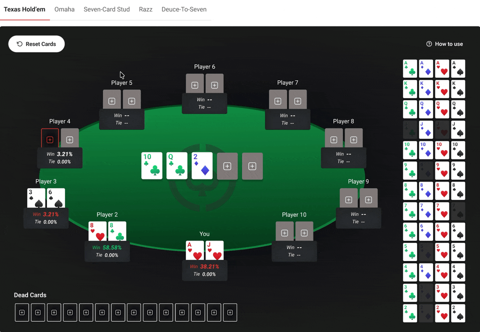
The deck grid sits permanently beside the table: no overlay, no panel switch. The user sees odds update in real time as cards are selected, solving the visibility gap that every competitor creates with their separated selection flows.
Mobile
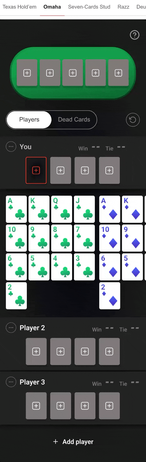
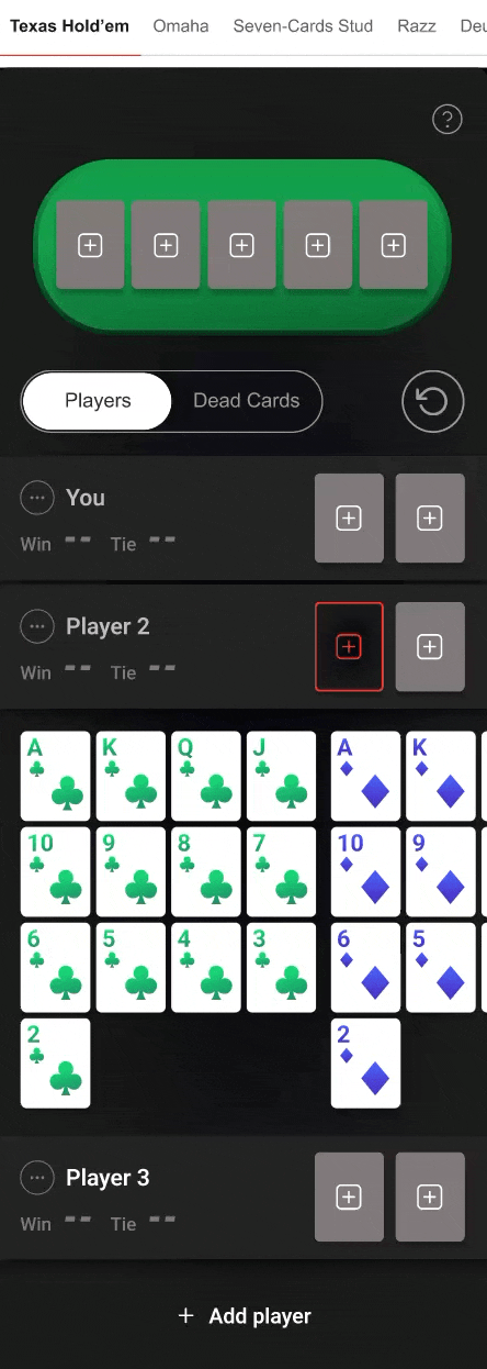
The deck appears inline within the lower 60% of the viewport, keeping the player list and Win/Tie % visible above. Single-tap model inspired by PokerListings' desktop pattern, extended to mobile. On selection, the card animates into the player slot and focus auto-shifts to the next empty slot. Removal is also single-tap. One gesture replaces every multi-step flow identified in the benchmark.
3. Focused output: Win % and Tie %
📔 Context
Poker calculators often overload the interface with secondary metrics (outs, pot odds, equity ranges). For a tool designed for real-table use between hands, the output needs to answer one question fast: "what are my chances?"
🚨 Problem
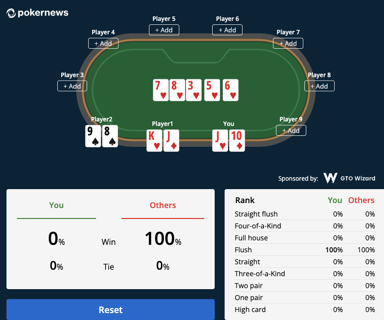
Some competitors like Poker News display results in a statistical table where users need to know poker hand names (flush, straight, full house) and cross-reference them with the board state to understand who is actually winning. Not immediately readable for casual players
💊 Solution
Mobile
The player deck appears below the player's card list, keeping the Win and Tie percentages and opponent hands always visible
Desktop
Win % and Tie % as the only output metrics, displayed large and immediately after calculation. No secondary metrics cluttering the result area. The interface stays focused on the one answer every player needs, from beginner to experienced. Result display is compact enough to remain visible without scrolling on mobile, keeping the card picker accessible for the next hand. This scoping decision also reduced dev complexity: one calculation output to build and validate per variant, not a matrix of derived metrics.
4. Dynamic player management and error handling
📔 Context
Poker odds calculations depend on how many hands are in play. Users need to add or remove opponents mid-session. Without clear feedback, users hit dead ends and bounce.
🚨 Problem
| Competitor | Mobile player management issue |
|---|---|
| Casino.us | Small X icon to remove a player, poor affordance on touch target. No contextual menu, no confirmation |
| PokerListings | Close/remove button adjacent to Reset Cards CTA and card slots, miss-touch risk. Global Reset Cards below Add a player, requires scrolling |
| PokerNews | Close button too close to rightmost card selection slot. Miss-touch can suppress a player without intent |
No competitor implements variant-aware validation: adding beyond the variant's maximum or removing the last opponent produces silent errors or broken results. Variant-specific limits (10 for Hold'em, 6 for Stud) are never communicated to the user.
💊 Solution
Mobile
Three-dot contextual menu per player row replaces bare X icons, creating spatial separation from card slots and eliminating miss-touch risk. On mobile, removing a player collapses the row, surfacing the Add a player CTA and giving visibility on the actual number of players at table without scrolling.
Desktop

5. Dead Cards management
📔 Context
In poker variants like Seven-Card Stud, players can see exposed cards from other players' hands. Marking these as "dead cards" changes the odds calculation significantly. This is a feature experienced players expect.
🚨 Problem
None of the 4 benchmarked competitors offer dedicated Dead Cards management on either desktop or mobile. The feature is either absent or collapsed into the same generic dropdown inputs used for hand selection.
💊 Solution
Mobile
Dead Cards tab on mobile shows a dedicated row of empty slots with the full deck below.
Desktop
On desktop, the Dead Cards row sits below the table permanently visible, no toggle needed.
Visual card picker replacing dropdown inputs, increasing engagement signal for SEO dwell time. Focused Win/Tie % output keeping the interface fast and accessible for all player levels. Dynamic player management with variant-specific validation (Hold'em 10 max, Stud 6 max). Dead Cards with global card state preventing duplicates across the entire 52-card deck. Every edge case handled with non-blocking toast feedback, zero dead-end states.
Mission 2: Cross-Platform Delivery & Dev Handoff
The tool needed to work across 4 breakpoints (desktop, tablet, mobile vertical and horizontal mode), with every interaction spec'd precisely enough for a dev team 6+ hours away to implement without synchronous overlap. The conversion layer (affiliate modules) needed to integrate seamlessly into the full PokerScout page, not bolted on as an afterthought.
1. Dedicated design per device
📔 Context
Poker odds calculators are used both during live play and for post-session analysis, on whichever device the player prefers. Each screen size creates different layout constraints for the same set of interactions: card selection, player management, result display.
🚨 Problem
💊 Solution
Each device (desktop, tablet, mobile portrait, mobile landscape) received its own dedicated design with component size variations and states adapted to the available space. The calculator sits below the site header, so it is not fully visible above the fold on initial load. Once the user scrolls to it, each layout ensures the complete game with all its features is visible without further scrolling. On mobile the space is more constrained but the layout was optimized to minimize scroll for core actions.
Desktop layout
Tablet layout
Landscape mobile layout
A dedicated landscape layout was designed to maintain full functionality in horizontal orientation. The table, card picker, and player list all reflow to use the wider viewport without requiring scroll for core actions.
Vertical mobile layout
2. Animation specs for dev handoff
📔 Context
Micro-interactions in a card game tool are not decorative. They confirm selections, signal state changes, and reduce cognitive load during fast-paced use. Without precise specs, developers guess at timing and produce inconsistent behavior.
💊 Solution
Every interaction documented with trigger, animation type, curve, and duration. Both desktop and mobile spec sheets delivered.
| Interaction | Animation | Curve | Duration | Detail |
|---|---|---|---|---|
| Card selection/deselection | Smart Animate | Bouncy | 800ms | Auto-focus shift to next empty slot |
| Deck appearance | Smart Animate | Ease Out | 400ms | |
| Dead Cards tab switch | Smart Animate | Ease Out | 400ms | |
| Board card selection | Smart Animate | Bouncy | 800ms | Auto-focus shift to next empty slot |
| Contextual menu | Fade + Slide Up | Dissolve | 300-400ms | |
| Player removal | Collapse | Ease In | 400ms | |
| Toast notifications | Fade + Slide Up | Ease Out | 300ms | Auto-dismiss 4000ms |
| Reset Cards | Simultaneous return | Ease In | 100ms | Clears disabled states, restores deck |
Cross-platform delivery across 4 breakpoints including dedicated landscape mobile layout. Full animation spec sheets per platform with interactive Figma prototypes. Async-first handoff documentation enabling zero-loss collaboration across 6h+ timezone gap.
Key Results
SEO growth tool delivered in 2 months. From standard calculator brief to three-layer growth asset, shipped across 5 poker variants and 4 breakpoints.
Outcomes
Process constraints