🍸 Archipelago - Design System for Pernod Ricard
Pernod Ricard
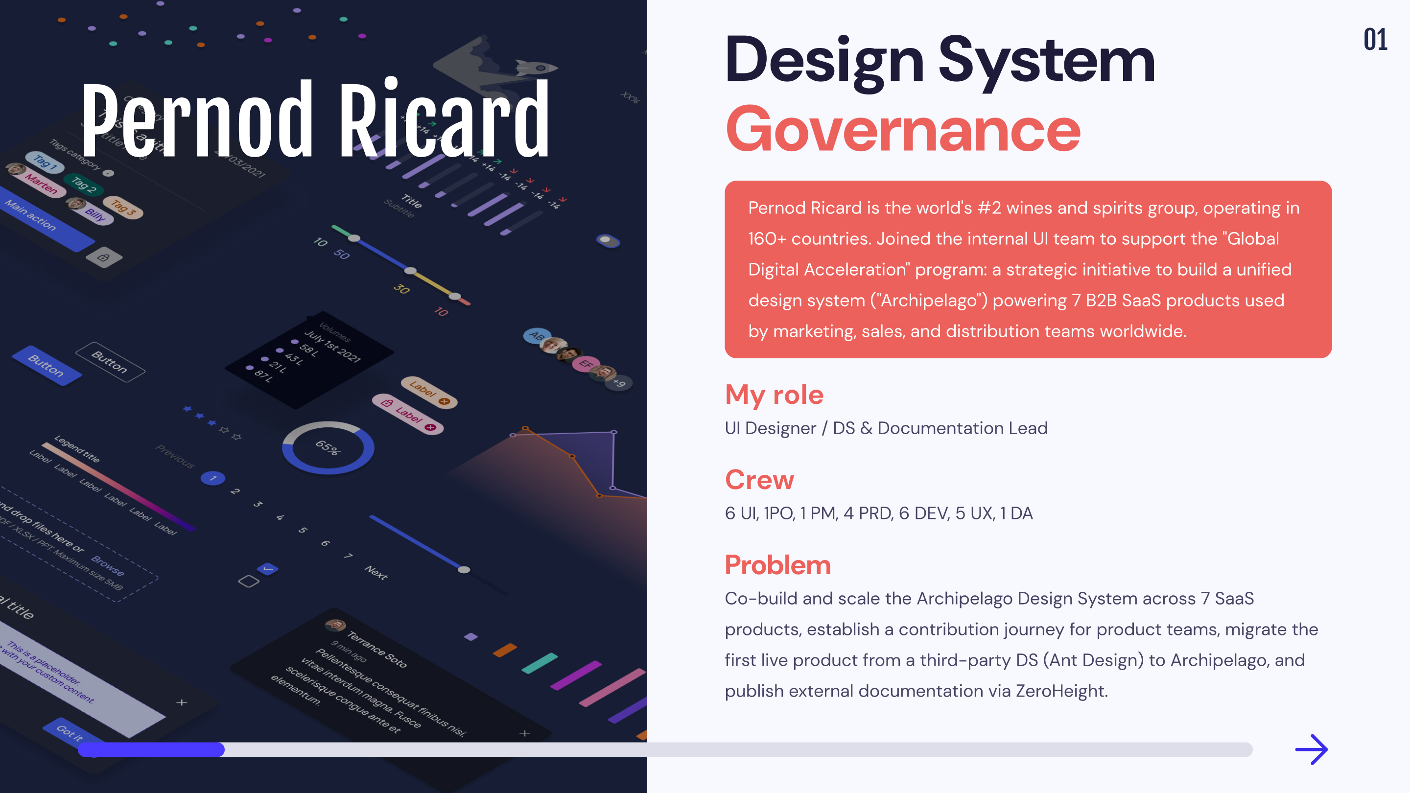

1,6 years
6 UI, 1PO, 1 PM, 4 PRD, 6 DEV, 5 UX, 1 DA
1 DS &
3 SaaS
Build a Design System for Pernord Ricard. Ensure the hand-off on the different products. Create a documentation source.
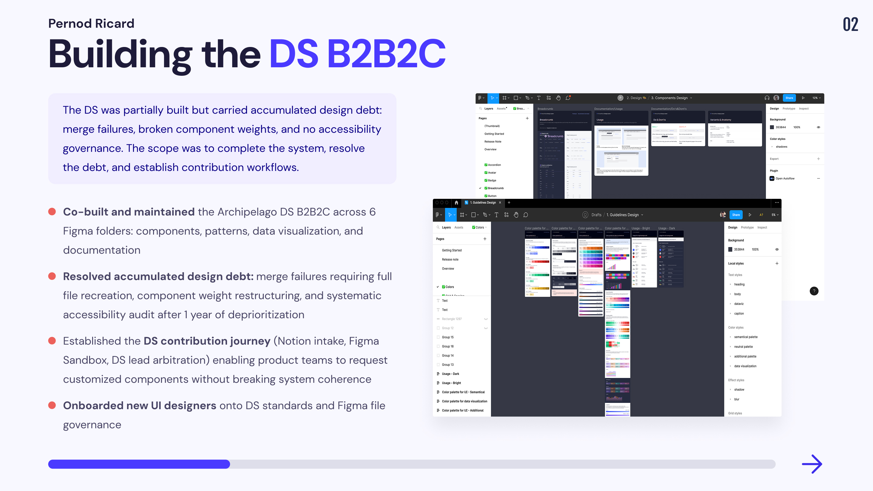
Mission 1 : Co-construction of the “Archipelago” Design System B2B2C
When I was asked to join the team, a good part of the design system had already been built. It was first created by an external agency and then handed over to the UI team dedicated to the design system of Pernod Ricard. The company needed me to reinforce its UI team because many projects were still to be done.
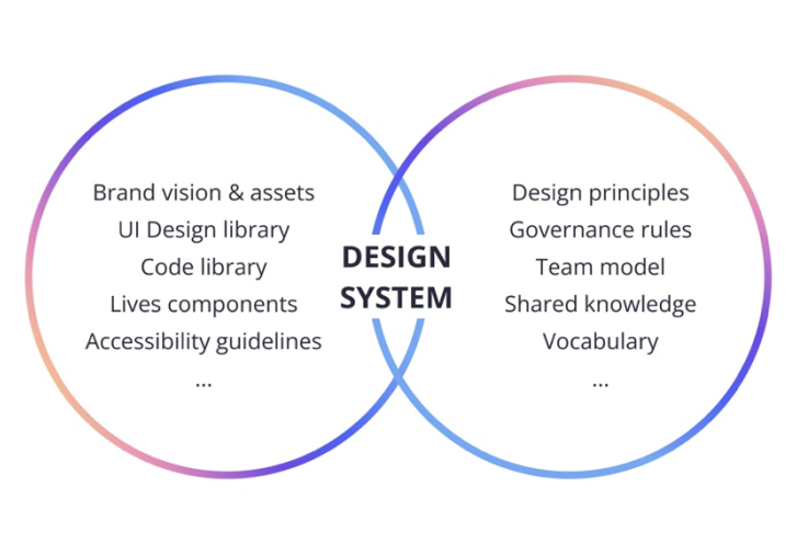
Design System
The design system is a collaborative work tool that brings together all the essential components for the conception of a digital project. The design system is a real reference system that allows you to homogenize all the graphic, design and technical elements of a digital interface.
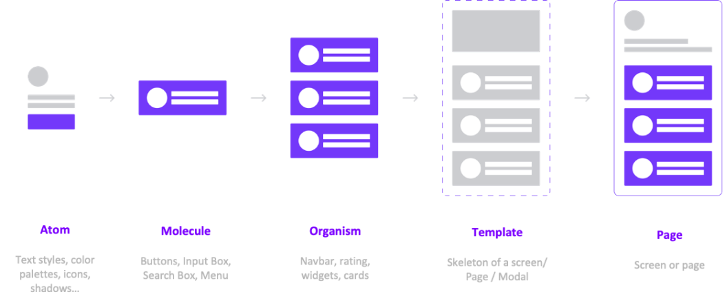
Atomic Design
The concept of Atomic design was created by the webdesigner Brad Frost. It is a biological metaphor, which proposes to divide the elements of the interface into 5 levels:
Our Organization
Pernod Ricard's design system is built on Figma and works on the concept of atomic design. In order to understand my mission as a UI Designer within Pernod Ricard, it is important to explain our organization on the Figma file.
🗄️ Teams
Pernod Ricard's digital transformation effort revolves around 7 main digital products that are connected to its one-of-a-kind "Archipelago" design system. We divided our workplaces into "Teams" in order to better organize ourselves, with each Team having its own Key Digital Product :
Revup
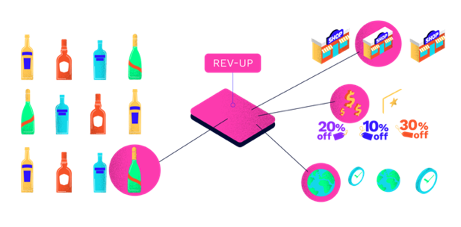
Optimizing retail promotional efficiency empowering Key Account Managers and Trade Marketing teams.
Extract
SAAS tool dedicated to collecting and validating data reported by markets working with advertising and promotional spend (data can come from digital media, traditional media, L3F (On-Trade & Off-Trade) & Brand Experience).
Matrix
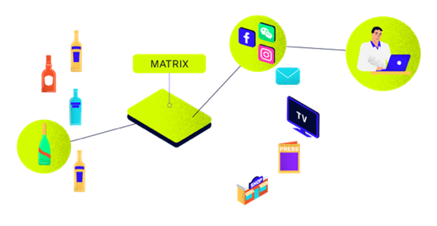
A tool to help decision-makers optimize Advertising & Promotion (A&P) investment allocation across brands and touchpoints.
D-Star
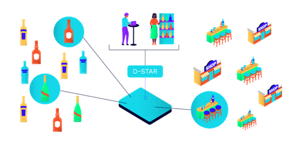
Empower Sales Teams with the right actionable insights & recommendations, deploying the right resources at the right time, in the right accounts with the right tools.
Direct Trade (Direct to Consumers and Trade Professionals)
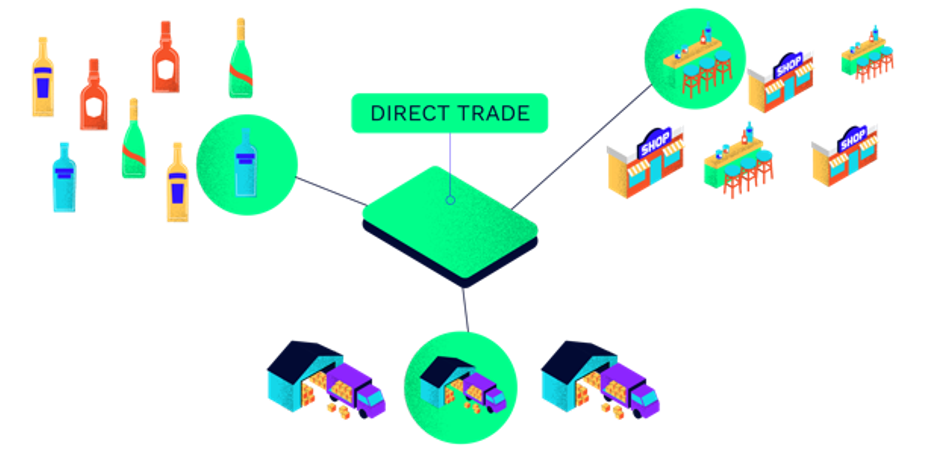
Scale the Drink’s&Co MarketPlace for consumers. Expand our route to market by connecting and creating a direct relationships with small bars and liquors shops.
Maestria
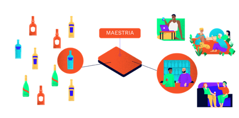
A tool to leveraging real-time data and predictive analytics to better understand the drivers and barriers along our cousumer’s and shoppers’ path to purchase.
We also established an Archipelago team within our Figma in order to segregate our design system from the KDP.
The company is a subscriber to the Figma organization plan, which enables us to establish hierarchies for categorizing our files inside teams. For instance, if one navigates to the "Team Archipelago repository", they can view a number of folders that have their own files and files that have a particular number of pages.
Open the accordion to better understand the structure of our organization.
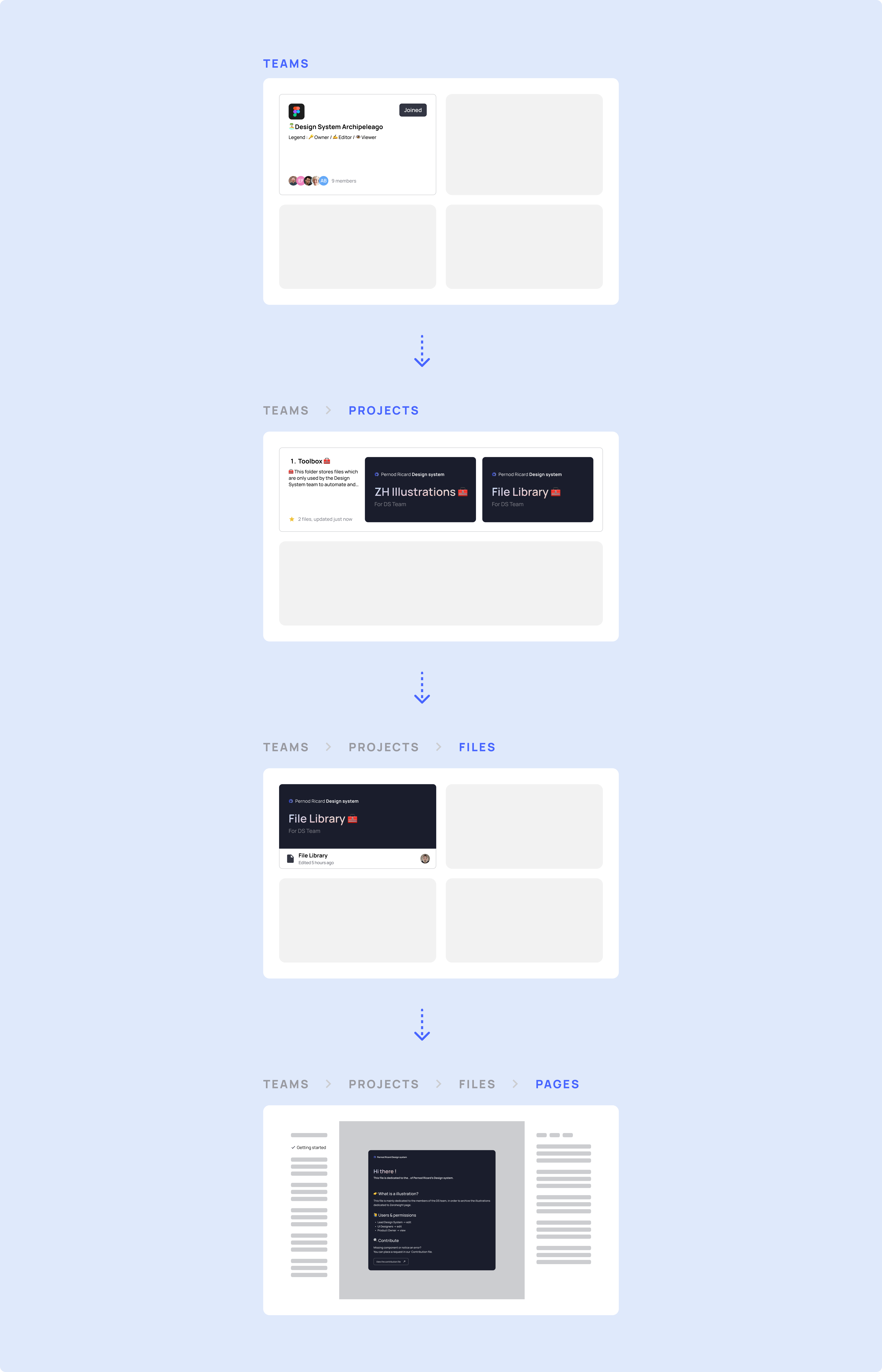
🗃️ Folders
The Archipelago Design System is composed of 6 folders and I participated in their construction
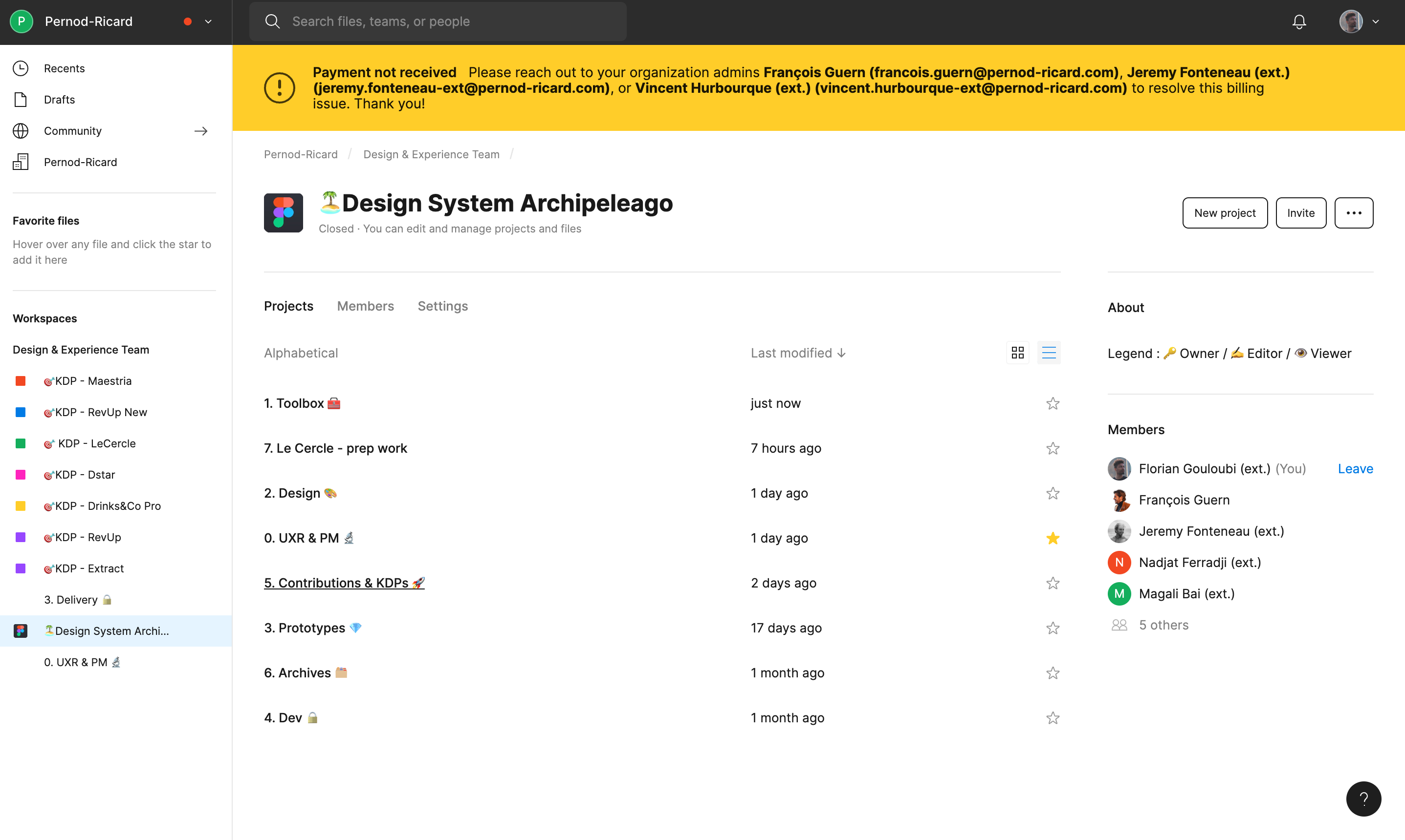
🗃️ Toolbox
That folder contain files that are used to automate and list all the visuals, components, or templates necessary for the documentation work.
📁 File Libray
This file is dedicated to the documentation necessary for the design system
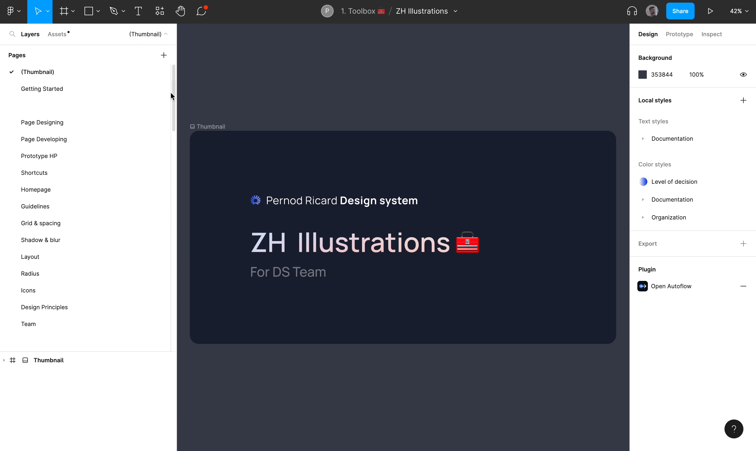
📁 ZH Illustrations
This file is dedicated to build illustations four our Zeroheight pages.
🗃️ Design
That folder contain files that are used to build guidelines, patterns, components & data visualization in the product. Pernod Ricard’s design system uses Atomic design, so the components are created using this method.
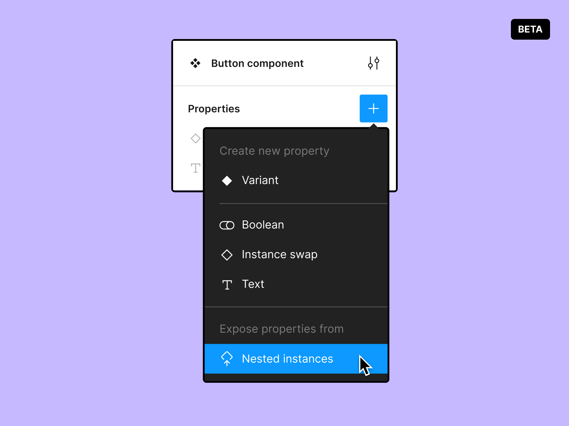
❖ sign refers to the main component that you will especially need to design your screen
◆ sign refers to the atoms that make up the main component.
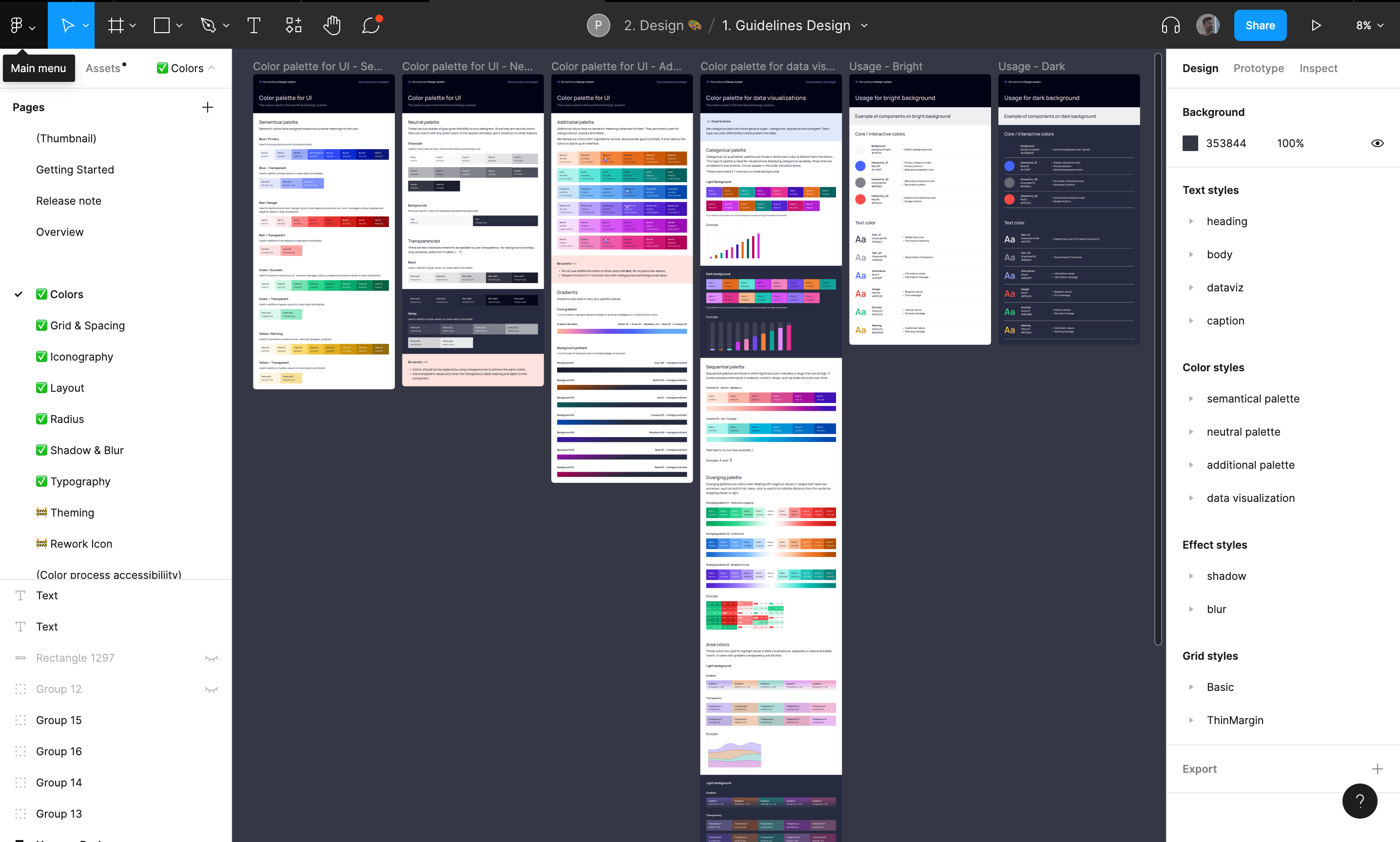
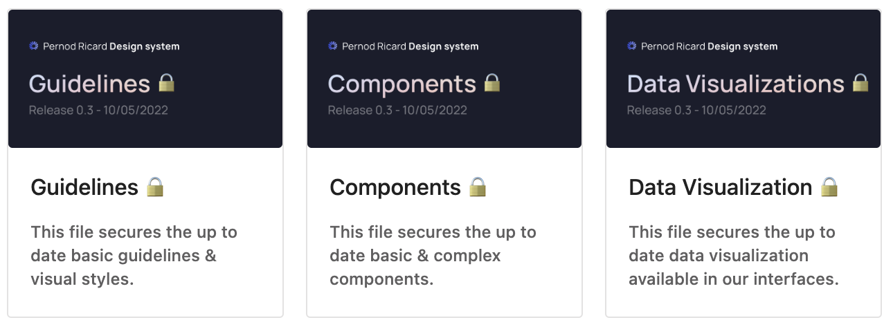
📁 Guidelines
This File is dedicated to the basic guidelines & visual styles
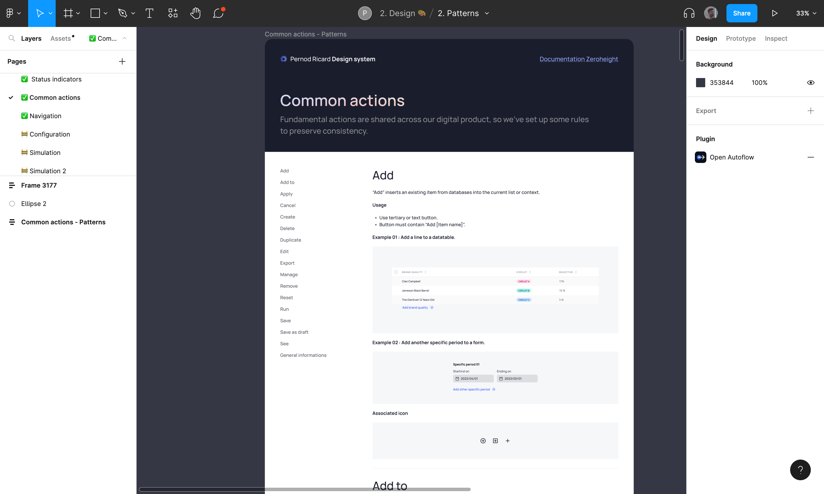
📁 Patterns
This file is dedicated to the patterns, interactions & common behaviours.
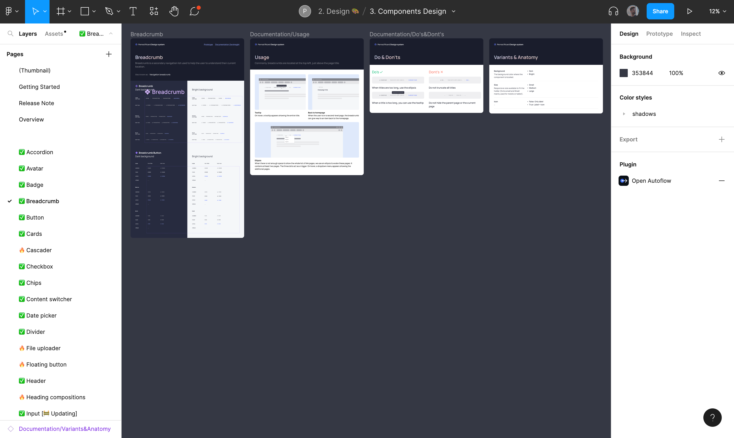
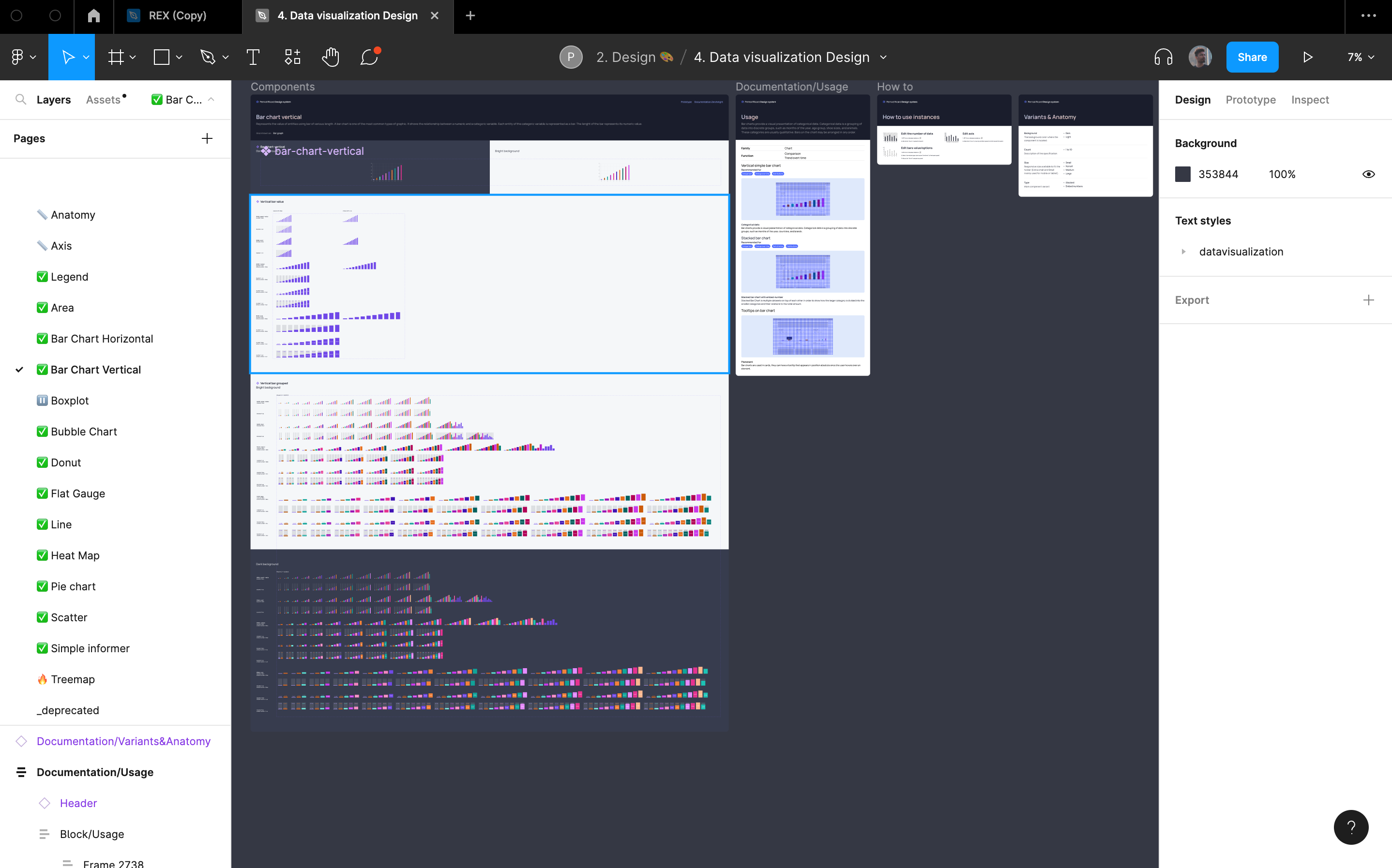
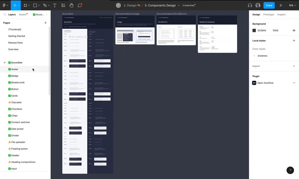
📁 Components
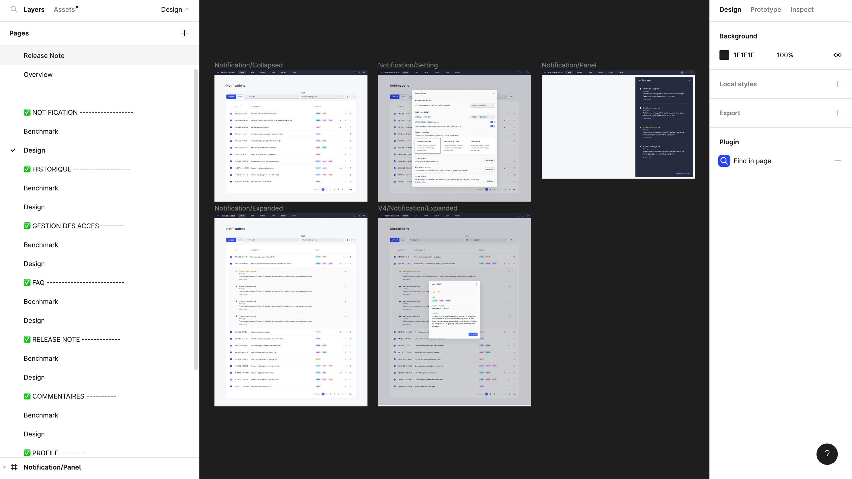
This file is dedicated to the basic & complex components. Each page presents a component with its usages, Do' s and Don'ts and its anatomy. A link is also provided to a prototype file if the user wants to see the behavior of the component when interacting with it (a feature much appreciated by the design system developers team during the handoff).
📁 Data Vizualization
This file is dedicated to how we represent & interpret data in our interfaces.
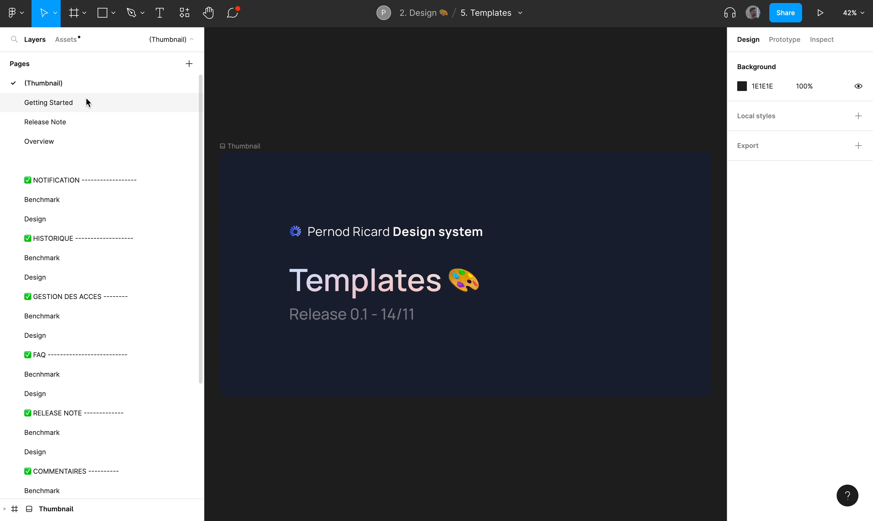
📁 Template
This file is dedicated to represent generic page templates that are common to all KDPs such as: notifications, history, access management, faq, release note, comments.
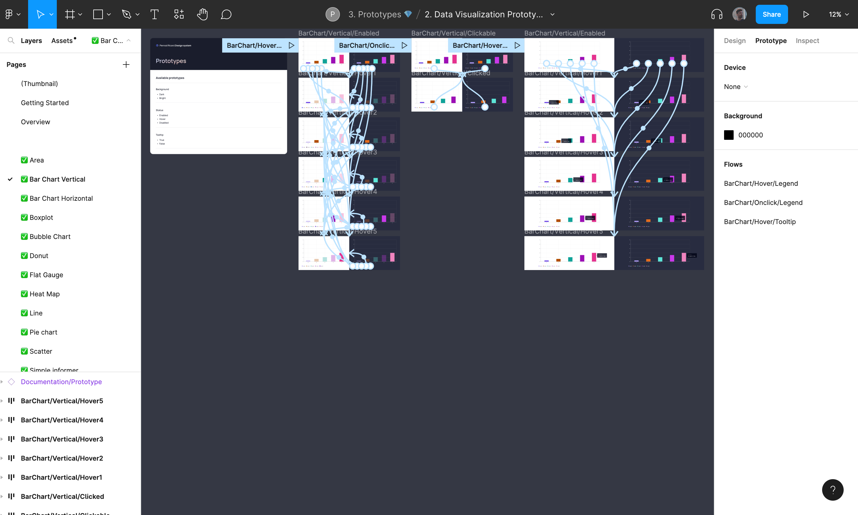
🗃️ Prototype
That folder contain files that are used to present component's interactions to facilitate understanding of component behaviors to product designers & developers.
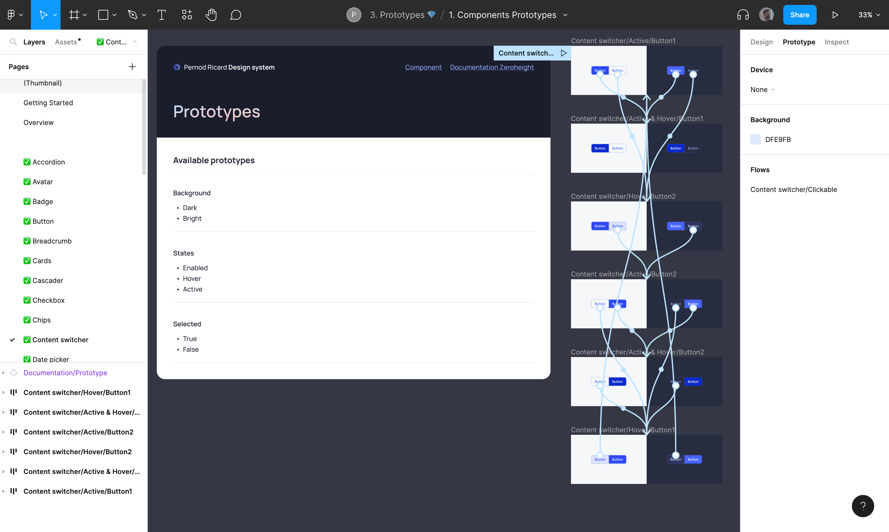
📁 Components Prototype
This file is dedicated to the basic prototypes of Pernod Ricard’s Design system.
📁 Component Data Vizualization
This File is dedicated to data visualization prototypes of Pernod Ricard’s Design system.
🗃️ Development
That folder contain files that are only used by developers from the Design System team to develop new evolutions or corrections of guidelines, components or data visualization. They are a frozen version of the DS in time. Once all the new DS updates have been developed, these files will be send into another folder called Archive and replaced by new versions.
🗃️ Contribution & migration
That folder contain files that are dedicated to improve Archipelago design system according to KDPs needs.
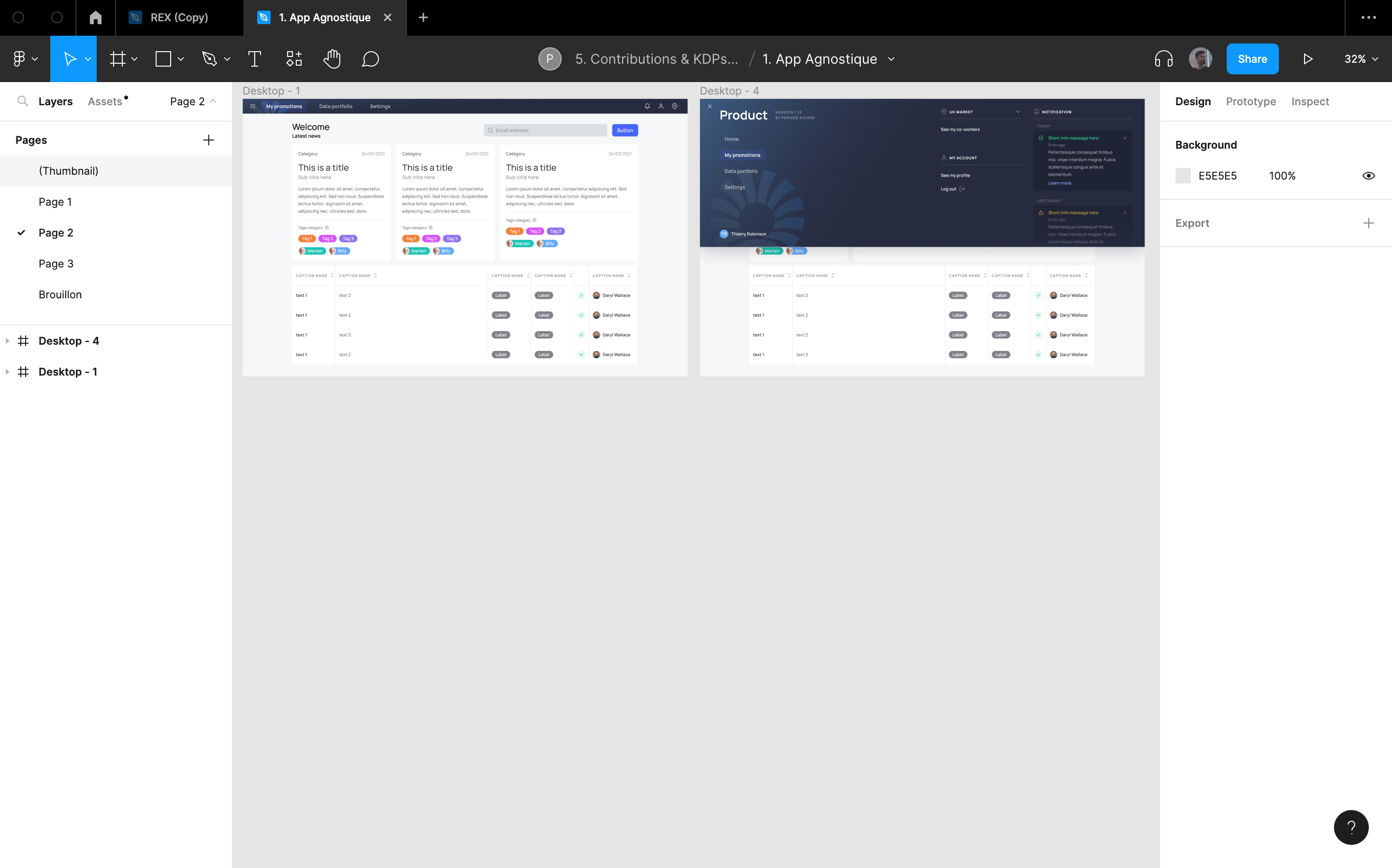
📁 App agnostique
The app agnostique file is dedicated to materialize a pre-existing template of what a KDP should be.
📁 Contributions
The contribution file is open to product designers for proposing new components according to their product and specific needs.
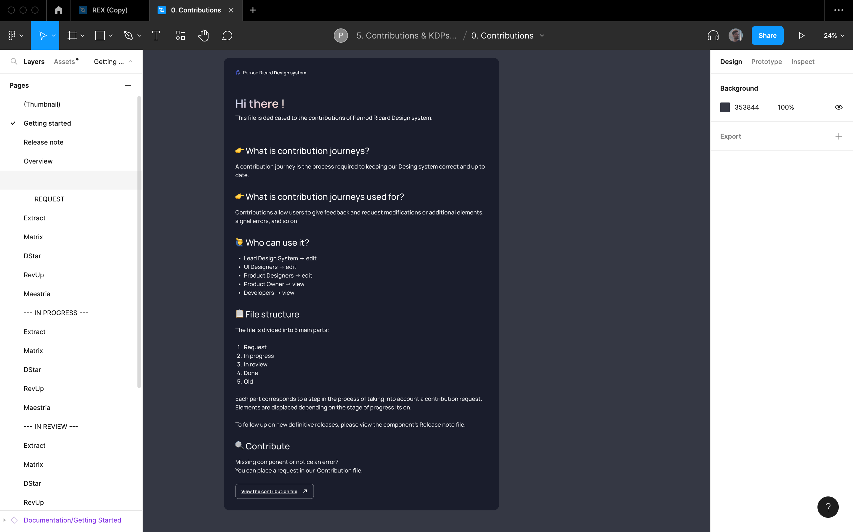
📁 Migrations Files
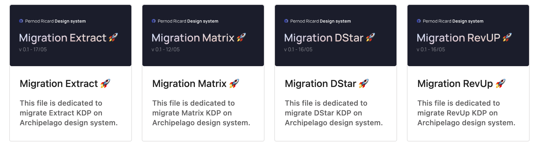
These files are dedicated to collectively improve UX across all KDPs and to migrate product to Archipelago design system.
🗃️ Archive
That folder contain all files who are deprecated.
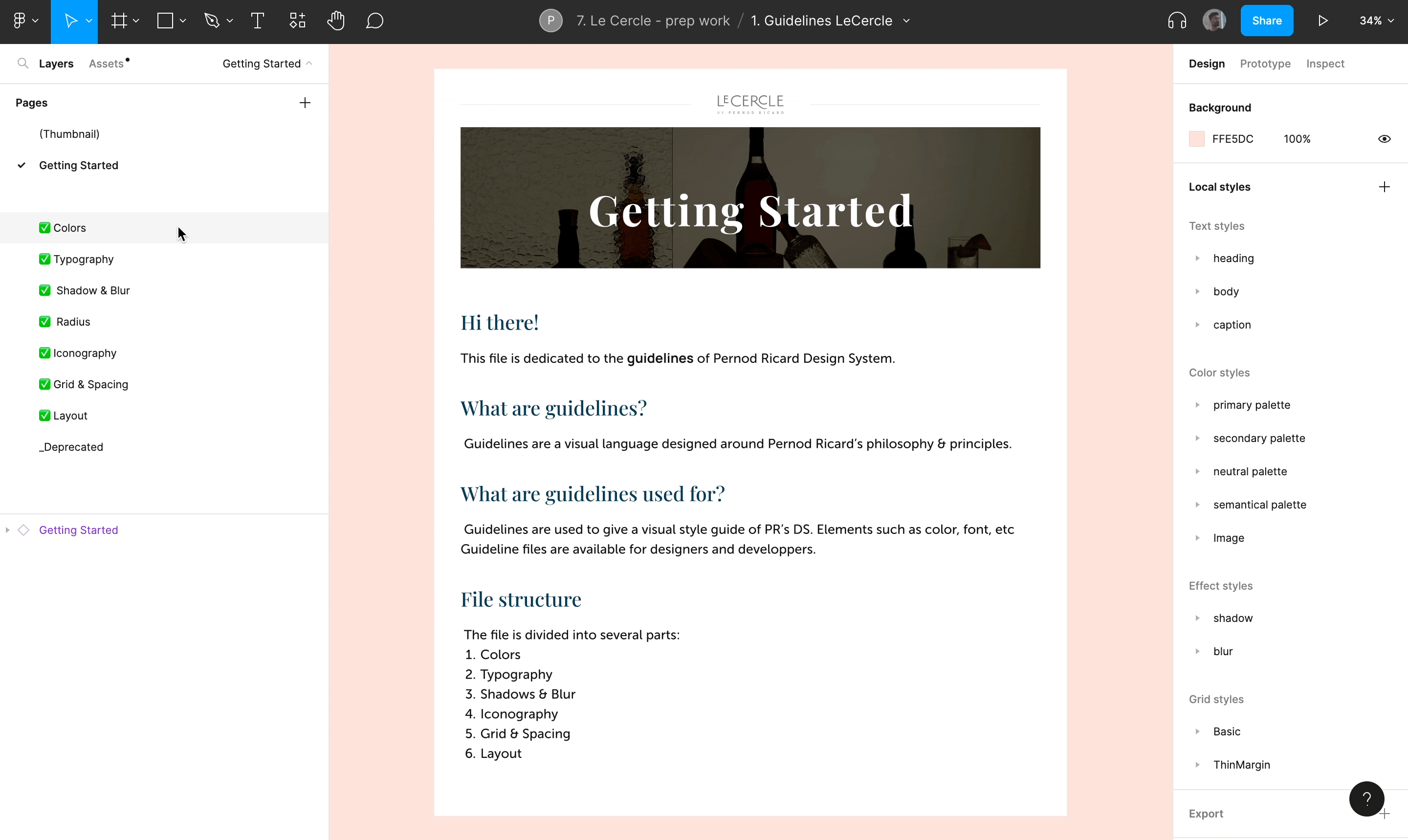
📁 File
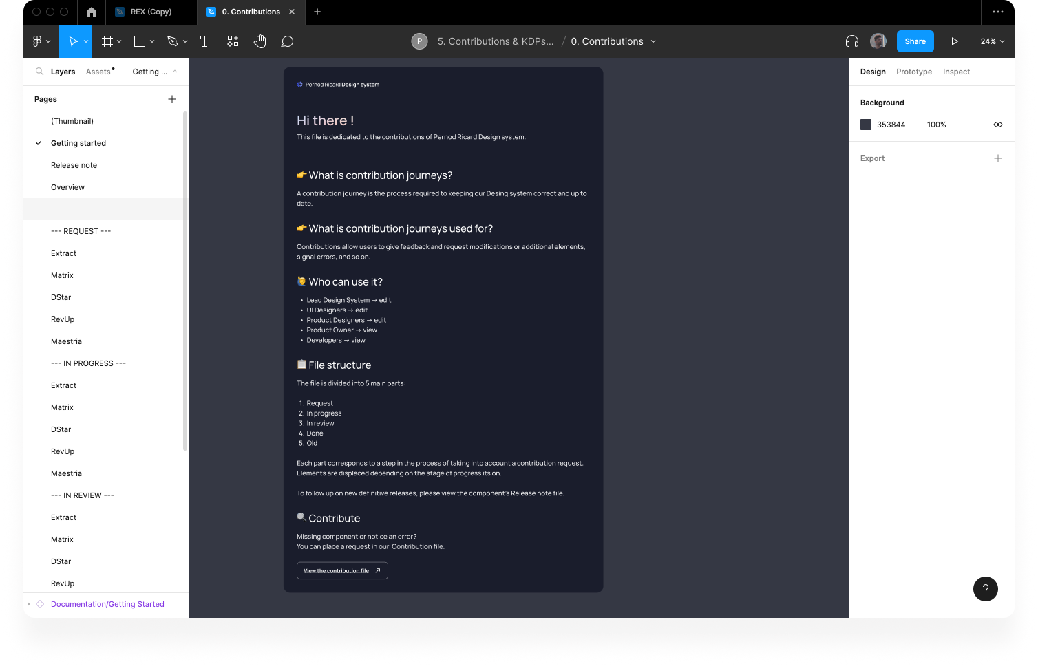
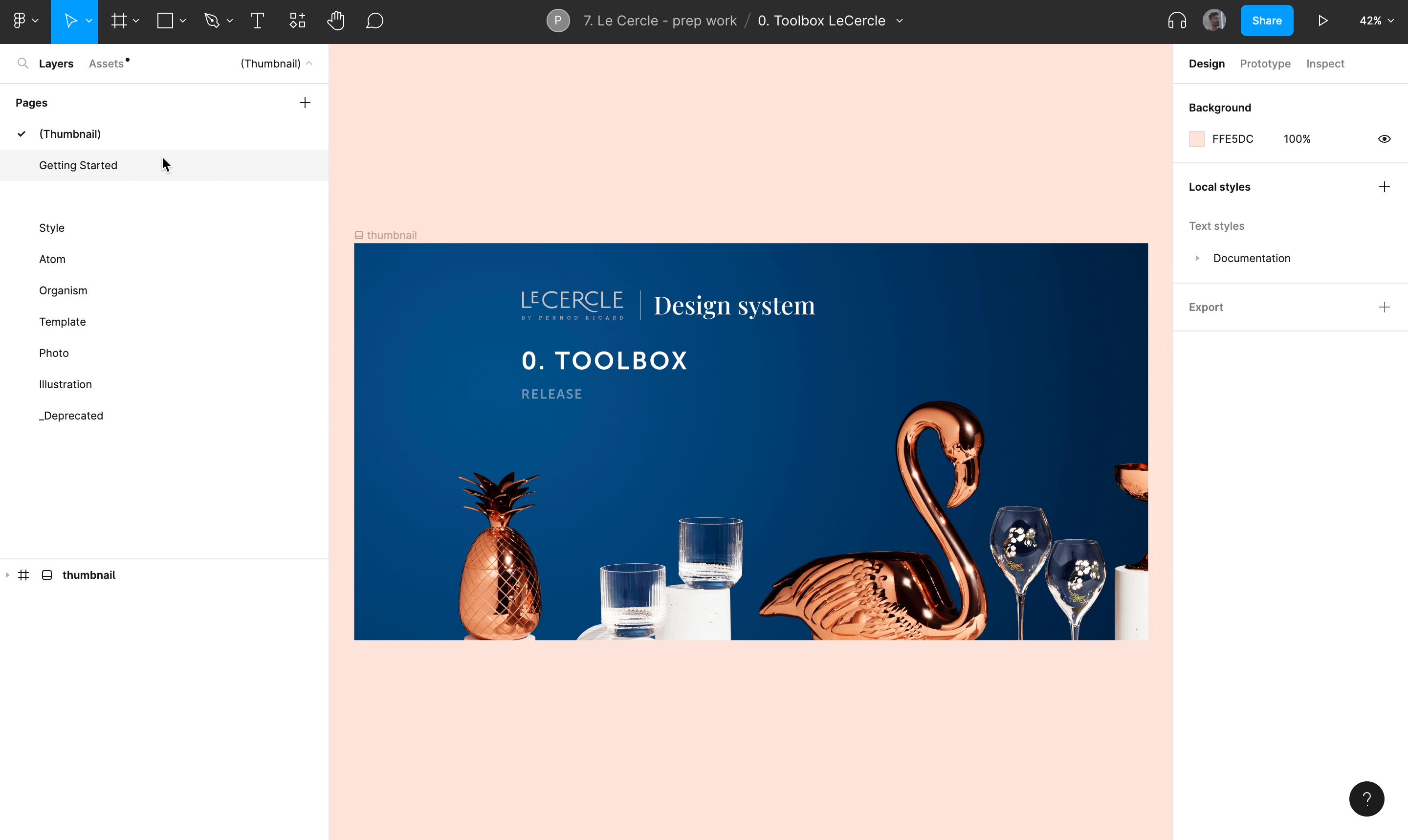
A file is composed of several pages and is divided into 5 parts:
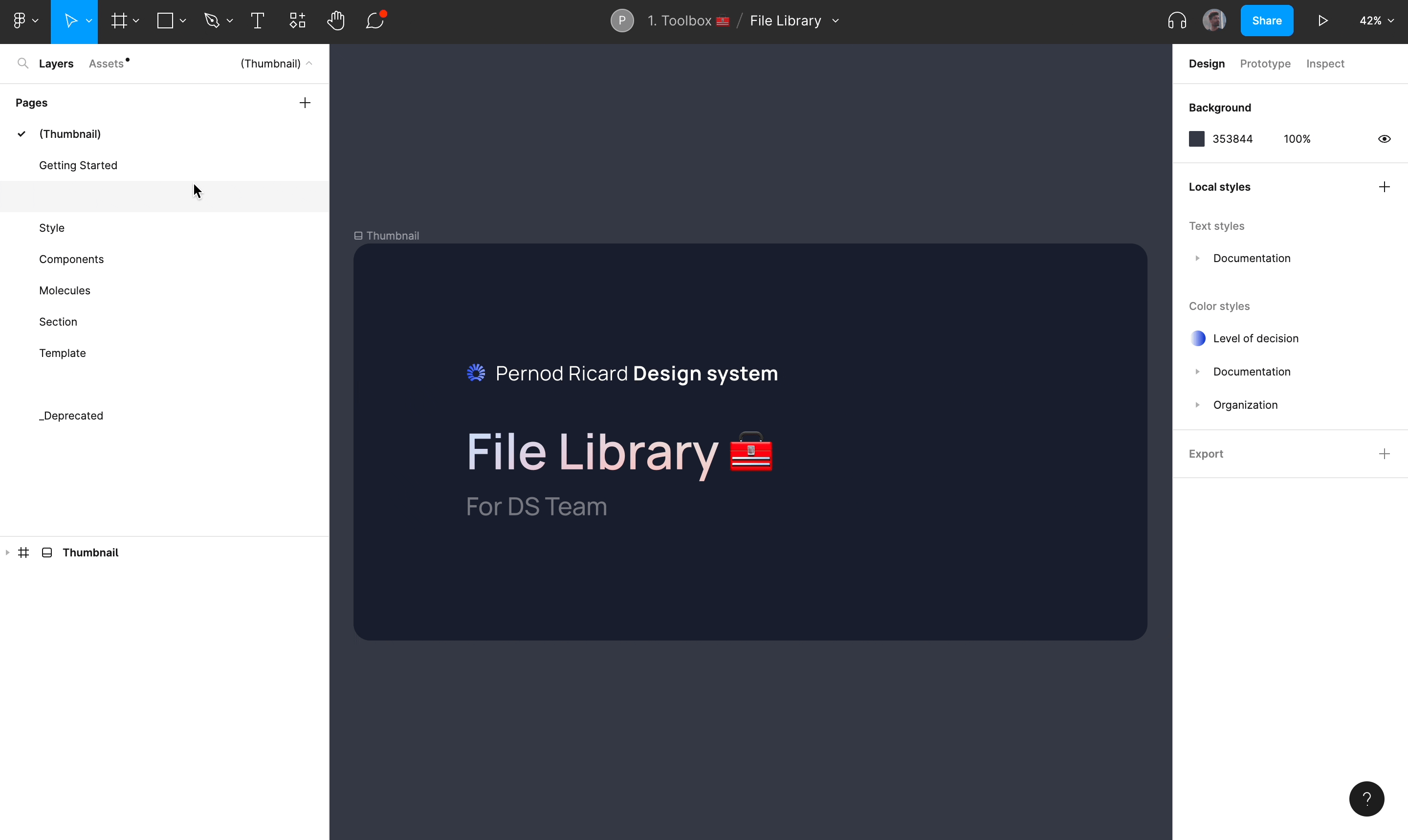
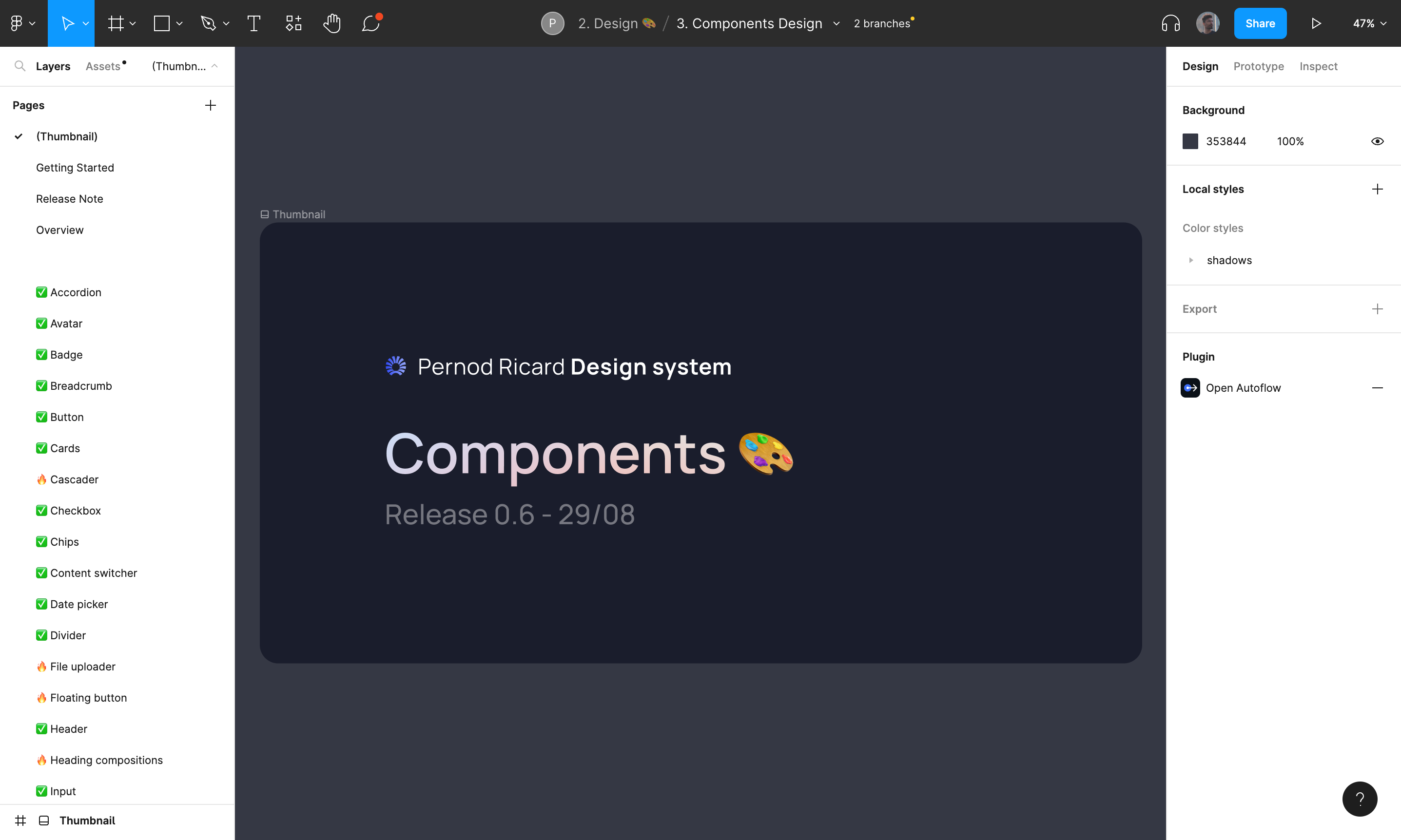
📃 Thumbnail
A Thumbnail shows us a preview of a file's contents.
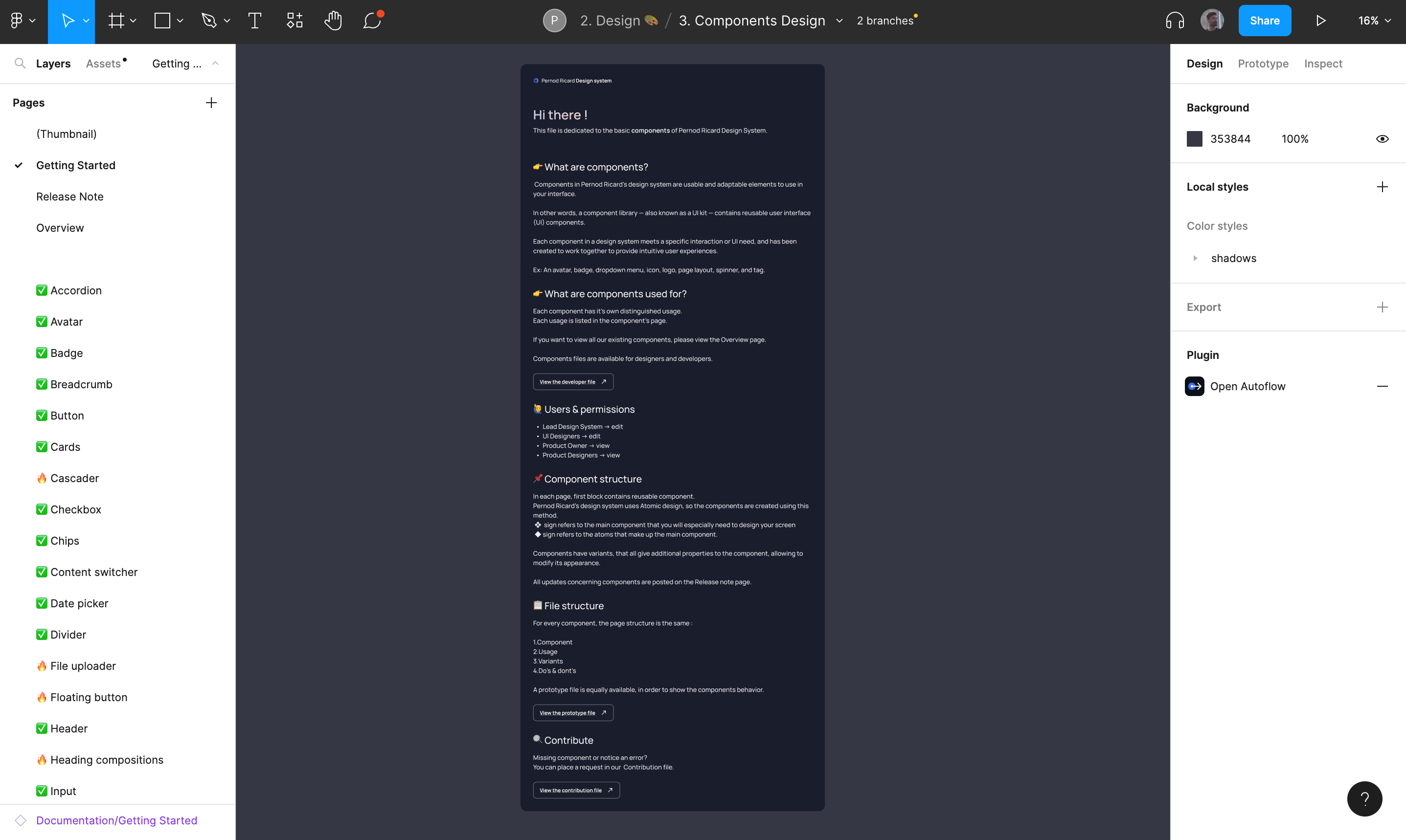
📃 Getting Started
The Getting Started page explains the different permissions of users according to their jobs. It provides information on how the file works, its structure, and which file it is linked to.
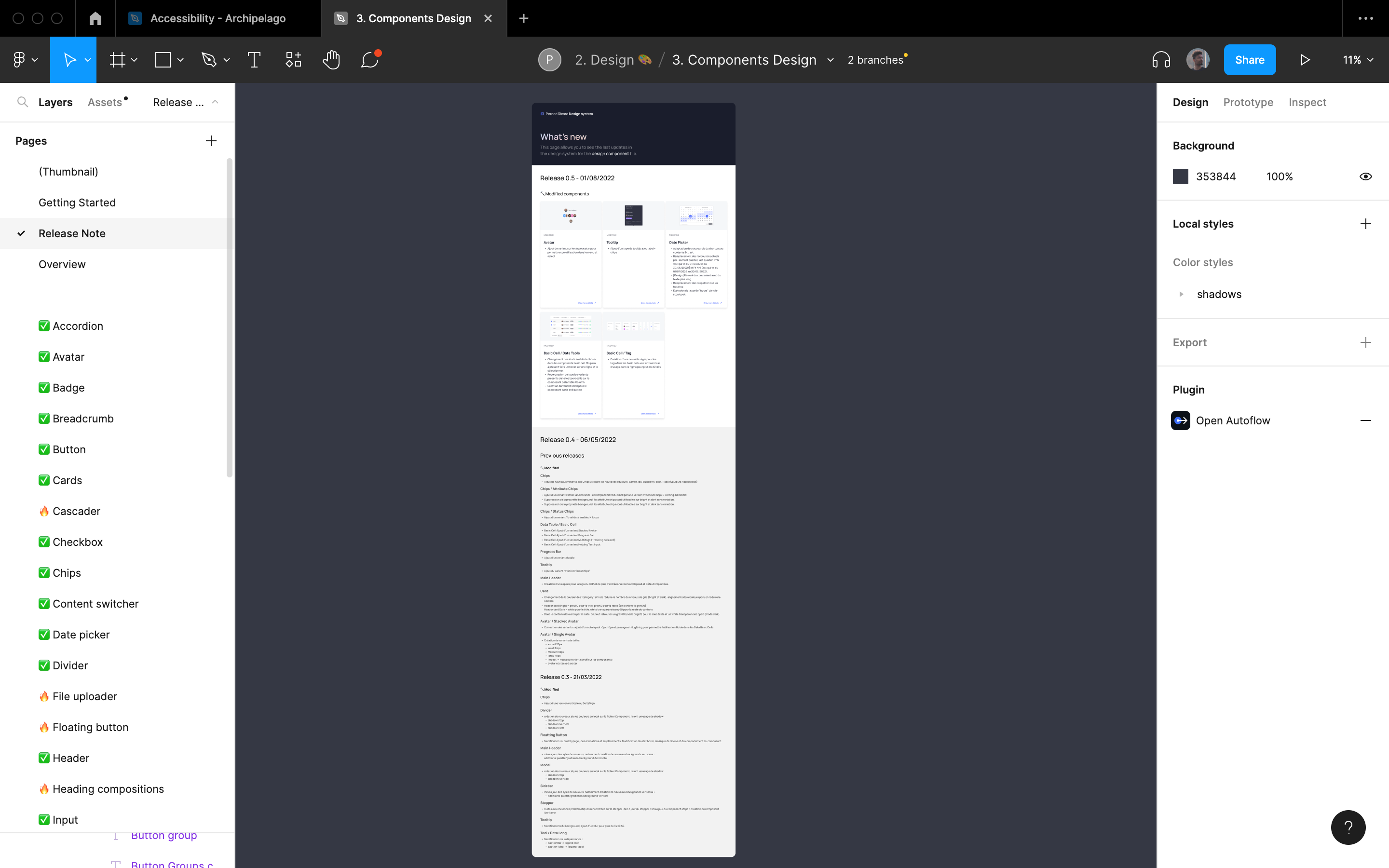
📃 Release Note
This page allows you to see the last updates of the folder.
📃 Overview
This page gives an overview of all the elements present in the file.
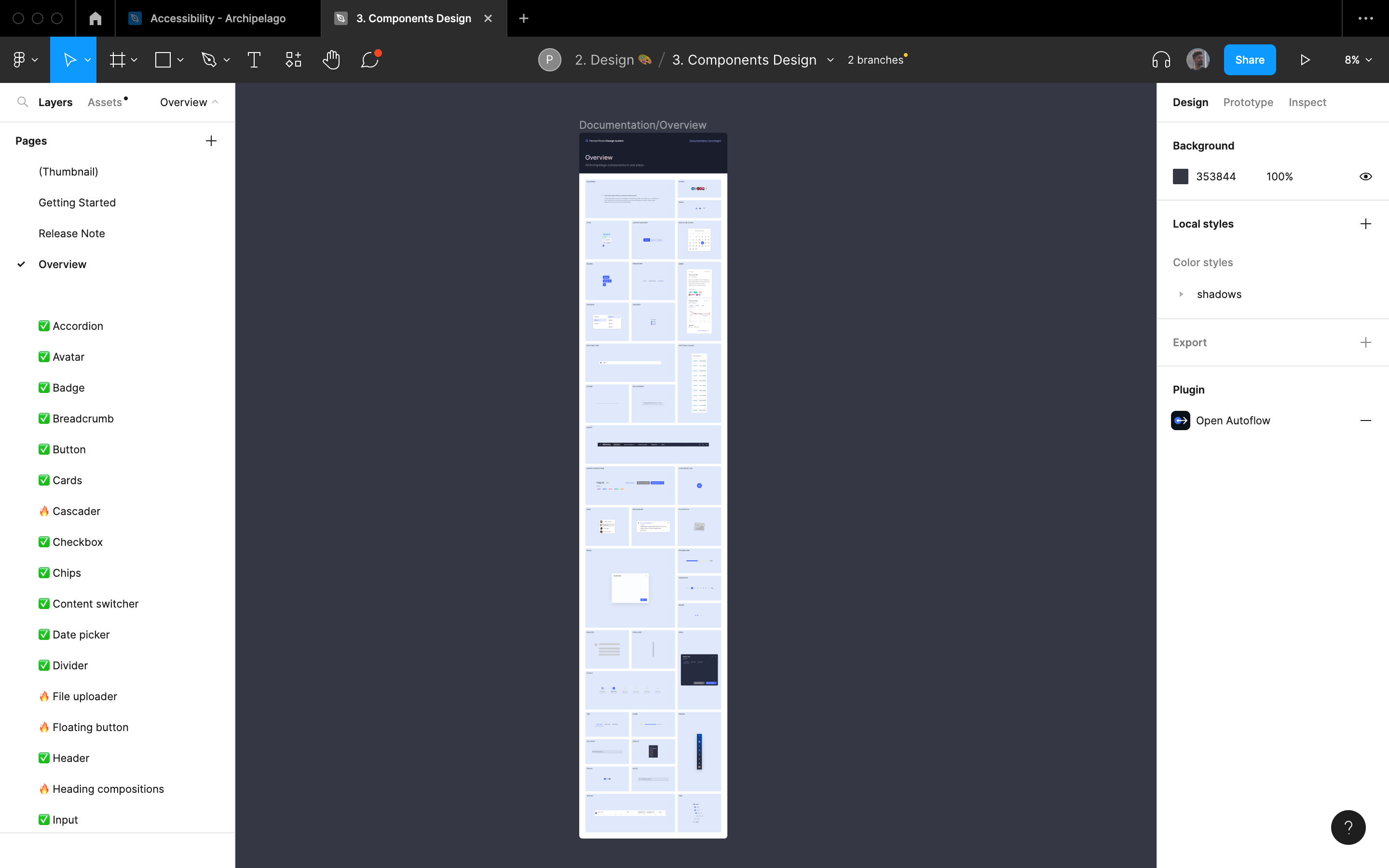
📃 Pages
The rest of the pages contain the elements that the document talks about (in the example below these are the components)
Manage the debt Design
Intervening in the middle of the construction of a design system, often implies having to deal with debt design issues. Feel free to consult the topics below if you want to know more.
🌊 Failure of Merge
📔 Context
Originally we had created a main system design file to provide developers with a frozen version of our design system. All the products using the DS were linked to main while the UI designers worked on a single child branch to add new modifications. This way we could adjust to the developers' rhythm by pushing the child branch only when all the components of the "main" version were coded.
🚨 Problem
This organization was working before the UI team grew. We waited 1.5 months before trying to merge the child branch into the main branch because we were subject to the developers' rhythm. Because of the large number of changes, Figma did not manage to merge the files.
🔦 Consequence
💊 Solution
In order to prevent this kind of problem from happening again, we made an entire copy of the Figma folder containing the components needed by the developers and locked it. Once all the new DS updates have been developed, these files will be send into another folder called Archive and replaced by new versions.
🏋️♂️ Component too heavy
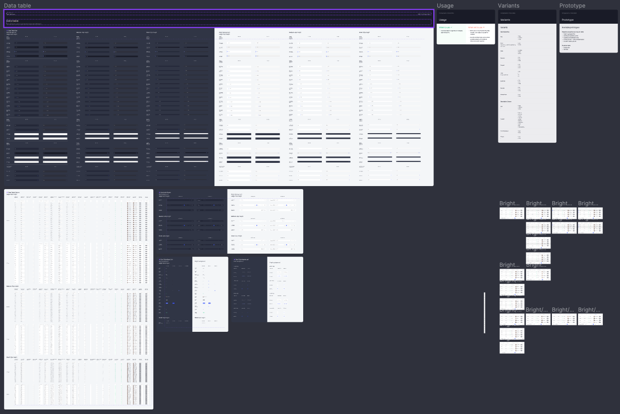
📔 Context
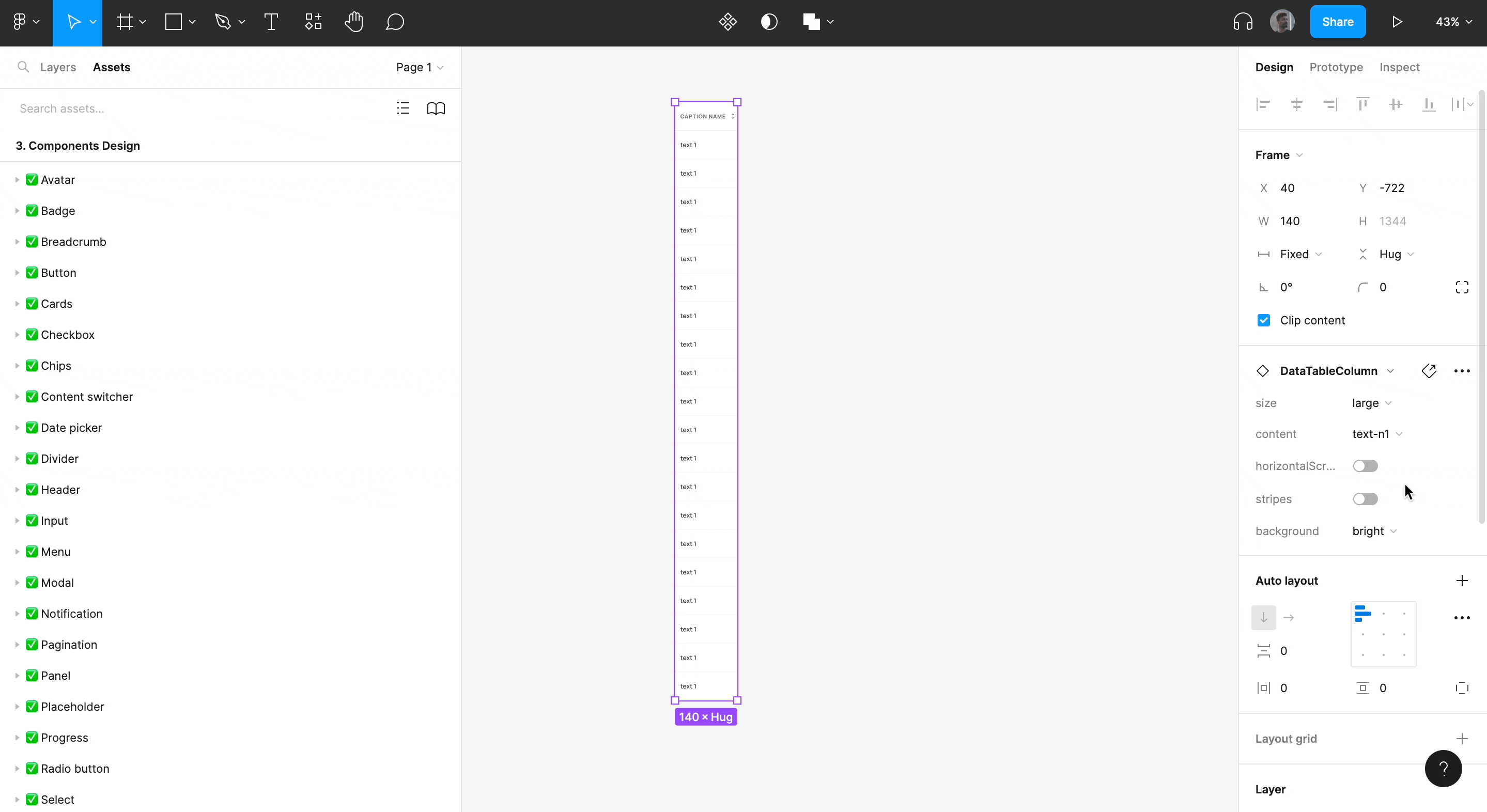
Given the number of possible combinations of variants, one of our nested components had become very heavy to load on Figma. One of the risks when working on a design system is to want to make the work of its users too easy by offering them all the possible use cases from the start so that they don't have to do anything.
🚨 Problem
The datable component had become so complex that we had to wait 10 seconds for each change we made to the component.
🔦 Consequence
Our production time was considerably extended, modifications that would have taken us only a few hours were easily transformed into 1 day of work.
💊 Solution
We have redesigned the structure of the component, removed unnecessary variants and divided the component into 3 Figma pages in order to achieve optimal file performance.
👓 Accessibility
📔 Context
The issue of accessibility has long been the poor relation of our design system. Pernod Ricard did not consider this issue as a priority to be dealt with in the first place and we only became interested in this subject 1 year after the creation of the design system.
🚨 Problem
Some users started to complain that they could not distinguish all the states of the components.
🔦 Consequence
Checking and updating all the components of a design system according to accessibility standards while working with 4 people in the same file is not an easy task. Without a good coordination we risk to impact negatively the graphical consistency of the DS.
💊 Solution
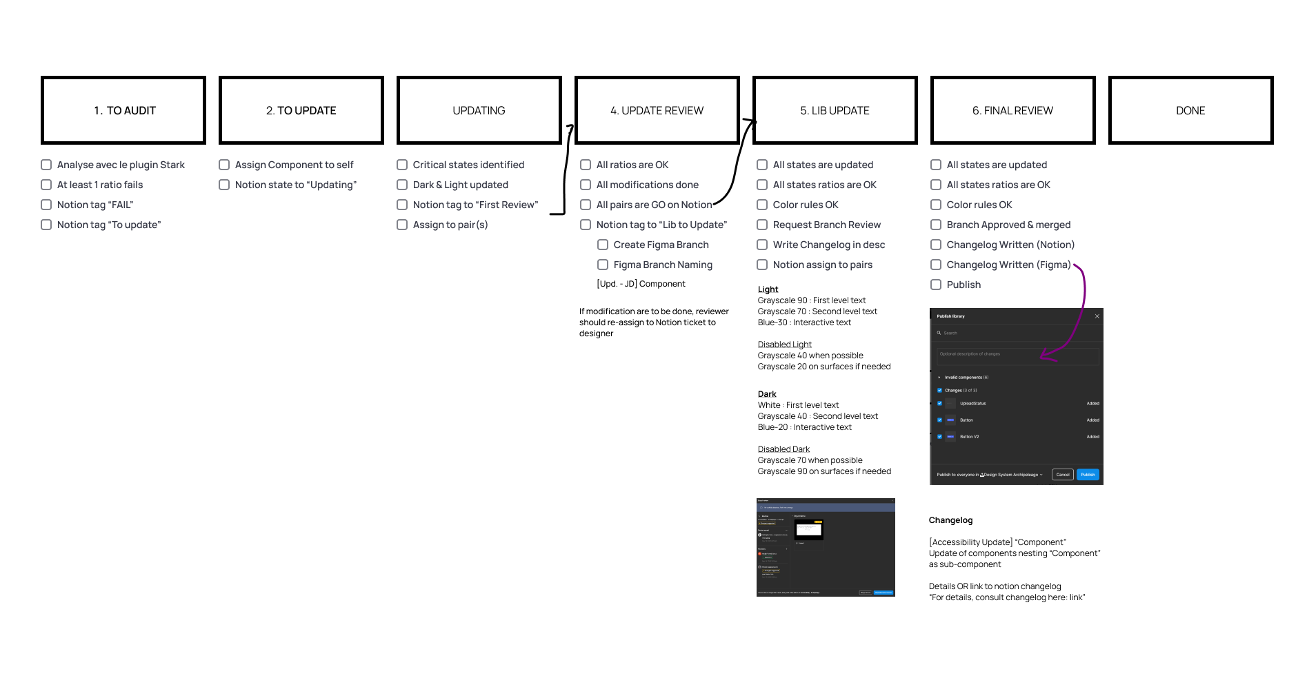
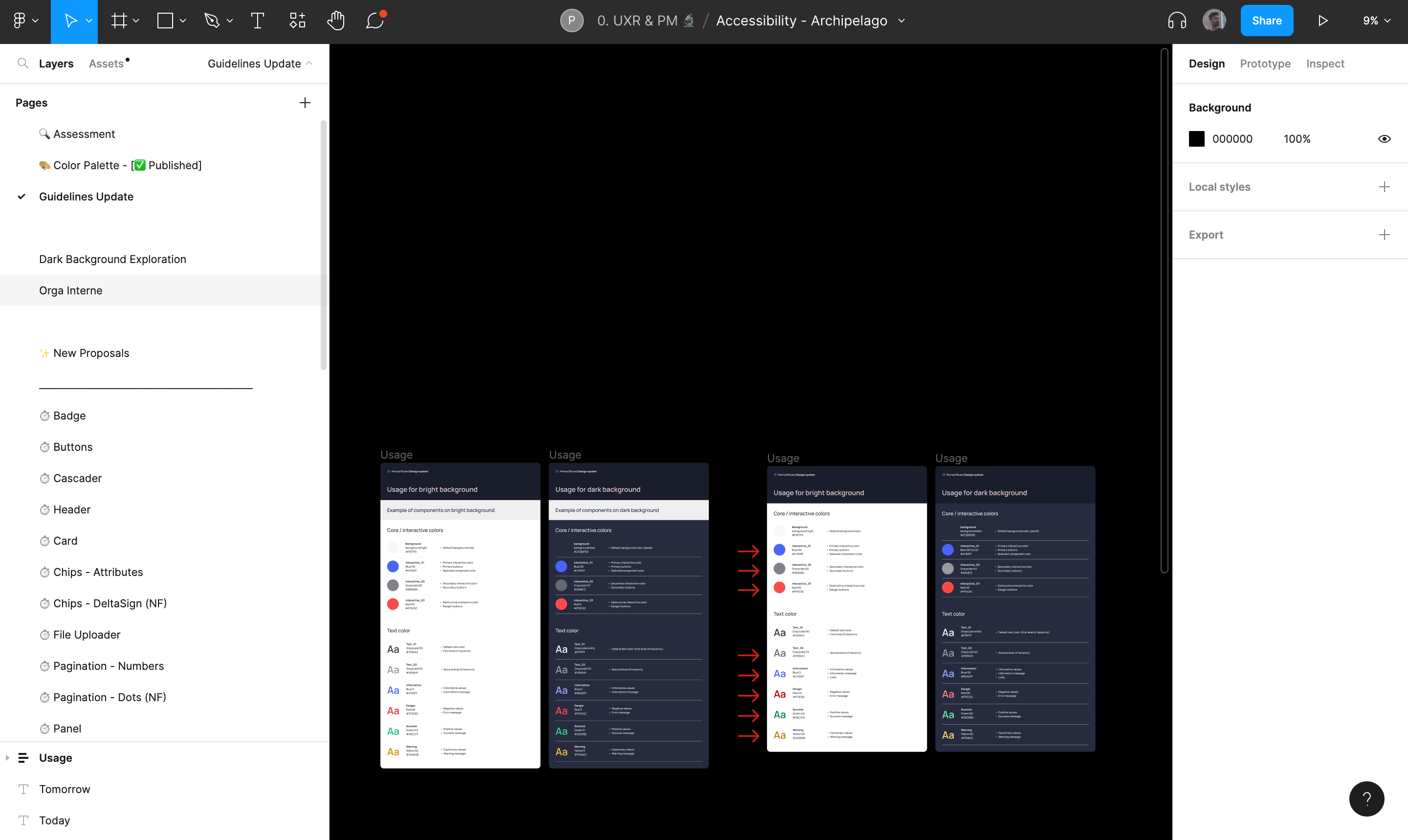
We had to set up a very precise organization process to validate and push each new update within the design system. A figma "accessibility" file was created with the updates of the guideline file, the experiments and the structure of our organization. Each component concept was first audited before being modified and reviewed by other designers. Once the experimentation was validated, a variant of the file was created in a child branch and all the modifications made to the component were annotated in a changelog before being passed in final review. Once the final review was validated, a merge from the child branch to the main was pushed. Finally, the updated component was published in the library with a summary of its documented changes.
Screen of the Figma accessibility file
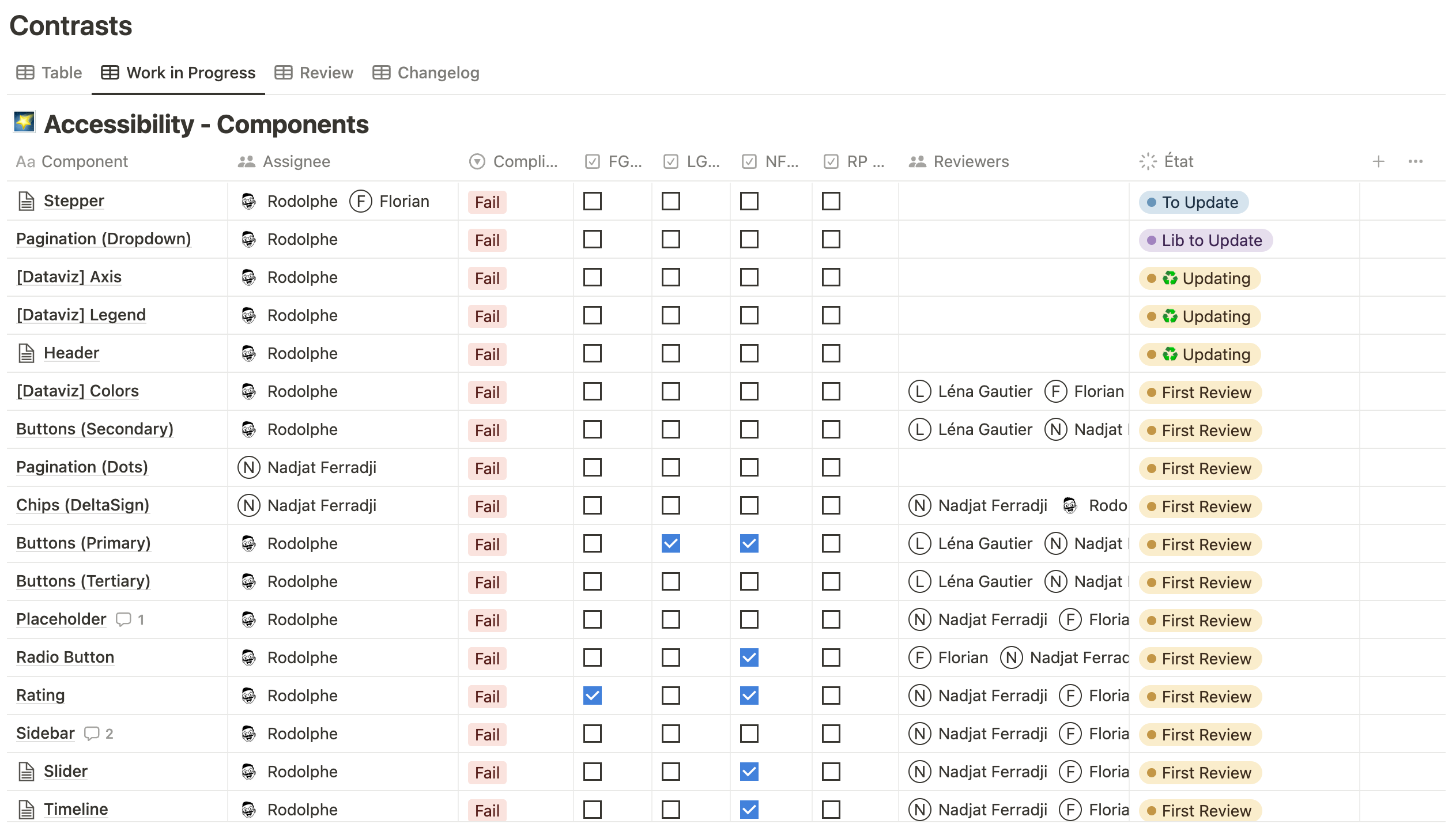
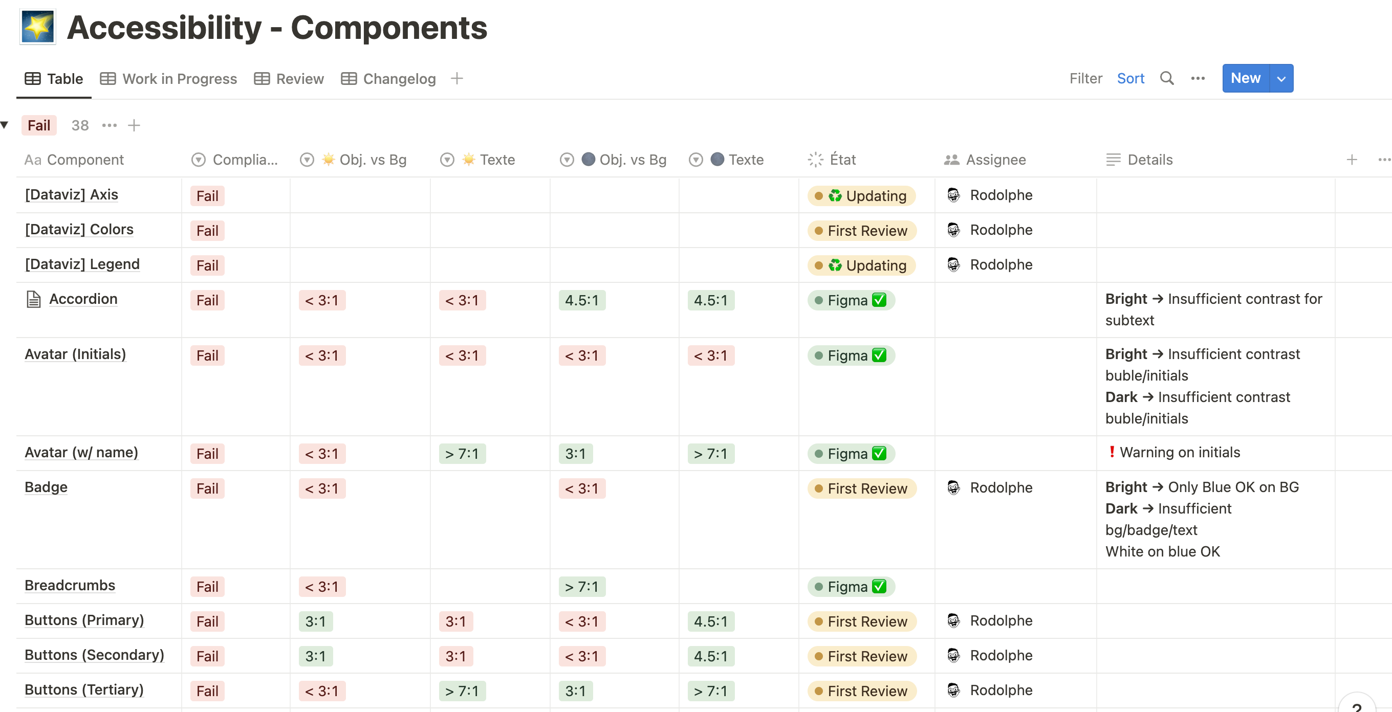
Screen of the Notion that help us to drive the work of accessibility
⚡ Figma updates
📔 Context
When Figma released its updates for component properties, the archipelago design system had already reached a certain level of maturity. With this update Figma proposed to designers to change the way they build their components in order to reduce the number of variants. Optimizing the components of the design system makes it lighter, easier to update and more efficient.
🚨 Problem
While updating our components we realized that our modifications had a negative impact on the production environment because the product designers' mock-ups had broken components.
🔦 Consequence
The product designers did not want to update their components because they knew that our updates could potentially sabotage their models.
💊 Solution
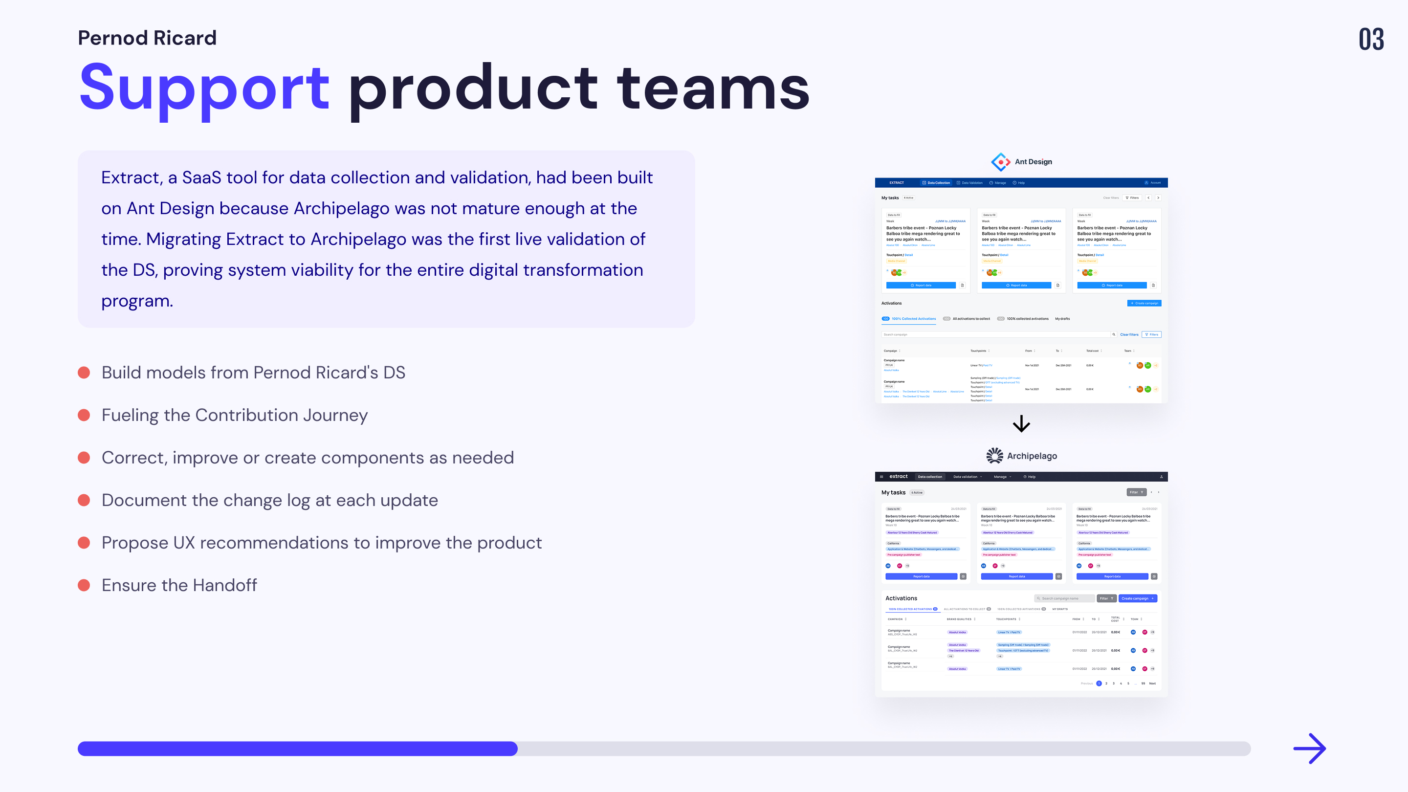
Mission 2 : UI support for SAAS products
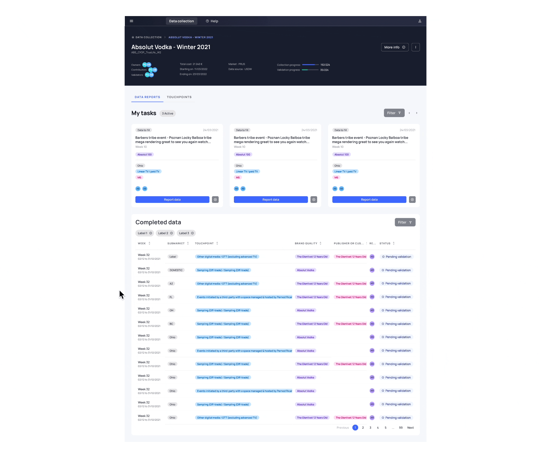
The SAAS products of pernod ricard are divided into 7 main digital products. These tools exchange data and information with each other to function. I was mandated by the Extract product team: a SAAS tool dedicated to collect and validate data reported by markets working with advertising and promotional spend (data can come from digital media, traditional media, L3F (On-Trade & Off-Trade) & Brand Experience).
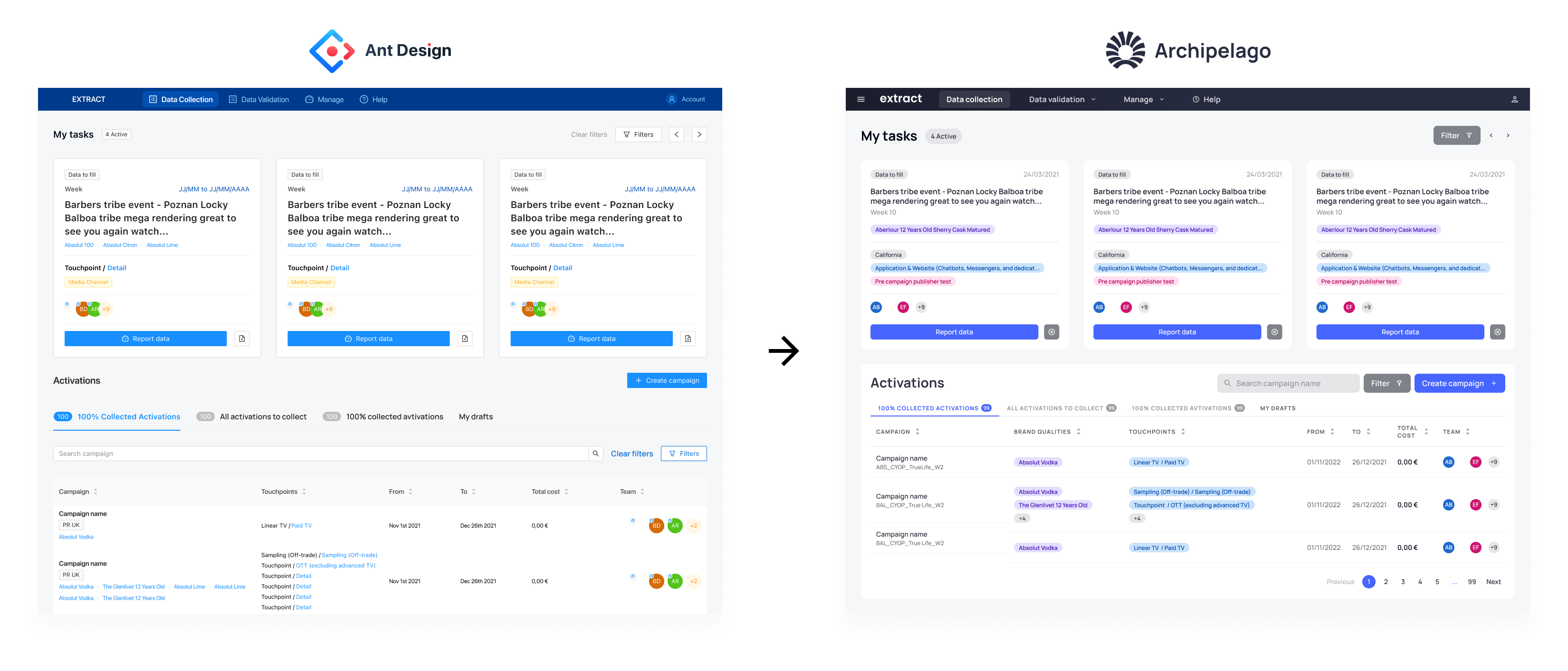
The Extract tool already has a worldwide user base. It was developed with the Ant design system because the Archipelago design system was not mature enough at the time. I was asked to intervene in order to replace the current Extract design system with the Archipelago one.
A major challenge
The main challenge of this migration was that the Archipelago design system had never been migrated to any SAAS product before. Extract being the first test case in this experiment, the reason for funding the DS depended on the success of its migration.
Learnings
This migration was the source of many learnings in terms of organization.
Here is the list of topics that were the source of many changes:
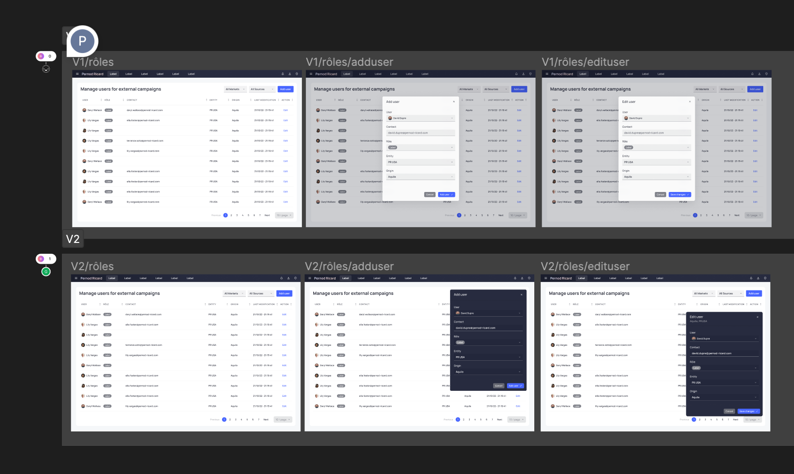
Contribution Journey
📔 Context
Several of our components needed a rework:
🚨 Problem
We didn't have a tool to carry over the component requirement from the SAAS tool set.
💊 Solution
We realized a first version of Contribution Journey on notion in order to collect the needs of the product designers and prioritize them.
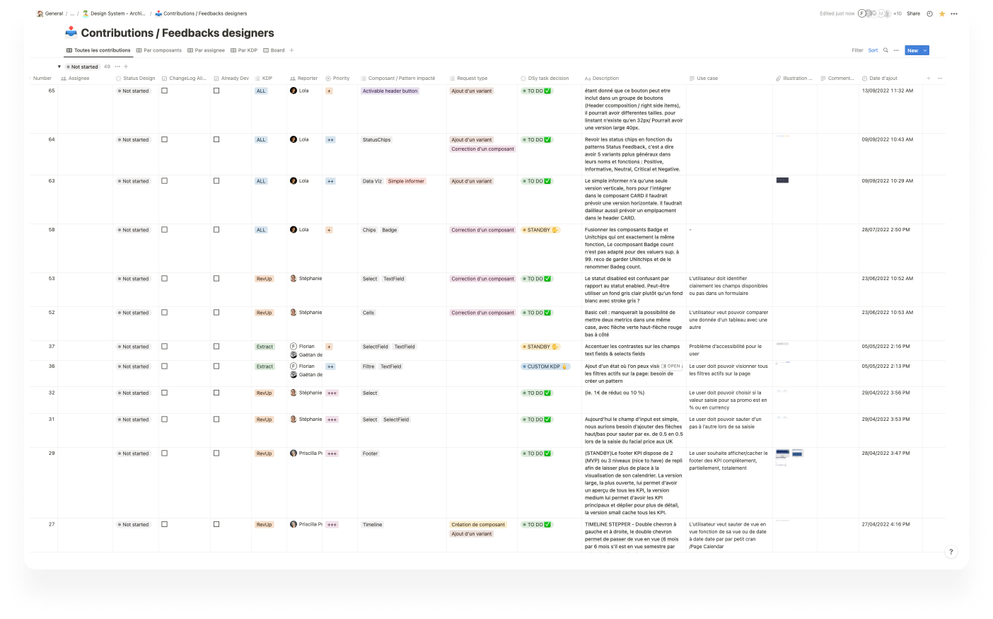
This first version of the contribution journey was efficient but a bit frustrating for the product designers who wanted to have a space to discuss and exchange their needs. To this end we created a sandbox on Figma allowing users to give feedback and request modifications or additional elements, report errors, and so on.
Handoff
📔 Context
The team initially wanted me to make models of all the possible screens that could exist on Extract.
🚨 Problem
Each micro action produced by the user can be interpreted as a new screen. It is therefore a task that quickly becomes time consuming.
💊 Solution :
We decided to work by user story by selecting the key screens to build in order to reduce the workload and increase the speed of production during iterations.
Customized components
📔 Context
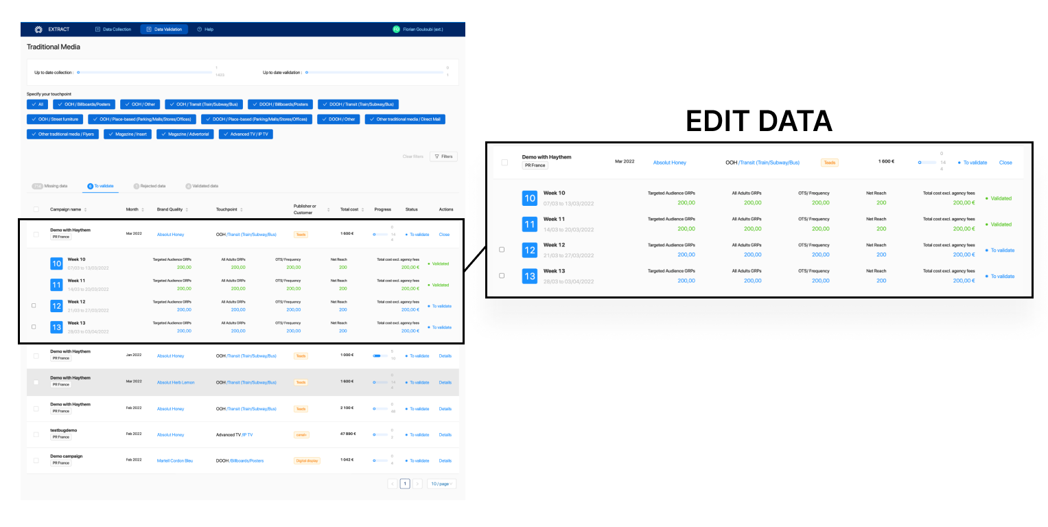
Extract needed specific behaviors on some components that did not yet exist in the Archipelago design system. For example, Extract wanted a dropdown behavior to be integrated into a basic cell when the user clicks on a cell to edit its data as if it were an accordion component.
🚨 Problem
We didn't want Archipelago to become a gas factory with components used in 1% of the cases because of one of our SAAS products.
💊 Solution
An arbitration was made by the lead design system. All the requests for custom components were not taken into account, instead we proposed to integrate different patterns. Thus, it is a panel that opens when the user clicks on a row to edit the data.
UX recommendations
📔 Context
When building the Extract mockups I noticed many UX inconsistencies within the tool.
🚨 Problem
I wanted to integrate my UX recommendations into the mock-ups, but the product manager was afraid that changing the design too much would extend the roadmap's deadline.
💊 Solution
To solve this problem I created 2 pages in a Figma file:
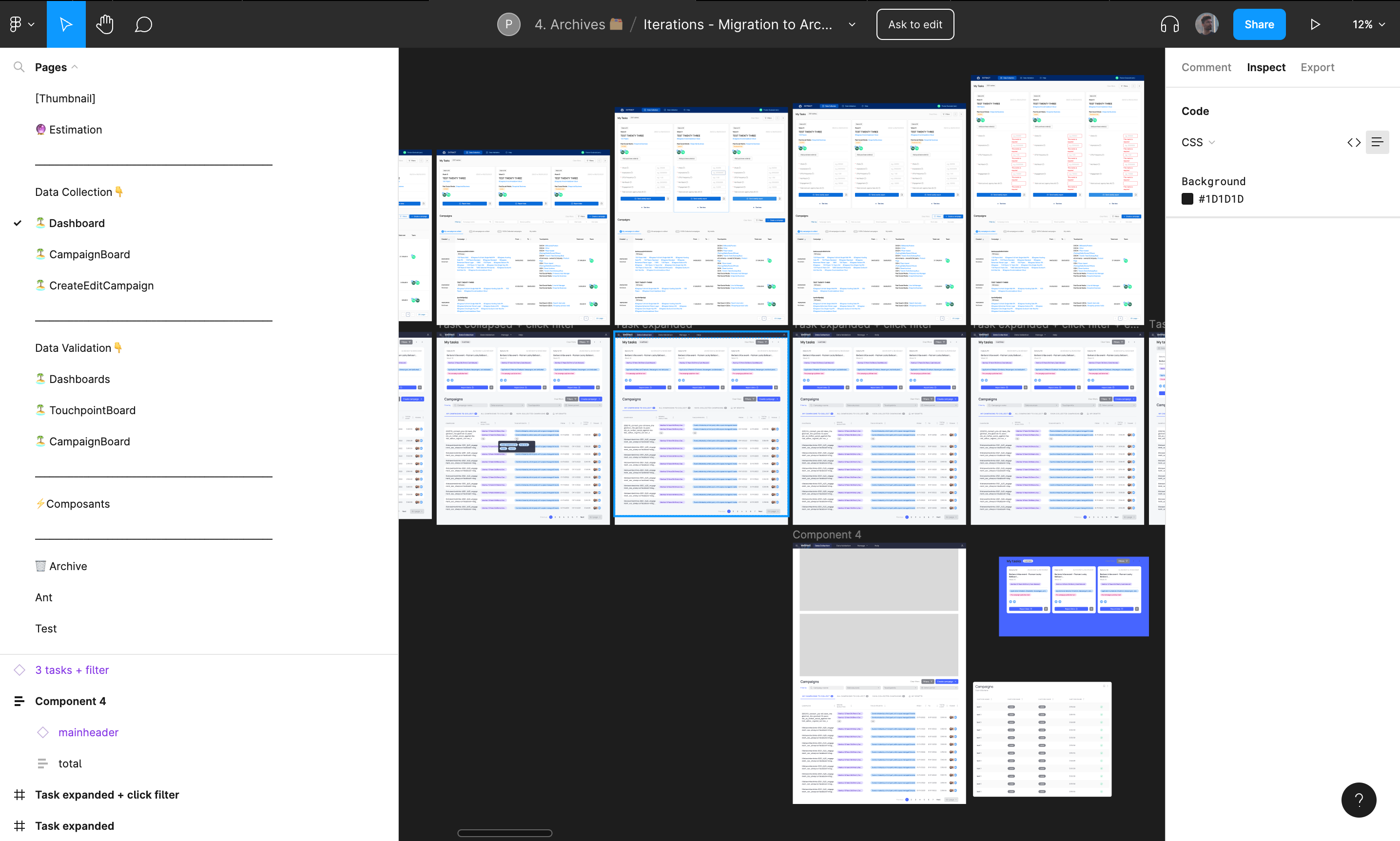
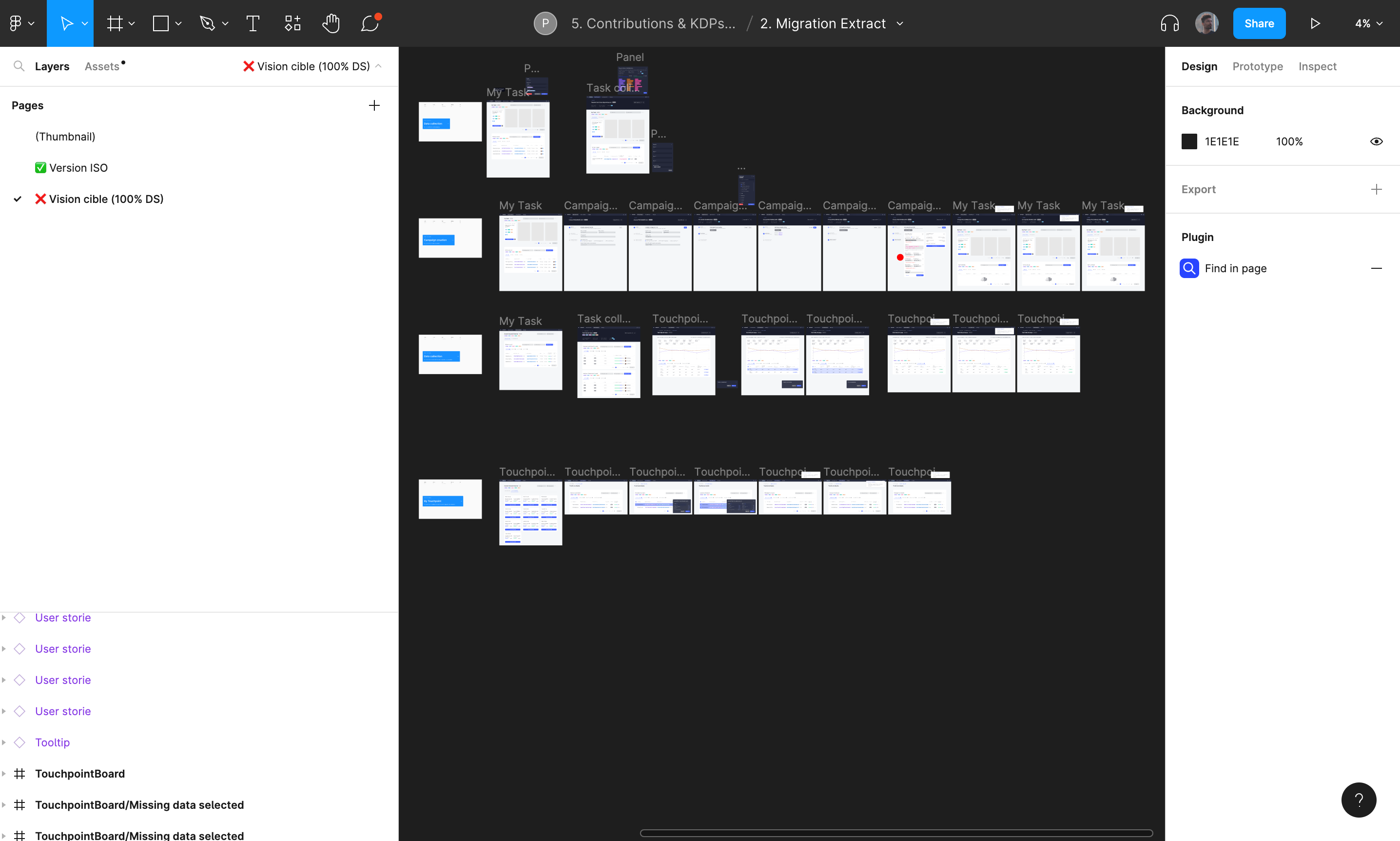
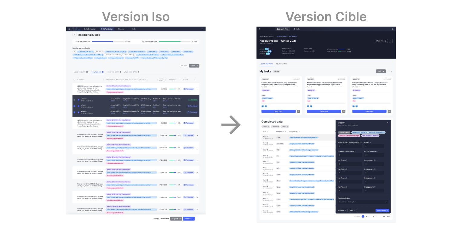
An "ISO version" page
This page contains all the key screens of the Extract tool. The interface is similar to the production version, it does not include any UX change but simply a swap of components to archipelago
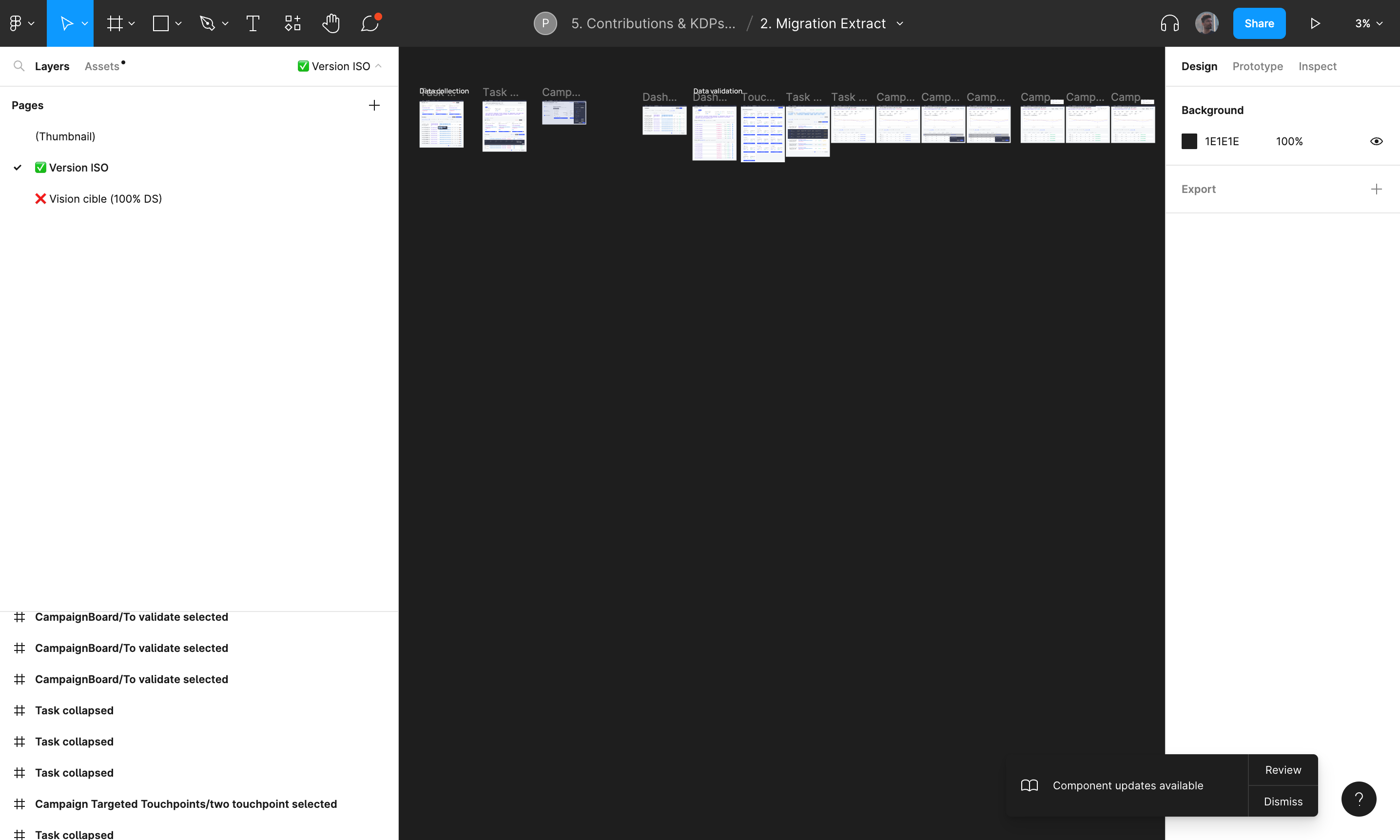
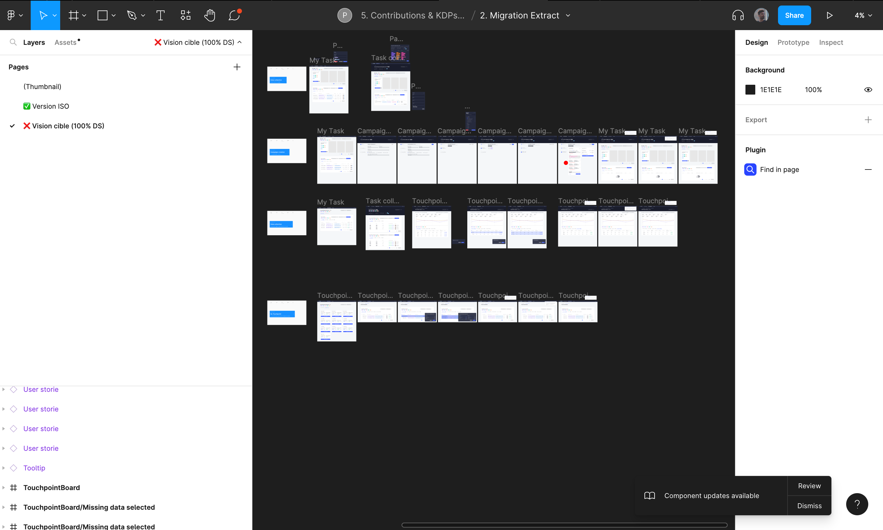
A "Target version" page
This page contains all the key screens of the Extract tool. These mockups present the ideal product with UX recommendations and patterns we intended to implement.
My recommendations in terms of path on Extract helped to fuel discussions on the implementation of cross-product patterns at Pernod Ricard.
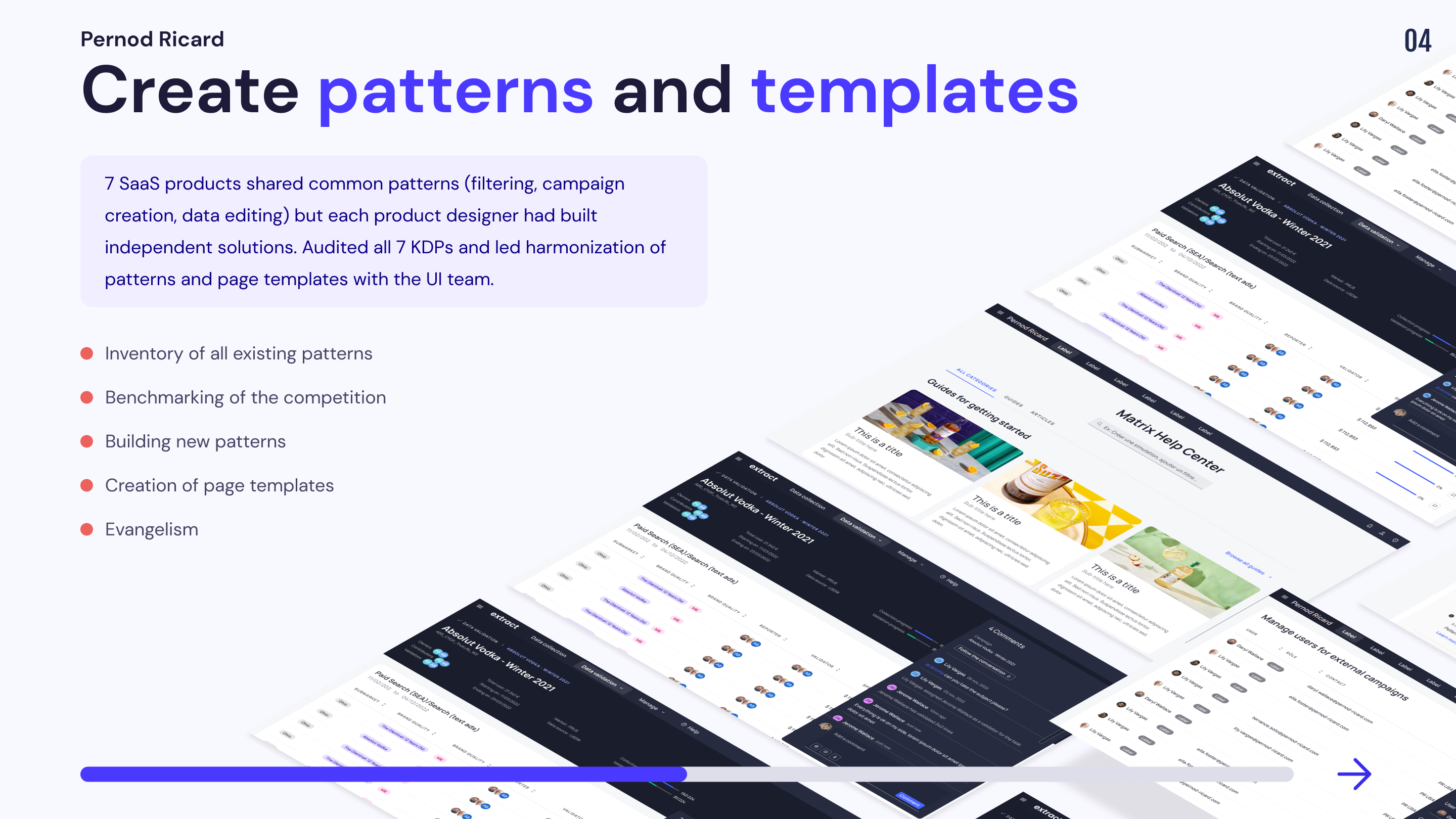
Mission 3 : Construction of Patterns & Page Templates
Pernod Ricard's SAAS products have many patterns in common (data filtering, campaign creation, data editing, etc.). However, as each product designer works in his corner, I noticed that different solutions had been proposed by the product designers to propose the same actions. We got together with the UI team to propose a harmonization of patterns and page templates across KDP.
Patterns
Pattern
UX design patterns are reusable design components that are used to solve common usability problems that users experience. For instance, a breadcrumb trail that shows users the path from the homepage to the page they are on is a design pattern. A 'pattern library', as the name suggests, is a library of user interface (UI) patterns that designers and design teams use to build digital products. They are referred to as 'patterns' because they're recurring solutions that solve design problems
The patterns site was divided into 3 parts:
1.Audit of the existing
Analysis of existing pathways on the various SAAS tools and identification of existing patterns
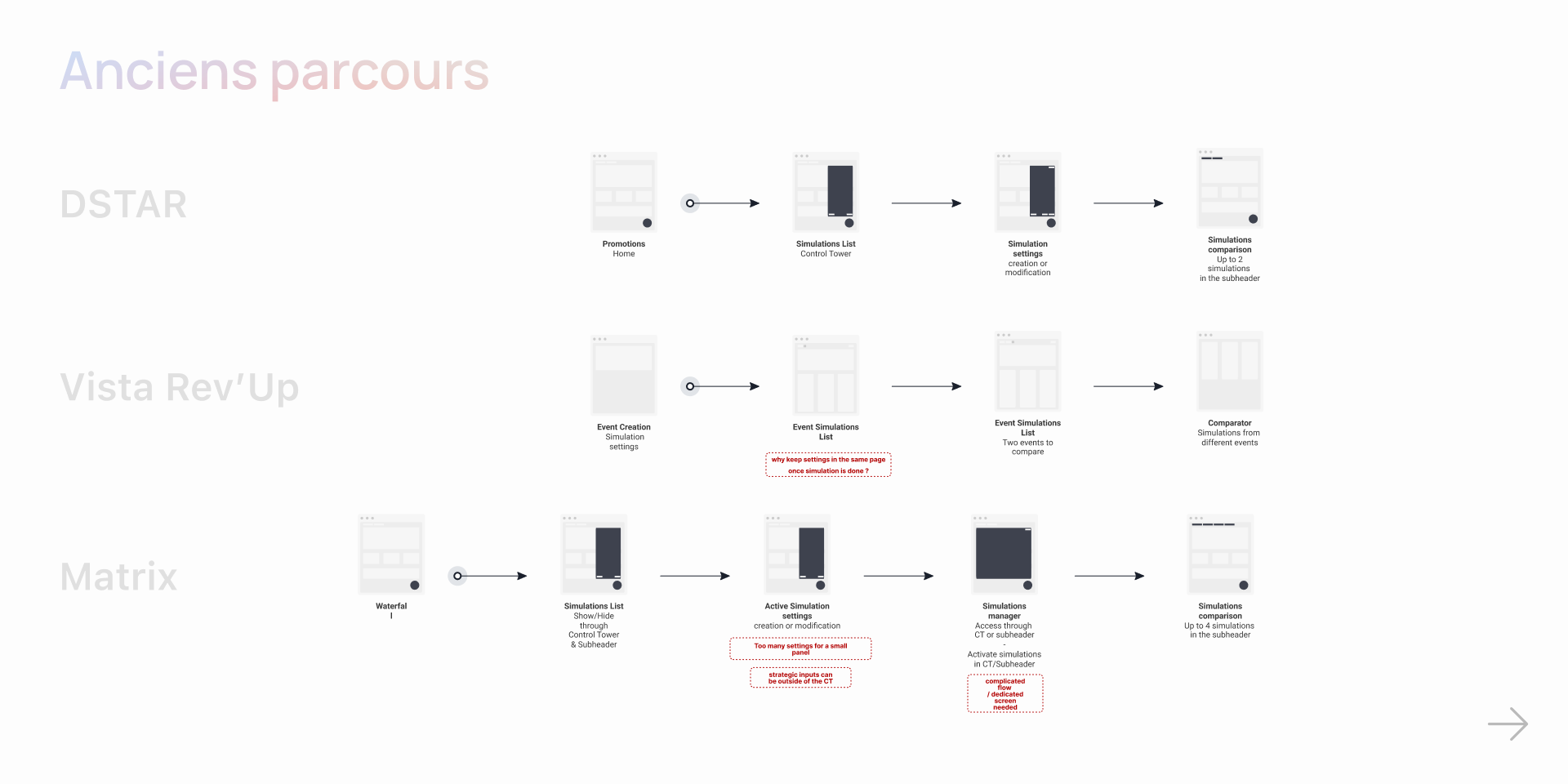
2. Flow homogenization
Identify and highlight patterns performing the same actions
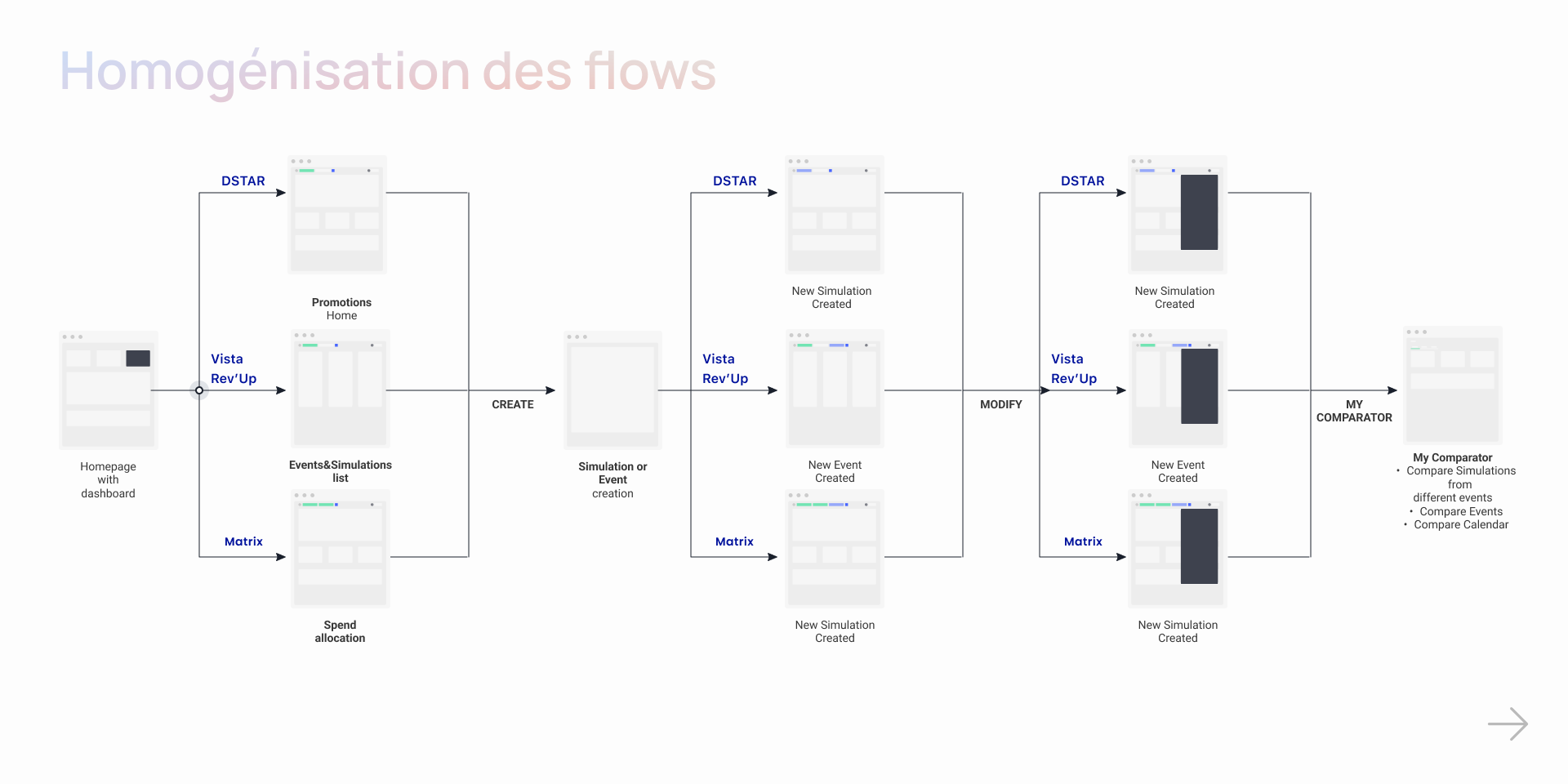
3 Building a Flow template
Creation of a template illustrating the different patterns that a Saas tool may need (Create a campaign, Edit data, Filter information, Compare data, Manage settings)
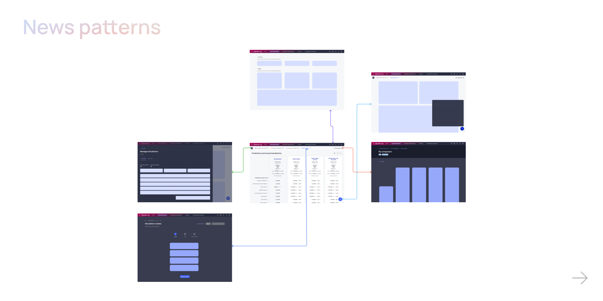
Page templates
The template site was organized as follows:
Benchmark
A benchmark was made according to the patterns of some digital products in order to find good practices. Each path was then broken down by key screen and a note was written for each product to summarize the interesting features of each.
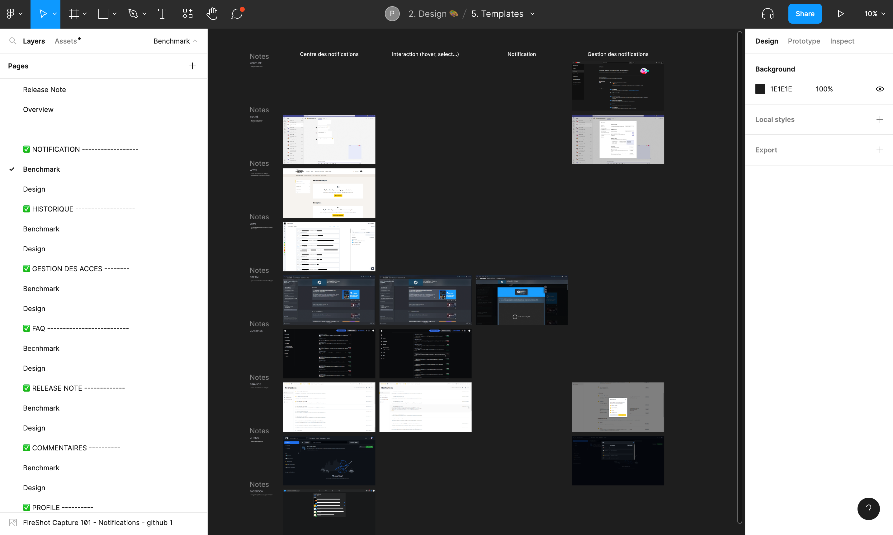
Design
Once the benchmark was done, we went through a quick freehand zoning and then we went directly to the production of models.
Collecting Feedback

A meeting to present our work was organized with the other Pernod Ricard designers in order to gather their feedbacks and comments. Indeed, each designer being responsible for a SAAS product, it was important to work and exchange with each of them.
Itération
In order to prioritize the type of modifications to be integrated in our templates we have set up a voting system on our figma file.
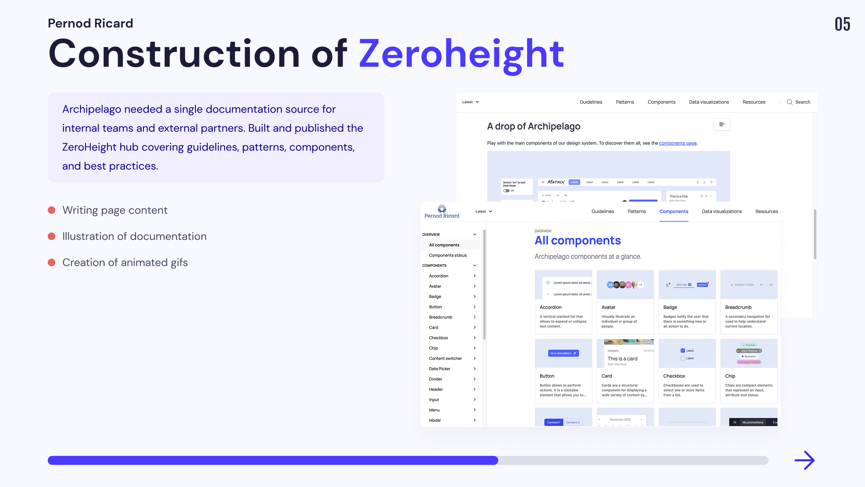
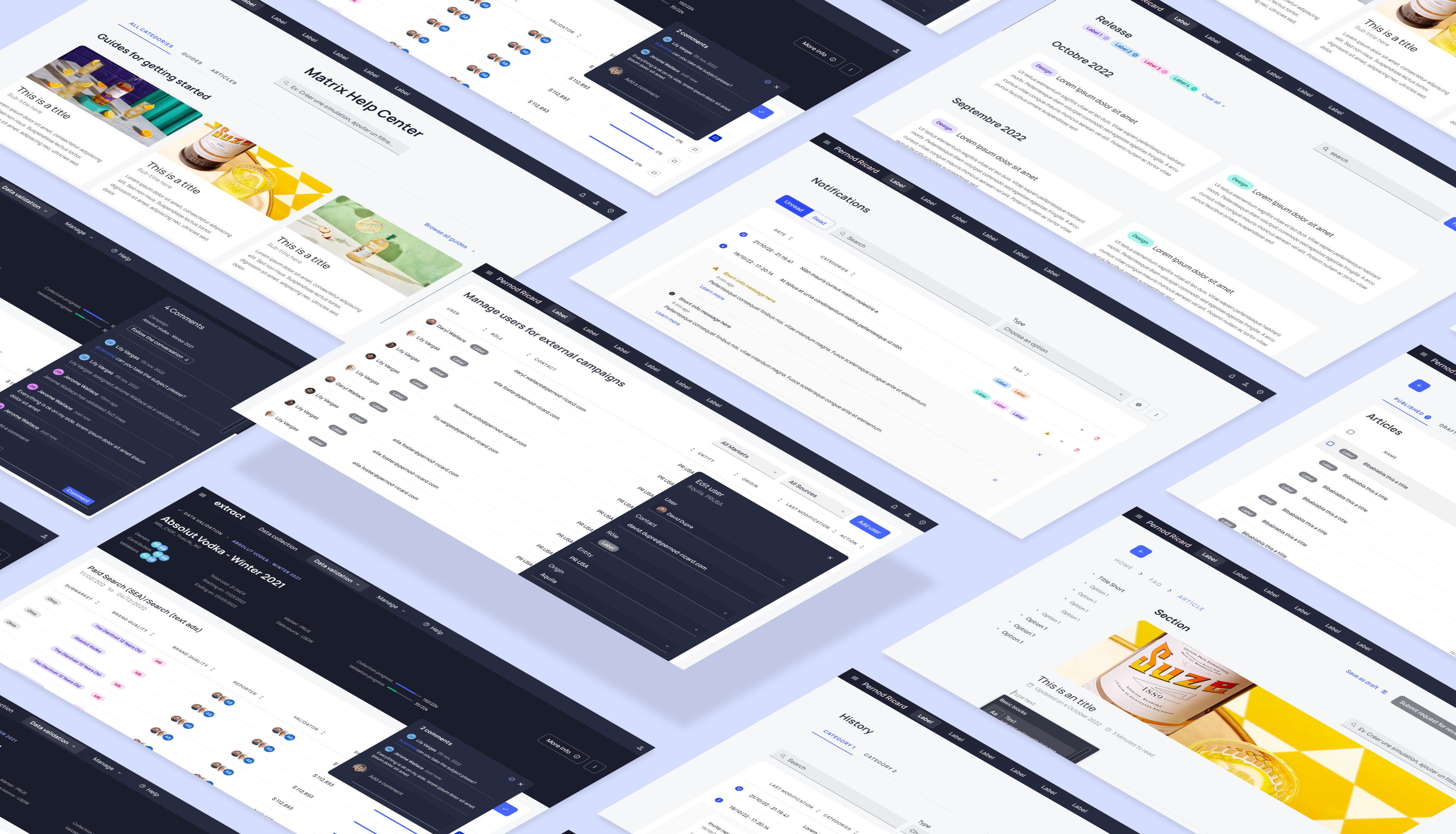
Mission 4: Creation of the Zeroheight
In order to communicate its design system externally and internally, Pernod Ricard needed a documentation source to present guidelines, patterns, components and best practices to help our collaborators work more effortlessly. So I was asked to work on building the zeroheight to present our documentation source.
You can consult the zeroheight here.
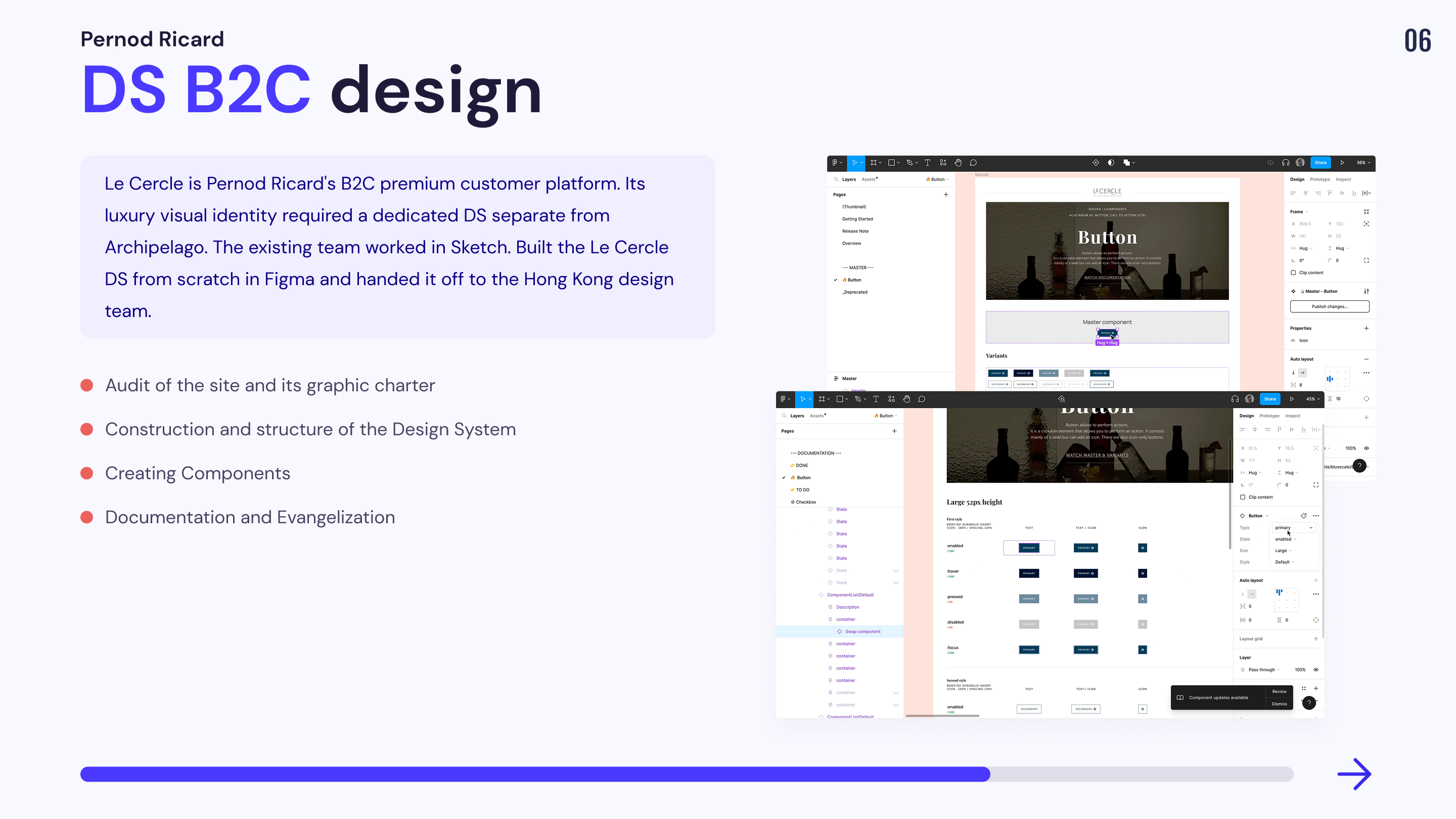
Mission 5 : Co-construction of the Design System “Le Cercle” B2C
I was asked by Pernod Ricard to work on a design system dedicated to one of its B2C sites dedicated to its premium customers. The graphic charter being based on the codes of luxury, we could not exploit the design system of Archipelago. The Circle's site was already online and was managed by another design team working under the sketch tool. We were asked to first build a file to guide the teams in the conception of their design system in Figma.
Our Organization
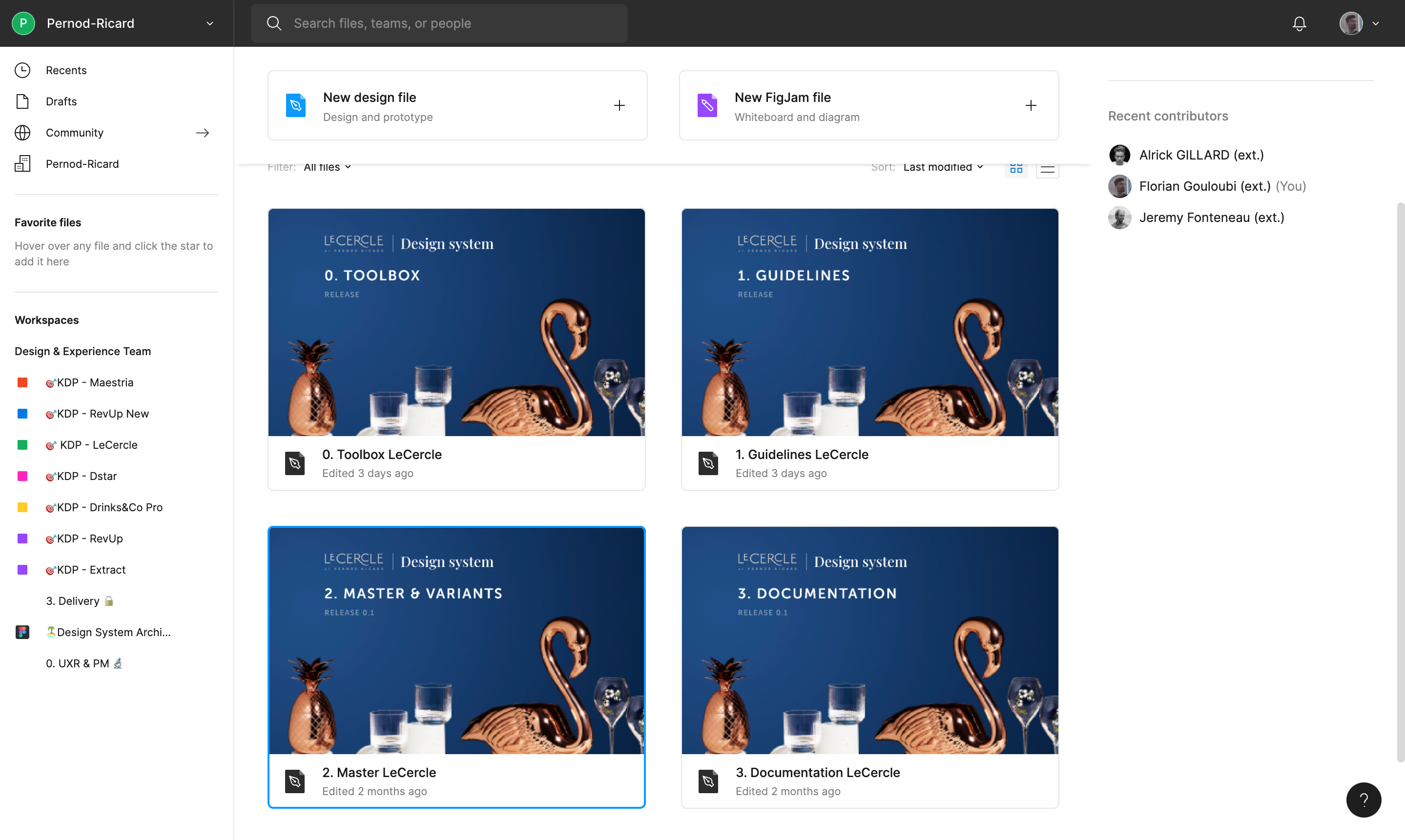
Files
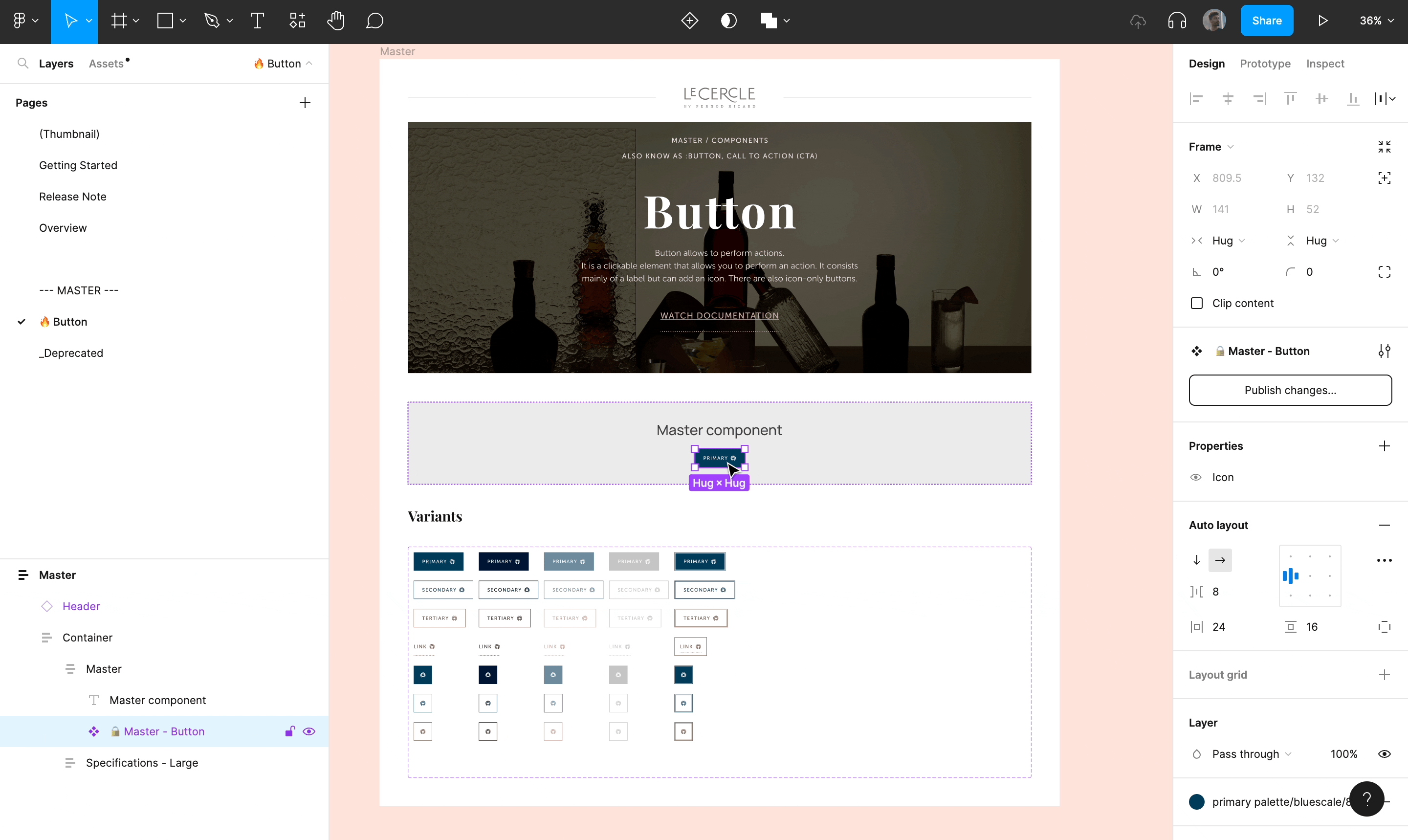
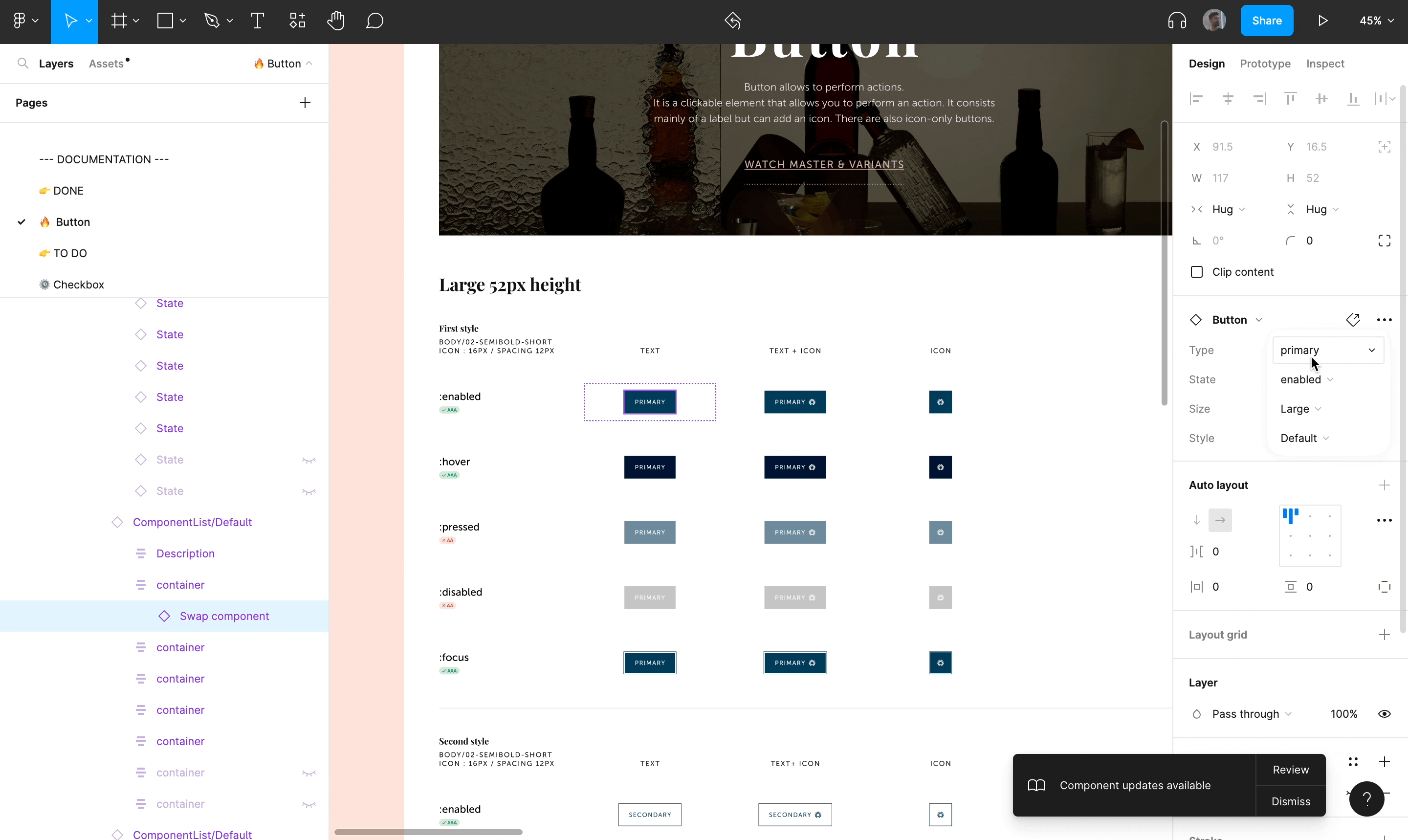
The Cercle Design System is composed of 4 files. This mission was very interesting because it allowed me to build a design system from scratch. I was free to experiment with all the optimizations I wanted, inspired by the problems I had encountered in the past, without having to worry about the mock-ups related to the design system.
Here are 2 experiments I was able to set up that do not exist in Archipelago:
The Master's degree
The objective of this component is to update all the variants of a component at once.
The Mastered Documentation
The objective was to optimize the writing of the legends of each variant of a component. Thus, a Figma file dedicated to the writing of the documentation has been realized. The legends are linked to a component and instances of components are adjusted in autolayout inside the frame in order to be able to edit the content quickly.
If you want to see more about the organization of our design system, please feel free to consult the following files.
📁 Toolbox
This file is used to automate and list all the visuals, components, or templates necessary for the documentation work.
📁 Guidelines
This File is dedicated to the basic guidelines & visual styles
📁 Master & Variants
This file is dedicated to the basic & complex components.
📁 Documentation
The Documentation file is dedicated to present a component with all its usages, its do's and don'ts and its anatomy.
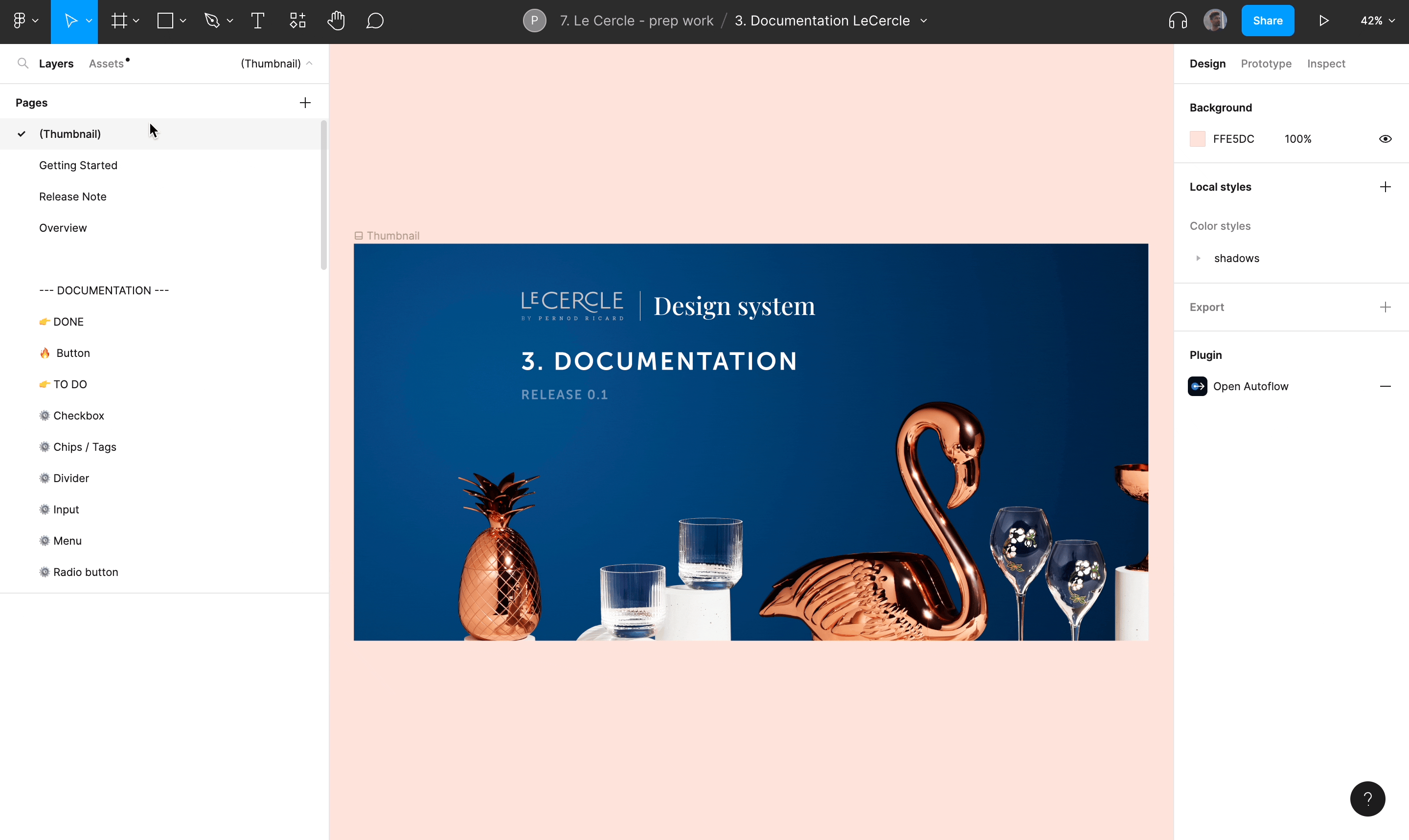
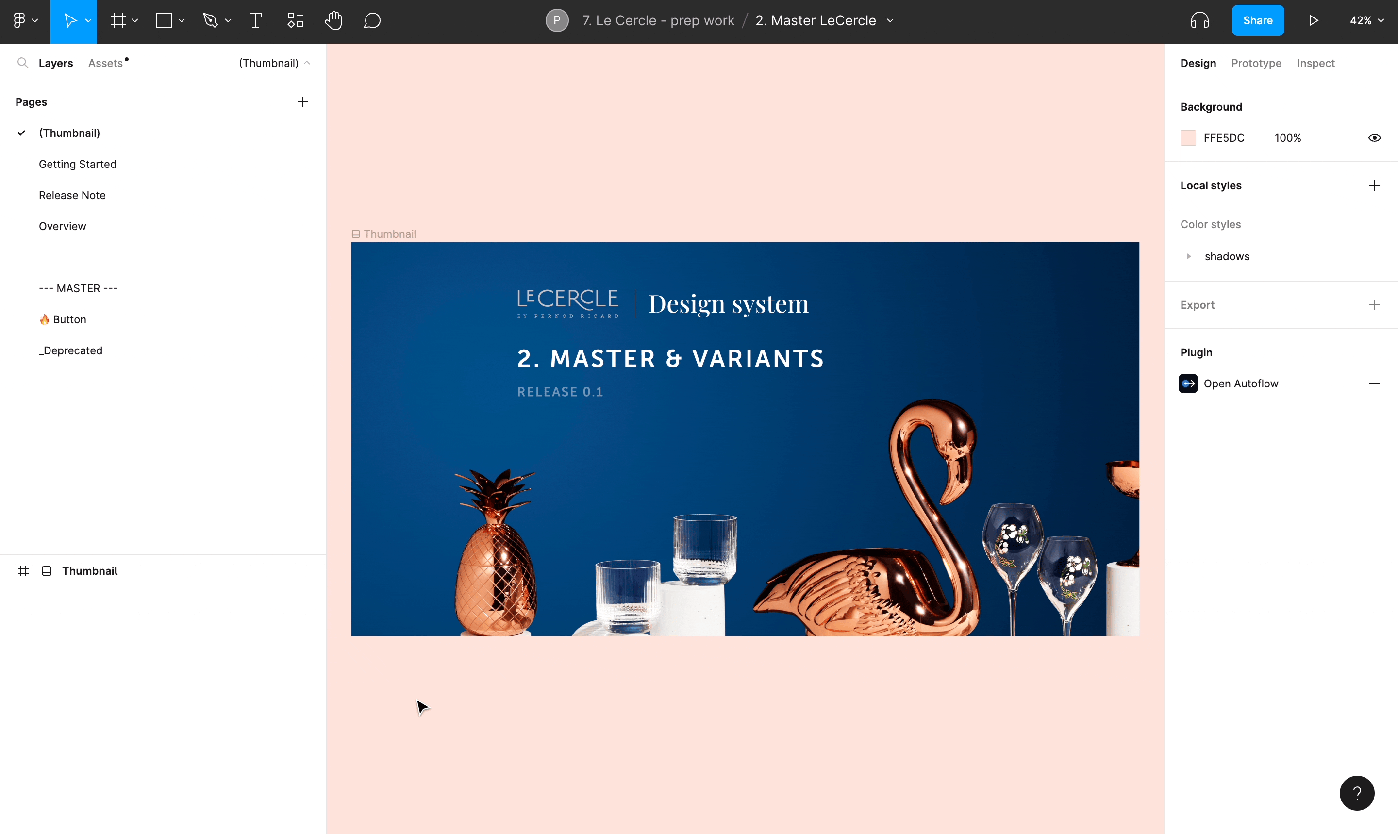
Just like Archipelago each file is composed of several pages divided into 5 parts (Thumbnail, Getting Started, Release note, Overwiew and Pages).
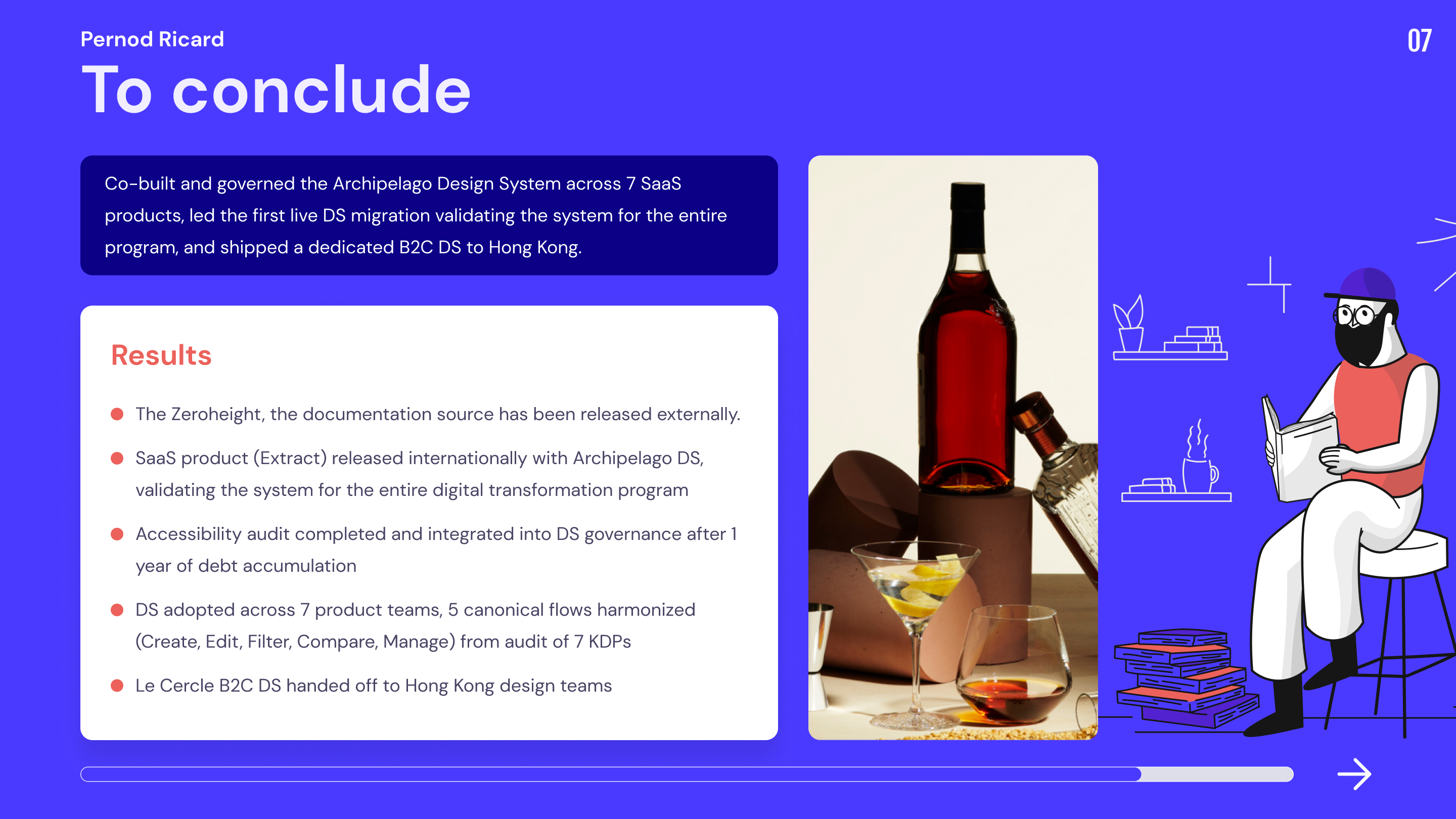
Key Result
Outcomes
Process constraints